Web Version - February 2012
Developed as a Joint Project of the
Braille Authority of North America
and the
Canadian Braille Authority
L'Autorité Canadienne du Braille
Published by The Braille Authority of North America
©2011 by The Braille Authority of North America
All rights reserved.
This material may be downloaded and printed, but not altered or sold.
The mission and purpose of the Braille Authority of North America are to assure literacy for tactile readers through the standardization of braille and/or tactile graphics. BANA promotes and facilitates the use, teaching, and production of braille. It publishes rules, interprets, and renders opinions pertaining to braille in all existing codes. It deals with codes now in existence or to be developed in the future, in collaboration with other countries using English braille. In exercising its function and authority, BANA considers the effects of its decisions on other existing braille codes and formats; the ease of production by various methods; and acceptability to readers.
For more information and resources, visit www.brailleauthority.org.
Canadian Braille Authority (CBA) Members
CNIB (Canadian National Institute for the Blind)
Canadian Council of the Blind
Braille Authority of North America (BANA) Members
American Council of the Blind, Inc. (ACB)
American Foundation for the Blind (AFB)
American Printing House for the Blind (APH)
Associated Services for the Blind (ASB)
Association for Education & Rehabilitation of the Blind & Visually Impaired (AER)
Braille Institute of America (BIA)
California Transcribers & Educators for the Blind and Visually Impaired (CTEBVI)
CNIB (Canadian National Institute for the Blind)
The Clovernook Center for the Blind (CCBVI)
National Braille Association, Inc. (NBA)
National Braille Press (NBP)
National Federation of the Blind (NFB)
National Library Service for the Blind and Physically Handicapped of the Library of
Congress (NLS)
Associate Member: Royal New Zealand Foundation of the Blind
Associate Member: T-Base Communications Inc.
Canadian Braille Authority
Irene Miller, Co-Chairperson
Braille & Large Print Services Supervisor
Alberta Education
Edmonton, Alberta, CA
Aquinas Pather
Quality Assurance, Tactile Design Specialist
T-Base Communications Inc.
Ottawa, Ontario, CA
Janet Milbury
Tactile Graphics Designer
Atlantic Provinces Special Education Authority
Halifax, Nova Scotia, CA
Braille Authority of North America
Lucia Hasty, Co-Chairperson
Chief Executive Officer
Rocky Mountain Braille Associates
Colorado Springs, Colorado, US
Allison O'Day
Certified Braille Proofreader
Minnesota State Services for the Blind
St. Paul, Minnesota, US
Diane Spence
Director Braille Services
Region 4 Education Service Center
Houston, Texas, US
Other Contributors
Mary Nelle McLennan, BANA Board Liaison
John McConnell, BANA Tactile Graphics Committee Consultant
Sarah Morley-Wilkins, BANA Tactile Graphics Committee Consultant
Constance Craig, BANA Tactile Graphics Committee
Susan Osterhaus, BANA Tactile Graphics Committee Consultant
Acknowledgements
Preface
Introduction
Background and Mandate
Unit 1 Criteria for Including a Tactile Graphic
Unit 2 Design Principles
Unit 3 Planning and Editing
3.1 Definition of Primary Components
3.2 Editing Content
3.3 Planning Process
3.4 Planning Size and Layout
3.5 Re-sizing the Original Print Graphic
3.6 Simplification
3.7 Elimination
3.8 Consolidation and Distortion
3.9 Separation
Unit 4 Production and Duplication Methods
4.1 Digital Master Production
4.2 Hard Copy Master Production
4.3 Duplication and Development
Unit 5 Braille Formats for Tactile Graphics
5.1 Placement of Tactile Graphic
5.2 Order of Elements in a Tactile Graphic
5.3 Headings, Titles, and Numbered Figures
5.4 Description of Print Illustrations
5.5 Illustration Captions
5.6 Transcriber's Note: Content and Format
5.7 Keys and Legends: Content and Format
5.8 Alphabetic and Numeric Keys
5.9 Symbol Placement and Measurements in Keys
5.10 Label Placement
5.11 Running Heads
5.12 Page Numbering
5.13 Special Symbols Page
5.14 Graphic Symbols Page
Unit 6 Mathematical and Scientific Diagrams
6.1 Clocks
6.2 Spinners
6.3 Circle Graphs
6.4 Money
6.5 Line Formations
6.6 Graphs
6.7 Pictographs
6.8 Counting Symbols
6.9 Thermometers
6.10 Measurement Tools
6.11 2-Dimensional and 3-Dimensional Drawings
6.12 Venn Diagrams
6.13 Tessellations
6.14 Stem-and-Leaf Plots
6.15 Orthographic Drawings
6.16 Ancient Numeration Systems
6.17 Chemistry
Unit 7 Complex Diagrams
7.1 Typical Characteristics of a Diagram that is Complex
7.2 Procedure
7.3 Design Techniques
7.4 Order of Preference for Modifications
7.5 Biology
7.6 Social Studies
7.7 Charts and Graphic Organizers
Unit 8 Orientation and Mobility
8.1 Map Designer Requirements
8.2 Content Decisions
8.3 General Overview or Area Maps
8.4 Orientation and Mobility Route Maps
8.5 Orientation and Mobility Maps - Design Considerations
8.6 Map Size and Scale
Unit 9 Tactile Graphics Supplements
9.1 Use of Tactile Graphics Supplements
9.2 Format and Layout
9.3 Collaborative Planning and Formatting
9.4 Choosing Transcriber's Notes and Key Symbols
9.5 Reference and Source Information
9.6 Transcriber's Notes/Producer's Notes
9.7 Preliminary Pages
9.8 Page Numbering
9.9 Diagram Identification
9.10 Key Explanations
9.11 Tactile Graphics Supplement Size
Unit 10 Quality Control
10.1 Proofreading the Tactile Graphic
10.2 Tactile Graphic Proofreading Procedures
10.3 Proofreading Tactile Graphic Copies
Unit 11 Graphics for Early Grades
11.1 The Challenge of Graphics for Young Readers
11.2 Design of Graphics for Young Readers
11.3 Re-sizing the Original Print Graphic
11.4 Clarity and Strength of Graphic
11.5 Teacher Reference Materials
Unit 12 Standardized Tests
12.1 Overview
12.2 Editing the Graphic
12.3 Format
12.4 Proofreading the Graphic
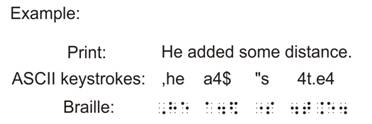
Appendix A Braille to ASCII Conversion
Appendix B Sample Braille Fonts
Appendix C Standard Key for Maps
Appendix D Production and Duplication Methods
Appendix E Texture Palette for Microcapsule Paper
Appendix F Line Styles
Appendix G Example of Tactile Graphic Template
Appendix H Production Materials, Equipment, and Suppliers
Appendix I Glossary of Terms
Parts of a Flower
Cross-section of Skin
Australia: Average Annual Rainfall
Circulatory System
Prince Andrew High School Floor Plan
Southwest Asia
U.S.A.
Sources of Pollution
Patterns
Digital Clock
Describing Money
Open- and Solid-circle Number Line
Number Line
Line Plot
Average Life Span Pictograph
Counting Symbols
Blocks of One Hundred
Thermometer
Angles on Survey Map
Nets
Tessellation: Polygons
Stem-and-leaf Plot
Calvin Cycle
Box-and-whisker Plot (Horizontal)
Box-and-whisker Plot (Vertical)
Value of Coins
Bus Routes
The Braille Authority of North America and Canadian Braille Authority jointly supported and funded the development of these guidelines and standards through the joint committee on tactile graphics. The committee wishes to express its appreciation to the BANA and CBA boards for their encouragement and financial support.
Other funding agencies that supported the initial surveys and research include the National Literacy Secretariat of the Government of Canada, Canadian National Institute for the Blind, and Canadian Braille Literacy Foundation.
There are many individuals, professionals, and volunteers, as well as organizations and private companies that generously donated their time, expertise, and materials to the development of these guidelines and standards. The joint BANA/CBA tactile graphics committee wishes to thank them for their commitment to the investigation and production of tactile graphics for the research conducted and the production of this manual.
Atlantic Provinces Special Education Authority (APSEA), Halifax, Nova Scotia, Canada
Canadian National Institute for the Blind (CNIB), Toronto, Ontario, Canada
Institut Nazareth et Louis Braille (INLB), Longueuiel, Québec, Canada
Learning Resources Centre (LRC), Alberta Education, Edmonton, Alberta, Canada
Region 4 Education Service Center (ESC), Braille Services, Houston, Texas, United States of America
Rocky Mountain Braille Associates, Colorado Springs, Colorado, United States of America
State Services for the Blind (SSB), St. Paul, Minnesota, United States of America
T-Base Communications, Inc., Ottawa, Ontario, Canada
Tactile graphics are not mere transcriptions of print illustrations or raised versions of a print graphic; they are the transformed representations of images that are adapted for the sense of touch. It is well known that the eye can take in enormously more information at a glance than can be perceived through the sense of touch. The process of enhancing print images for better tactile perception involves many aspects that these guidelines and standards address.
Tactile graphics may represent a variety of print illustrations that contain information conveyed in graphic formats. For the purposes of this publication, terms used to describe print images that provide content or data to the reader are used interchangeably, including diagram, illustration, graphic, figure, drawing. These images may be produced by a variety of methods using different materials. They accompany textual information to give a tactile representation of diagrams and information presented in print.
Tactile graphics are essential components of braille materials transcribed for use in educational and professional fields. Guidelines and standards for the inclusion, design, and presentation of tactile graphics are all the more necessary today with the advent of electronic text production and the proliferation of diagrams, illustrations, and graphs in educational texts.
The purpose of these guidelines and standards is to provide transcribers, educators, and producers with information about best practices, current methods, and design principles for the production of readable tactile graphics. It is not the purpose of these guidelines and standards, however, to teach the transcriber/tactile graphics producer how to prepare tactile graphics. The best method for learning how to prepare a tactile graphic comes from hands-on training, from critical feedback from other tactile producers and tactile graphics readers, and from experience.
To best facilitate the use of these guidelines and standards, it is suggested that the reader review the sections of the manual that apply to his/her intended purposes and use the variety of examples that accompany this manual. The Supplement to the Guidelines and Standards for Tactile Graphics includes thirty-five tactile graphic examples produced by a variety of production methods and includes examples from the mathematics, science, and social studies disciplines. Further examples are provided in simulated braille and are found within the text of the manual.
All tactile graphic examples, whether in the supplement or in the manual itself, are accompanied by a list of points and the print illustration from which the tactile graphic was produced. The points that accompany each example in the supplement inform the reader of the production method used to prepare the tactile graphic, the braille code used when transcribing the text in which the tactile graphic appeared, and a list of rules used and decisions made when preparing the tactile graphic. The tactile graphic examples found in the supplement volume are referenced in this manual as (See Supplement Example #, Title.). Further examples appear in this manual as illustrations of tactile graphics showing simulated braille and are referenced as (See Title, page #.). Shadow dots for unused portions of the braille cell shown in the illustrations should never be used on a real tactile graphic.
The Canadian Braille Authority and the Braille Authority of North America formed a joint committee to gather current information about tactile graphics and to write guidelines to standardize best practices for design and production of tactile graphics. These guidelines and standards provide detailed information and standards to guide individuals who produce tactile graphics at all levels. Tactile illustrators, transcribers, teachers of students with visual impairment, parents of children who are blind, teaching assistants, educational resource centers, braille production houses, and test agencies all need information about standard presentation formats to produce readily usable and understandable tactile representations of illustrations, maps, diagrams, and graphs that appear in print. Suggestions for use of specific and varied materials and different methods of production are included for diagrams, figures, and graphs that appear in print.
These guidelines and standards evolved from information gathered in surveys and research investigations into methods and current practices in use, including the Canadian Braille Authority Report of Tactile Graphics Sub-Committee Part 1 (1996): Research Findings and Recommendations; Part 2: Interim Measures (1996); and Canadian Braille Authority Report of Tactile Graphics Sub-Committee Part 3 Recommendations from GRASP: Graphic Research And Standards Project compiled in July 2003 . The findings from this research and the methods and practices are incorporated throughout the document and referenced in the relevant sections. The Report of Tactile Graphics Sub-Committee Part 3 is posted on the CBA web site under "CBA Publications.”
Graphic Research and Standards Project (GRASP) studied the characteristics of design that offered the best discrimination among components within a graphic. The findings can be found at www.canadianbrailleauthority.ca/docs/Report_Tactile_Graphics_part3.pdf or at www.canadianbrailleauthority.ca/docs/Report_Tactile_Graphics_part3.brf.
The Guidelines for Mathematical Diagrams, developed, field-tested, and revised under the auspices of and published by the Braille Authority of North America, have been incorporated into this document.
These guidelines and standards generally conform to practices set out in BANA guidelines for braille. They also incorporate information and are based upon recommendations and best practices issued by many agencies and producers that prepare tactile graphics.
1.1 Tactile graphics, in combination with 3-dimensional models, need to be introduced early in the process of learning braille. The ability to read graphics will be required for the understanding of concepts such as diagrams, graphs, and maps, and to be able to participate in standardized testing.
1.2 The transcription of a text is not considered complete until the required graphics have been included.
1.3 No diagram should be routinely omitted if a viable method can be found to render it tactually comprehensible. On the other hand, diagrams that do not add additional, necessary information than what is stated in the surrounding text may be omitted. Sometimes the information in a caption is sufficient without including the graphic.
1.4 A decision must be made about which would be more clearly understood by the reader—a well-stated transcriber's note, a tactile graphic, a simplified tactile graphic with a transcriber's note, or a 3-dimensional model. Some complex diagrams will never provide meaningful tactile information.
1.5 A Teacher's Guide or other course material may provide additional information on the purpose of the graphic and could be a factor in determining what can be eliminated from the graphic or if the graphic needs to be included at all.
1.6 If there are questions asked about an image that cannot be described without giving away the answer, a tactile graphic should be included.
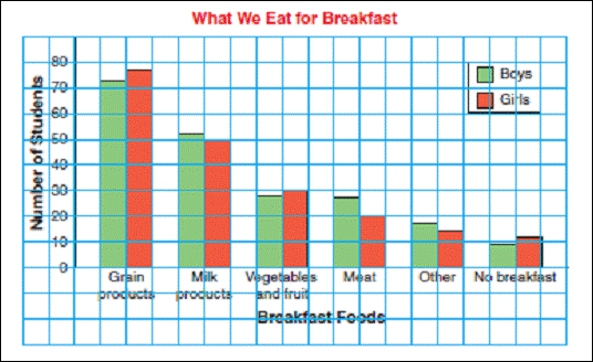
1.7 Graphs should be presented as a tactile graphic rather than presenting the data as a list. Tactile representations provide a clearer comparison of information, as in a pie chart or a plotted line graph, rather than comparing only numbers.
On the following page, the Decision Tree illustrates the process for determining if a graphic should be produced.
1.8 Decision Tree
Is this appropriate for a tactile graphic?
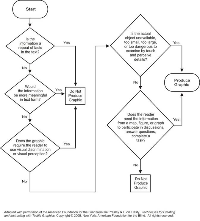
Considerations in the Planning ProcessWould the information be more meaningful in text form?
What information will be conveyed?
Which production method will be used?
Adapted with permission of the American Foundation for the Blind from Ike Presley & Lucia Hasty. Techniques for Creating and Instructing with Tactile Graphics. Copyright © 2005. New York: American Foundation for the Blind. All rights reserved. |
2.1 A tactile graphic is a representation of a print graphic designed in a manner that is the most meaningful to the reader. It is not an exact reproduction.
2.2 Cost and time must not be the primary considerations when determining the method of production. Choose the most effective production medium for each graphic.
2.3 The braille code and format used in preparation of the tactile graphic must be consistent with the transcription of the main body of text.
2.4 The dimensions of the braille text page(s) and any inserted tactile graphic page(s) should be the same. Tactile graphics produced using various media may be combined in the same volume.
2.5 Some eye-catching design techniques used in print, such as decorative borders, are irrelevant to the concept being taught and should be omitted.
2.6 Many frames or image outlines found around print diagrams should also be omitted if they would add extra lines without purpose. At times, image outlines are required to indicate containment such as water or land areas on a map. (See U.S.A., page 3-39.)
2.7 The tactile graphic should be positioned near the left margin of the page or indented according to the braille code in use, rather than centered. A blank line is required before and after the tactile graphic.
2.8 A print graphic may be simplified as long as the original intent is not compromised.
2.9 If the task does not involve measurement, modifications to size, position, or layout may be made to an illustration to clarify presentation.
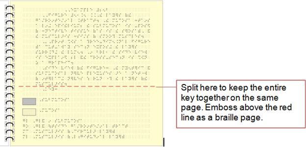
2.10 If the concept of depth is not required, a 3-dimensional view should be changed to a 2-dimensional view. (See Cross-section of Skin, page 3-15; Supplement Example 26, Cross-section of Skin.) Identify the view, such as front or cross-section. (See Supplement Example 25a, Gastrointestinal Tract and Supplement Example 25b, Gastrointestinal Tract.)
2.11 Clutter occurs when components of the graphic are too close together or so similar that they become hard to distinguish tactually. Clarity of components is improved by creating a break (blank space) between adjacent textures or where lines cross other lines or textures. (See Cross-section of Skin, page 3-15.)
A break is not required where the contrast in texture and strength of lines is clear. (See Supplement Example 24, Phase Diagram.)
2.12 If the reader is required to measure a line or an object, the line or object should not be lengthened or enlarged and must be raised and designed in a way that permits measurement with a braille ruler. If the reader is required to measure an angle, the rays should be extended.
2.13 If the reader is required to measure distance, the scale and graphic must be revised proportionately.
2.14 Use transcriber's notes to explain changes made to the print format.
2.15 When writing transcriber's notes, use vocabulary appropriate to the grade level and subject matter of the text. Use terminology from surrounding text. If needed to clarify the content in the graphic, further description may be added in the transcriber’s notes.
Example: "chart" rather than "table".
2.16 The use of transcriber's notes for kindergarten and first grade should be limited. (See Unit 11, Graphics for Early Grades).
2.17 A combination of symbols, keys, and words may be used to convey information. Since the use of a key involves an extra step for the reader to interpret the graphic, use a braille label (word) instead of a keyed symbol when it will fit in the available space.
2.18 Maintain consistency throughout a transcription when assigning alphabetic keys and/or textures to a particular item.
Example: Use of standard keys listed in Appendix C: Standard Key for Maps; use of same texture for repeating features such as water listed in Appendix E: Texture Palette for Microcapsule Paper.
2.19 The age and experience of the reader must be considered when designing a tactile graphic. Based on the student’s skill level, it may be necessary to limit the number of key symbols when assigning areas, lines, and points.
2.20 Facing pages should be used when the key and graphic will not fit on one page. Facing pages allow the reader to see both graphic and key without turning pages. (See U.S.A., page 3-39.)
2.21 Consider placing the tactile graphics on a separate page with limited text so that the graphic may be used with electronic text (e-text), as a tactile graphic supplement, or added to a collection for future use.
Planning the tactile graphic is a critical step in producing a meaningful representation of a print graphic or illustration. This step may require as much time as the actual production, yet is critical to ensuring that the final product conveys the information intended for the reader.
All information in the print graphic that is to be included in the tactile graphic may be categorized into one of the following primary components.
3.1.1 Area. An area represents a region that has specific significance in the graphic, such as states or rovinces in a map, stripes of different colors in the drawing of a flag, or the layers of soil and rock classifications in a geological diagram. Areas are usually concrete portions of a diagram.
3.1.2 Line. A line is linear information such as rivers, important geographic boundaries, historical routes (the Oregon Trail), or pathways (circulatory system or electrical circuit). In mathematical drawings, the line may be used to present the outline of a shape or indicate division, angles, or a length to be measured. Lines may represent either concrete or imaginary information.
(See Unit 3, Planning and Editing, 3.4.3.4, for information about locational (secondary) lines, such as tick marks, lead lines, number lines, and rulers.)
3.1.3 Point. A point symbol indicates a specific place within the graphic. It is usually placed in an area or on a line and represents specific data, such as a city, a bus stop, an oil well, a point in a line graph, or a gland in an anatomy diagram.
3.1.4 Label. A label may be words or an alphabetic or numeric key used to identify an area, line, or point symbol. A reader can discern information more efficiently when words are used rather than when symbols or keys are added; however, the use of whole words may sometimes add too much clutter.
(See Unit 5, Braille Formats for Tactile Graphics, 5.8, for format of abbreviations in labels.)
Facts or data included in a tactile graphic should be selected based on the purpose of the graphic and what the reader is expected to gain from the graphic. The tactile producer should not change the content or its meaning and should seek additional help in interpreting content if the material in the print diagram is not fully understood.
3.2.1 When determining the content of a tactile graphic, the producer must carefully read the text surrounding the graphic as well as other information, such as end of chapter questions. When possible, consult the Teacher's Guide or other course information.
3.2.2 In general, a single graphic should contain no more than five different area textures, five different line styles, and five different types of point symbols. If more are needed to represent the information required, consider using an alphabetic key.
The use of a planning sheet is recommended to document the planning process. Listing the content, textures, symbols, and labels helps track pertinent information and provide consistency in the graphics presented throughout the transcription. Documenting the information assists the transcriber or tactile producer in planning similar graphics.
TACTILE GRAPHIC PLANNING SHEET |
|
|---|---|
| Title: | Method: |
| Transcriber: | Graphics Designer: |
| Due Date: | Proofreader: |
Include (derived from surrounding text):
|
|
Simplification and/or elimination:
|
|
Re-sizing:
|
|
Consolidation and/or distortion:
|
|
Separation (List titles or headings for each part of the diagram):
|
|
Transcriber's notes (explaining change in format or description to support graphic):
|
|
Comments:
|
|
AREAS
| Information |
Texture/Material/Fill |
LINES
| Information | Texture/Material |
POINTS
| Information | Texture/Material |
ALPHABETIC KEY
NUMERIC KEY
TACTILE GRAPHIC PLANNING SHEET |
|
|---|---|
| Title: Australia: Avg. Annual Rainfall | Method: CorelDRAW/microcapsule paper |
| Transcriber: | Graphics Designer: |
| Due Date: | Proofreader: |
Include (derived from surrounding text): regions of rainfall, ocean/sea
|
|
Simplification and/or elimination: regions of rainfall, ocean/sea
|
|
Re-sizing: enlarge to full page size. Transcriber's note and key on facing page
|
|
Consolidation and/or distortion: consolidate 12 ranges of rainfall into 5, smoothing outlines as necessary
|
|
Separation (List titles or headings for each part of the diagram):
|
|
Transcriber's notes (explaining change in format or description to support graphic):
|
|
Comments: Verify from text that by consolidating regions, the reader is able to determine details needed for questions, discussion, etc. - incorporation of print legend into key listing - non-texturing of water
|
|
AREAS
| Information |
Texture/Material/Fill |
| over 1200 mm |
solid fill |
| 600-1200 mm |
large dot pattern |
| 200-600 mm | diagonal lines |
| 50-200 mm | small dot pattern |
| 0-50 mm | smooth- no fill |
LINES
| Information | Texture/Material |
| none | |
POINTS
| Information | Texture/Material |
| none | |
ALPHABETIC KEY
| none- all labels spelled fully | |
NUMERIC KEY
| none | |
When planning a graphic, consider the amount of space available within the size of the page on which the graphic will be produced. Prepare a template that incorporates the space requirements for each page size and production method that will be used. (See Appendix G: Example of Tactile Graphic Template.)
3.4.1 Braille Cell Measurements
A braille cell may vary slightly in size and shape when produced using different brands of braille embossers, computer-generated braille fonts, a braillewriter, or a slate and stylus. (See Appendix B: Sample Braille Fonts.) An embossed page of full braille cells (40 cells wide by 25 rows) may be vacuum formed onto a clear plastic sheet to aid in planning the layout of the graphic. A transparent sheet with a braille grid of SimBraille dots is available commercially.
Refer to the BANA website for the size and spacing of braille characters at
www.brailleauthority.org/sizespacingofbraille/sizespacingofbraille.pdf.
3.4.2 Overall Size of a Graphic on 11 by 11-1/2 Inch Paper (28 by 29 centimeters)
3.4.2.1 Maximum overall width of tactile graphic: 40 cells
3.4.2.2 Maximum overall length of tactile graphic: 25 lines
This includes the lines required for page numbers, running head, figure number and/or caption, transcriber's note, key, title of graphic. (See Appendix G, Supplement Example of Tactile Graphic Template.)
3.4.3 Component Measurements
3.4.3.1 Areas. Minimum size 1/4 square inch (6 square millimeters). Very small areas are more easily read if raised above other areas to increase the tactual contrast or shown below another area that is raised
Example: Bodies of water where land is raised.
3.4.3.2 Lines. Primary lines must be minimum 1/2 inch (1.25 centimeters) in length.
3.4.3.3 Dashed Primary Lines. The length of each dash should be 1/4 to 3/8 inch (6 millimeters to 1 centimeter), separated by spaces approximately half the length of the dash.
3.4.3.4 Locational (Secondary) Lines. For tick marks on number lines and graphs, the length must be 1/2 inch (1.25 centimeters) or 1/4 inch (6 millimeters) on each side of line and shown as less significant than primary lines on the tactile graphic. For clocks, the tick marks should straddle the circumference line and extend no less than 3/16 inch (4.5 millimeters) and no more than 1/4 inch (6 millimeters) on either side of the circumference. (See Supplement Example 2, Twenty-four Hour Analog Clock.)
3.4.3.5 Lead lines (from component to label) must be the least significant line in the graphic, with a preferred minimum length of 3/4 inch (2 centimeters) and a preferred maximum length of 1-1/2 inches (3.75 centimeters), with no arrowhead at the end. If at all possible, a lead line should be straight. GRASP research indicates that lead lines that are curved or change direction are harder to follow. Lead lines can either be solid or textured. (See Supplement Example 5, Energy Pie Chart.)
3.4.3.6 One end of the lead line should touch the component it identifies and the other end should be at least 1/8 inch (3 millimeters) from the beginning or end of the braille label. (See Parts of a Flower, page 3-9; Supplement Example 25b, Gastrointestinal Tract.)
Example of Tactile Graphic Design:
Parts of a Flower
3.4.3.7 Arrows. An arrow should be comprised of a shaft and either an elongated solid triangle or an open arrowhead. The shaft may be a solid or broken line, but the shaft and arrowhead should be approximately the same weight.
If a solid triangle is used as an arrowhead, the triangle should be isosceles (two sides of the same length) with the angle between the two longer sides between 30º and 45º to best indicate direction. The shaft of the arrow should be unspaced from (attached to) the arrowhead. (See Supplement Example 11, Transformation.)
If an open arrowhead is used, the two sides of the arrowhead should be an equilateral triangle with the two sides being the same length as the undrawn base. The shaft of the arrow should be spaced (detached) 1/8 inch (3 millimeters) from the apex. (See Supplement Example 2, Twenty-four Hour Analog Clock.)
3.4.3.8 Grid lines must be less significant than other information shown on the graph so they do not interfere with reading the graph's content.
3.4.3.9 In order to keep the grid from looking like an area texture, it is recommended that grid lines be no closer than 3/8 inch (1 centimeter).
3.4.3.10 Axis lines should be stronger than grid lines and include an arrowhead at the outer ends if shown in print.
3.4.3.11 Point Symbols. For discrimination between two or more different-shaped symbols, the minimum diameter must be at least 1/4 inch (6 millimeters). The space between a point symbol and any other component must be a minimum of 1/8 inch (3 millimeters).
3.4.3.12 Labels. Labels should be placed a minimum of 1/8 inch (3 millimeters) to a maximum 1/4 inch (6 millimeters) from any other component. If the label cannot be placed within minimum and maximum distance, the label must be placed far enough away to allow a 3/4 inch (2 centimeter) lead line.
3.4.3.13 A minimum of 1/8 inch (3 millimeters) "blank space" should be allowed on all sides of the label when embedded in an area texture.
3.4.3.14 The measurements of the area texture sample for the key are 1/2 inch (1.25 centimeters) high (vertical measurement) and 1 inch (2.5 centimeters) wide (horizontal measurement).
3.4.4 Size of Paper
Graphics produced on different sizes of paper or plastic, but included in the same volume or binder can be more difficult to locate and confusing to the reader.
3.4.4.1 The presentation and use of the graphic will dictate the size of paper or plastic on which the graphic is produced. For example, an orientation and mobility map that is to be portable and carried with the reader may be produced on 11 by 17 inch size (28 by 43 centimeters) or as a fold-out.
3.4.4.2 A math diagram included in a textbook must be produced in the same overall paper size as the text of the book, usually 11 by 11-1/2 inches (28 by 29 centimeters).
3.4.4.3 A tactile graphic produced for direct use by a reader may be any size needed for clarity of the image.
3.4.4.4 When a tactile graphic is too large to fit on a standard 11 by 11-1/2 inch braille page (28 by 29 centimeters) and/or when it is not conducive to split the tactile into a multiple-page presentation, a foldable flap may be added to increase the width of the page. The tactile graphic is designed to fit over the width of the extended pages and to be read with the foldable section opened. (See Prince Andrew High School Floor Plan, page 3-29.)
3.5.1 To provide clarity, a print graphic often should be enlarged. Such enlargement should be only as much as is needed to convey information clearly.
Example: A graphic of a clock face included in a first grade textbook should not be enlarged to such an extent that the reader must search large areas of empty space to find features.
3.5.2 When diagrams require the reader to use a ruler to measure or to use a distance scale to compare areas, it must be produced at exactly the same size as shown in print. (See Supplement Example 19, Measuring.)
When the diagram must be enlarged to provide tactual discrimination, a transcriber's note must precede the graphic explaining this. The graphic must be large enough and of sufficient line strength that braille measuring tools (i.e., braille ruler, braille protractor) can be used to accomplish the task.
When a diagram such as a map contains a scale and requires enlargement, the scale and the map must be enlarged proportionally. (See U.S.A., page 3-39.)
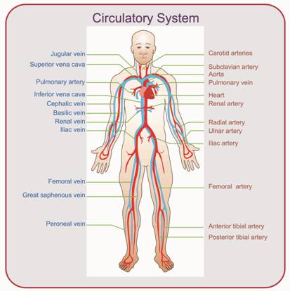
3.5.3 Complex diagrams may need to be produced in sections or layers. (See Circulatory System, page 3-25; Southwest Asia, page 3-33; U.S.A., page 3-39.)
3.6.1 Many print illustrations are too complex (i.e., they contain too much information) to show tactually without simplification. Care should be taken not to over-simplify because it may detract from or interfere with the comprehension and intended purpose of the diagram. (See Unit 7, Complex Diagrams; Supplement Example 26, Cross-section of Skin.)
3.6.2 Three-dimensional images are especially difficult to decode. When possible, simplify them to two dimensions. In some cases you may need to show more than one view to include all of the content in the print graphic. (See Supplement Example 25a, Gastrointestinal Tract and Supplement Example 25b, Gastrointestinal Tract)
Example of Tactile Graphic Design:
Cross-section of Skin
3.7.1 Print information may be eliminated if it will not hinder the purpose of the diagram.
Example: Small islands, rivers, mountains, lines of longitude and latitude, etc., may be left off many maps. Minor cities could be eliminated if only major cities are essential.
3.7.2 Frames or borders found around many print diagrams should be eliminated unless it provides a frame of reference.
3.7.3 Secondary information may be included as a note or description in a transcriber's note or included in a key instead of on the tactile graphic.
Sample transcriber’s note: "The Camarasaurus had chisel-like teeth (not shown) all along its jaws."
NOTE: This type of combination may be done if, and only if, the original purpose of the diagram is not hindered or made impossible
3.8.1 Small islands may be combined and shown as a larger area or linear features if they are important but too small to depict accurately.
Example: The islands of the West Indies can be shown as a single unit that would represent the chain of islands but would not indicate the actual size or number.
3.8.2 If numerous print symbols are used to indicate the location of demographic information or physical features, such as mountains, fewer symbols may be shown on the tactile graphic.
3.8.3 When there are too many area textures or patterns required by the original print illustration to be tactually discriminable, the diagram can be separated or the number of areas can be reduced by combining similar areas. (See Supplement Example 30, Australia: Average Annual Rainfall.)
3.8.4 A very small or narrow area or linear feature may be proportionally distorted if it will assist in detection or labeling.
3.9.1 To reduce clutter, many complex diagrams should be divided into sections or separated into layers of information. A diagram showing the whole image (overview) must appear first to provide the reader with a concept of the whole picture. (See Circulatory System, page 3-25.)
3.9.2 When a diagram is separated into sections or layers of information, a transcriber's note must indicate what type of division is made and the number of parts into which the illustration is divided.
Sample transcriber’s note: "The map is divided along the Mississippi River into Western and Eastern United States as indicated on the overview map."
3.9.3 Where a complex graphic has been separated into sections, a few points of reference in the overview diagram will allow the reader to understand how the separate parts fit back together.
Example: A print diagram of the human body might be separated into three tactile graphics: an overview including a point of reference, followed by a graphic showing the upper body, and the next graphic showing the lower portion of the body.
3.9.4 A logical division should be selected and a title designated to reflect the position of the divided parts in the whole. The diagram can be divided in half (either horizontally or vertically), divided into quarters (when additional room for enlargement is needed to include details), or divided by a natural landmark (the United States divided into two sections along the Mississippi River). The lines used to indicate the division should be a distinctly different texture than any other lines used in that graphic and should be shown on each section. (See Circulatory System, page 3-25; U.S.A., page 3-39.)
3.9.5 A logical division should be selected based on categories of information and a title designated to reflect the content.
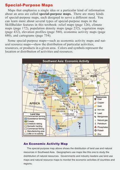
For instance, a complex map may be shown first as an overview, followed by separate layers within the whole: cities and states or provinces; bodies of water (i.e., seas, lakes, rivers); resources (i.e., minerals, industry); land regions; etc. (See Southwest Asia, page 3-33.)
Sample transcriber's note: "This map is divided into three parts (political, land use and resources) and shown over six maps. The first part is a political map of Southwest Asia. The second part, land use, is divided into two maps, and the third part, which shows the distribution of resources, is divided into three maps. Countries that are too small to key are: ISRAEL (west of JORDAN), LEBANON (west of SYRIA), KUWAIT (southeast of IRAQ), and in the Persian Gulf is QATAR and the island state of BAHRAIN. Each map is shown on a left-hand page followed by its key on the right-hand page(s)."
Example of Tactile Graphic Design:
Australia: Average Annual Rainfall
Example of Tactile Graphic Design:
Circulatory System
Example of Tactile Graphic Design:
Prince Andrew High School Floor Plan
Example of Tactile Graphic Design:
Southwest Asia
Example of Tactile Graphic Design:
U.S.A.
Tactile graphic production is learned "hands-on" and may be very challenging to a beginning tactile producer. Training, experience, and feedback will improve the skills required to produce a clear, understandable tactile graphic.
Various production methods, from simple to complex, may be used to produce a tactile graphic. The method used depends on the tools and production equipment available.
For detailed instructions on production and duplication methods, see Appendix D: Production and Duplication Methods.
4.1.1 Embossed Braille Image
An image is computer-generated using software programs for braille and graphics and then embossed on computer paper with a graphics embosser. (See Supplement Example 35, Neighborhood Map.)
Embossed braille, tooling, and collage may be combined to form a hard copy tactile graphic master.
Production and duplication equipment required: computer, braille and graphics software programs, specific braille fonts, braille paper, graphics embosser
4.1.2 Microcapsule Image.
An image is computer-generated using software programs for braille and graphics, transferred to microcapsule paper using a photocopier or printer, and then developed by a fuser. (See Supplement Example 25b, Gastrointestinal Tract.)
Production and duplication equipment required: computer, braille and graphics software programs, specific braille fonts, photocopier or printer, microcapsule paper, fuser
4.2.1 Tooling
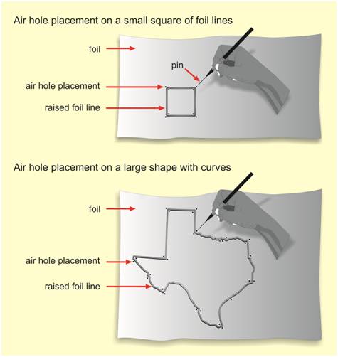
Tools can be used to create different area and line textures and point symbols on a paper foundation (base layer) or on diagramming foil to form a raised image. Common household tools (i.e., tracing wheel) or special kits can be purchased to create a tactile graphic master. (See Supplement Example 30, Australia: Average Annual Rainfall.)
Tooling, collage, and embossed braille may be combined to form a tactile graphic master.
Production and duplication equipment required: braille paper, diagramming foil, household tools and/or tooling kit, rubber mat, plastic sheets, vacuum-form machine
4.2.2 Collage
Textured materials are glued onto a paper foundation (base layer) to form a raised image. Common household items (i.e., drywall tape, corrugated paper, crochet cotton, string, punched-out dots) can be used to create a tactile graphic master. (See Supplement Example 25a, Gastrointestinal Tract.)
Collage, tooling, and embossed braille may be combined to form a tactile graphic master.
Production and duplication equipment required: braille paper, household items, plastic sheets, vacuum-form machine
4.2.3 Sculpture
Modeling clay is molded into an image and baked to produce the tactile graphic master. The baked clay object is attached to a paper foundation (base layer). (See Supplement Example 27, Bones.)
Production and duplication equipment required: braille paper, polymer clays, clay softening agent, silicone sealant, oven, vacuum-form machine, plastic sheet
4.2.4 Other Simple Techniques
For use in the classroom, tactile graphics may be produced quickly using simple techniques. Some methods can be used by a person who is visually impaired to practice handwriting or to draw a picture.
4.3.1 Braille Embosser
A graphics file is created using software programs for braille and graphics and then printed on a graphics embosser. The electronic file can be saved for further editing or duplication. (See Supplement Example 14, Bar Graph.)
4.3.2 Fuser
A graphics file is created using braille and graphics software programs and then transferred to microcapsule paper using a photocopier or printer. Certain pens can also be used on the microcapsule paper to add features. A halogen bulb in the fuser raises the gray and black areas on microcapsule paper, resulting in a tactile graphic. The electronic file can be saved for further editing or duplication. (See Supplement Example 2, Twenty-four Hour Analog Clock.)
4.3.3 Vacuum Form
A hard copy master is created using tooling, collage, foil, or sculpture production methods. The heating component and vacuum pump of the vacuum-form machine mold a plastic sheet (e.g., Brailon® thermoform sheet) to the shape of the hard copy master. This process forms a duplicate copy while retaining the master for future use. (See Supplement Example 10, Shaded Cartesian Graph.)
The following information is based on the format guidelines for presentation of these items from Braille Formats: Principles of Print to Braille Transcription, 1997, and The Nemeth Braille Code for Mathematics and Science Notation, 1972 Revision. Information in this document replaces the former Guidelines for Mathematical Diagrams and Report of Tactile Graphics Sub-Committee, Part II: Interim Measures.
5.1.1 An illustration should be inserted as close as possible to corresponding discussion in the text. If an appropriate location is not apparent, place it at the end of the print page on which it appears.
5.1.2 A blank line is required before and after a tactile graphic.
5.1.3 When it is necessary to move an illustration from its position in the print text, insert a transcriber's note at the original position, giving the print page number of the new location. A second transcriber's note must be inserted before the illustration at its new location stating the page number of its position in the print text.
5.1.4 When individually numbered or lettered diagrams are presented in print, they should be placed one below the other (vertically) rather than side by side (horizontally).
5.1.5 For test materials or answer choices where a comparison is being made between diagrams, they may be placed side by side in order to keep them on the same page. Items would be spatially arranged in order, horizontally, regardless of what is shown in print.
Example: A. B.
C. D.
Tactile graphics may consist of some or all of the elements listed below.
There are many different ways that the headings of print graphics are presented. Some print graphics do not have headings, some headings are included with the figure number and caption, some headings are embedded in the text of the caption, and some headings are displayed. Print graphics for different subject matter, such as mathematics and social studies, are also presented in various ways. Each print graphic needs to be analyzed to decide how these elements may be presented to the reader in the most understandable order and format.
|
|
|
|
|
5.3.1 Centered Headings. The most commonly used heading in a graphic is the centered heading. It is used for the title of a graphic. Blank lines should be left before and after centered headings unless the centered heading is the first line on a page (no running head used) or follows a page change indicator or a top box line. When a running head is used, a blank line is necessary before the centered heading. A blank line is not required between a running head and a repeated centered heading.
5.3.2 Cell-5 headings are sometimes used within a key and must be preceded by a blank line. Cell-5 headings must start in cell 5 with runovers in cell 5. A blank line would not be used between a cell-5 heading and any accompanying text such as boxed material, listed items presented in columns, numbered or lettered items. A blank line would be inserted between a cell-5 heading and a tactile graphic. (See Southwest Asia, PAGE 3-33; Number Line, page 6-23; Supplement Example 6, Number Line.)
5.3.3 When a tactile graphic extends beyond one braille page, repeat the title or identify the part of the graphic that is being continued. It is not necessary to insert the word (cont.) after the title because the transcriber’s note should orient the reader to information that follows. (See Supplement Example 30, Australia: Average Annual Rainfall; Supplement Example 10, Shaded Cartesian Graph.) For diagrams that are in multiple parts, see Unit 7, Complex Diagrams. (See Australia: Average Annual Rainfall, page 3-21.)
5.3.4 A print illustration may include a label or the word Figure (or Fig.) followed by a number and text. Follow the print copy for the numbering of illustrations in combination with hyphens, dashes, and colons. Use the decimal point (46), not the period, to represent the print dot when brailling the heading numbers that use a print dot to separate the number of the chapter from the number of an item within the chapter. This information should be brailled starting in cell 7 with runovers in cell 5 and placed before the drawing. Include figure numbers only if they are there in print. (See Parts of a Flower, page 3-9.)
5.3.5 Blank Lines in Tactile Graphics
Page 1 |
Page 2+, do not add (cont.) |
|---|---|
RUNNING HEAD |
RUNNING HEAD |
RUNNING HEAD |
RUNNING HEAD |
RUNNING HEAD |
RUNNING HEAD |
Page 1 |
Page 2+, do not add (cont.) |
|---|---|
CENTERED HEADING |
REPEATED CENTERED HEADING |
CELL-5 HEADING |
REPEATED CELL-5 HEADING |
Key: |
continuation of key listing |
5.3.6 When there is no title to the print illustration, it is permissible to add a title in braille for clarity. It is not necessary to add transcriber’s note symbols to this title.
Tactile graphics can be identified by way of transcriber's notes or a transcriber-assigned title. The "added name" is a useful identification tool that enables the reader to quickly understand what the picture is showing. Note: The tests publisher or state/provincial assessment content specialist must approve any changes to standardized tests.
5.3.7 A line 25 identifier is not needed on line 25 of the page containing a tactile graphic or on any accompanying key pages.
5.4.1 When a description, identification, or explanation of an illustration or a series of illustrations is inserted in the braille edition instead of a tactile graphic, these insertions must be brailled as transcriber's notes. The description or explanation must be preceded by the transcriber's note symbol starting in cell 7, followed by the illustration label or the appropriate word (i.e., Picture, Map, Diagram) and a colon. The description or explanation must follow on the same braille line with runovers in cell 5. The description or explanation should be as brief as possible using the vocabulary appropriate to the grade level and subject matter of the text. Unless required by other braille formats, no blank line should be left before or after a description or between a series of descriptions.
Example of Tactile Design:
Sources of Pollution
5.4.2 Omission of Illustrations. When illustrations are unrelated to the text or when sufficient information in the illustration is given in its caption or in the narrative body of the text, the illustration should be omitted and not described.
A note should be included on the transcriber's notes page stating that diagrams have been omitted. If the illustrations are numbered and an occasional one is omitted, a transcriber's note should be inserted at the site of omission. (See Patterns, page 5-35.)
An illustration caption consists of any statement that is shown accompanying an illustration or its title. A caption must be preceded on the same braille line by the illustration title. If no label is shown, insert the appropriate identification (i.e., Picture, Map, Diagram) beginning in cell 7 and followed by a colon, with runovers in cell 5. Transcriber's note symbols are not required in this instance. Special typeface must be ignored except when required for emphasis or distinction. Do not leave a blank line before or after a caption or between captions in a series unless required by other braille format rules (i.e., after a centered heading). When a description or explanation is needed in addition to the print caption, it must be inserted as a transcriber's note and placed where most appropriate, before or after the caption. (See U.S.A., page 3-39; Sources of Pollution, page 5-11.)
5.6.1 The transcriber's note contains any general explanation written by the braillist about the illustration and is presented before the key. A Key Listing may be part of the transcriber's note. The transcriber's note may include any of the following:
5.6.1.1 General facts, Example: "The following diagram shows ..."
5.6.1.2 Changes, Example: "This map is shown in three parts ..."
5.6.1.3 Omissions, Example: "Rivers are not shown."
5.6.2 The explanation is written in paragraph form as a standard transcriber's note and is started in braille cell 7 with the opening transcriber's note symbol. Runover lines begin in cell 5 and end with the closing transcriber's note symbol. If a transcriber's note accompanying a tactile graphic, whether literary or Nemeth, consists of seven words or less, it is enclosed in transcriber's note symbols and included within the text.
5.6.3 Word division between syllables (hyphenation) at the end of the line is not recommended.
5.6.4 Occasionally, information contained in a note or notes is essential for understanding the graphic before reading it. In this case, insert a transcriber's note before the graphic.
Sample transcriber’s note: "Note(s) shown in the graphic below."
The note should be preceded by the appropriate reference indicator starting in cell 7, with runovers in cell 5. When more than one note is shown, no blank lines should be left between the notes.
5.6.5 Transcriber's notes should be as short and concise as possible without sacrificing important information. They must be written in the present tense and must be written in the grade level vocabulary being used in the text and describe—not interpret—the information in the drawing.
5.7.1 The key listing should be presented in the following order:
5.7.2 The texture, symbol, or key used in the graphic must be an exact match to that used in the key listing.
5.7.3 The explanation for the area textures, line textures, and/or point symbols does not need to be in alphabetical order. Follow a logical order within each area, line, and point grouping (most significant to least significant). (See Supplement Example 12, Line Graph.)
For diagrams with a "random" order of labels, the keyed abbreviations are to be presented in alphabetical order on the key listing.
For diagrams with a "logical" order of labels, the keyed abbreviations are to be presented in the same order as they are shown on the diagram (from left to right, top to bottom, or clockwise starting at the top). (See Supplement Example 35, Neighborhood Map.)
Numbered keys should be placed in numeric order.
5.7.4 All the explanations should follow print capitalization. For example, if EUROPE is all in upper case in print, it would then be fully capitalized in the braille explanation.
5.7.5 If the original print illustration has a legend or key, these symbols should be integrated with those created by the braillist and placed in the key within transcriber's note symbols. When print uses the word "Legend," it should be replaced with the word "Key" in braille. (See Southwest Asia, page 3-33.)
When a passage is teaching the concept of reading maps, a transcriber's note must be inserted to explain the use of the word "key" rather than "legend." If this replacement is made throughout the volume or throughout an entire transcription, it should be explained on the transcriber's notes page.
Sample transcriber’s note: "In braille, the word 'key' replaces the print word 'legend.'"
When space does not permit the inclusion of labels in a tactile graphic, a key is assigned to represent information in a print diagram. The choice of key symbol should relate logically to the print diagram and should be suggestive of the item that it represents.
5.8.1 Keying Techniques for Transcribing Literary Material
5.8.1.1 Any combination of letters or letters and braille contractions requiring a minimum of two braille cells but no more than three braille cells may be used. Use of 2-cell keys is preferred. It is recommended that the first letter of the key symbol should be the first letter or contraction of the item that it represents.
5.8.1.2 One of the letters in each key entry must include dot 3 and/or dot 6 in the braille configuration. The only exception is the use of International Organization for Standardization (ISO) abbreviations for North America and the World. (See Appendix C, Standard Key for Maps, page A-3.)
The use of aa, ac, cc, and ca as a two-cell alphabetic key should be avoided because the dot configuration only uses the top third of the braille cell and makes it difficult to recognize them as braille characters as opposed to part of a texture symbol.
5.8.1.3 Single-letter keys are not recommended, but if used they must be followed by a period. Do not use the letter indicator before a two-cell alphabetic key, even when the letter combination corresponds to a braille short-form word.
5.8.1.4 Single-cell braille contractions should be used when they occur in the word that is being keyed. Example: "stl" rather than "sl" for St. Lawrence River.
5.8.1.5 Short-form words that consist of two or three braille cells may be used in a key.
EXCEPTION: Texts transcribed in Nemeth code where the use of two letter short-form words is prohibited.
5.8.1.6 In a numeric key, the number sign must precede each number and is brailled without a period.
5.8.2 Keying Techniques when Transcribing Using The Nemeth Braille Code for Mathematics and Science Notation, 1972 Revision
5.8.2.1 An alphabetic key must consist of two lower-case English letters. One of the letters in each key entry must include dot 3 and/or dot 6 in the braille configuration. The only exception is the use of International Organization for Standardization (ISO) abbreviations for North America and the World. (See Appendix C, Standard Key Maps, page A-3.)
5.8.2.2 A single-cell braille contraction cannot be used as part of a two-cell alphabetic key, since it may cause the reader to misinterpret the key as a mathematical symbol or notation.
Example: edc could be read as the shape of a circle.
5.8.2.3 Some short-form contractions that consist of two English letters may be used as a key. The only short-form contractions that can be used in texts other than those transcribed in the Nemeth Code are: al, bl, fr, hm xs, xf, lr, ll, pd, qk, sd, td, tm, tn, wd, yr.
EXCEPTION: The Nemeth Code prohibits the use of short-form contractions as a key.
5.8.2.4 An alphabetic key may be used only when the author's entries are never composed of two lower-case letters. If the points of a triangle are labeled "a," "b," and "c," and one of the line segments is labeled as "ab," an alphabetic key may not be used for any other labels shown on the diagram.
5.8.2.5 A numeric key should consist of a numeral written in the upper part of the braille cell (literary number). This numeral must be preceded by the numeric indicator and must not be punctuated.
5.8.2.6 Two items that are identical should have the same key assigned to them.
5.8.3 Placement of Keys, Both Literary and Nemeth
Insert a key as a transcriber's note below the graphic title. (See Southwest Asia, page 3-33.) When a title is not shown, place the transcriber's note key before the body of the graphic unless the key is continued on more than one page.
5.8.3.1 A blank line must be left before a key that follows a centered graphic title. No blank line should be left before a key following a top box line. Leave a blank line after completion of the key before the beginning of the graphic or diagram.
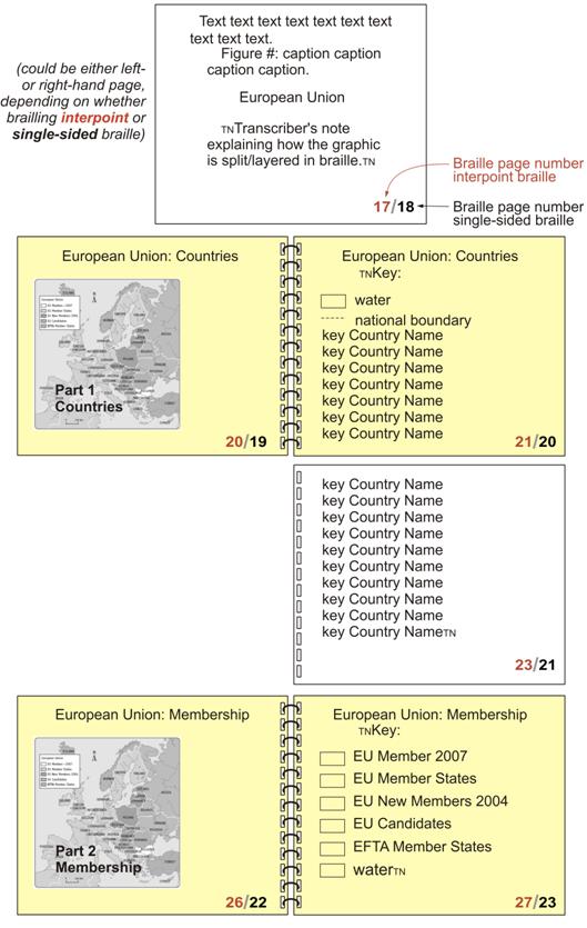
5.8.3.2 Whenever possible, the key must appear on the same braille page with the graphic. If this is not possible, insert the key on the page immediately preceding the illustration. These keys must be displayed as left-hand pages (i.e., facing pages) whether or not interpoint braille is being used.
When a key is placed on a facing page, it should follow the title of the graphic. The title of the graphic should be repeated on the graphic page. It is not necessary to place "(cont.)" after the title.
EXCEPTION: If one part of a tactile graphic requires more than one page for a key, the graphic would be placed on the left-hand page and the key on the following right-hand pages. All of the graphic and key pages for one print graphic would then follow this format. All the key pages would appear on right-hand page(s) even though there may only be some parts with only one key page. Insert the heading on the graphic. It is not necessary to add the heading on any continued key pages. (See Southwest Asia, page 3-33.)
5.8.3.3 If a graphic is preceded by a reference note and a key or by a transcriber's note containing a key plus additional information, the key must always be the last item presented before the graphic.
EXCEPTION: If one part of a tactile graphic requires more than one page for a key, the graphic would be placed on the left-hand page and the key on the following right-hand pages. All of the graphic and key pages for one print graphic would then follow this format. All the key pages would appear on right-hand page(s), even though there may only be some parts with only one key page. Insert the heading on the graphic. It is not necessary to add the heading on any continued key pages. (See Southwest Asia, page 3-33.)
5.8.4 Key listing
Items in the key must be listed in the following order: texture symbols, letter key symbols, and number key symbols in numerical order.
5.8.4.1 The word "Key:" preceded by a transcriber's note symbol in cell 7 should begin the presentation of keyed information. If the key is a continuation of a transcriber's note, the opening transcriber's note symbol does not have to be repeated.
A blank line should be left between "Key:" and the key symbol list unless this would cause the key page information to be spread over additional braille pages.
EXCEPTION: If one part of a tactile graphic requires more than one page for a key, the graphic would be placed on the left-hand page and the key on the following right-hand pages. All of the graphic and key pages for one print graphic would then follow this format. All the key pages would appear on right-hand page(s), even though there may only be some parts with only one key page. Insert the heading on the graphic. It is not necessary to add the heading on any continued key pages. (See Southwest Asia, page 3-33.)
5.8.4.2 The entire key is enclosed in transcriber’s note symbols because the information is an interpretation of what is presented in the print legend and graphic.
5.8.4.3 Texture symbols used to represent areas and lines start in cell 1; the explanation starts in cell 6 with runovers in cell 8. Point symbols are to be centered within the first four cells of the line. The explanation should begin in cell 6 and runovers in cell 8.
5.8.4.4 The top edge of the area textured symbol and the top of the point symbol will align with the top edge of the braille cell in the explanation (dots 14). The line texture symbol will align with dots 25 of the explanation.
5.8.4.5 Letter and number key symbols start in cell 1 and are followed by one blank cell. The explanation starts one cell to the right of the blank cell with all runovers in cell 3. (Explanations for 2-cell symbols begin in cell 4, and explanations for 3-cell symbols begin in cell 5, with both types having their runovers starting in cell 3.)
5.8.4.6 The closing transcriber's note symbol must be placed after the last item in the key listing. (See Southwest Asia, page 3-33.)
5.8.4.7 No blank line is required between different types of symbols unless the symbol takes up more vertical space than one braille line. A blank line must precede and follow the complete list of symbols in the key. (See Supplement Example 25a, Gastrointestinal Tract and Supplement Example 25b, Gastrointestinal Tract.)
5.8.4.8 If a group of keyed items has a heading (i.e., Countries, Percentages), the heading should be placed in cell 5 with runovers in cell 5 before the listing. Cell-5 headings must be preceded by a blank line. No blank line follows the cell-5 group heading. (See Southwest Asia, page 3-33.)
5.8.4.9 In an effort to conserve space and make the key fit on the same page as the diagram, it is acceptable to make two columns of information for the key listing. If this approach is used, "Key:" should be changed to "Key in 2 columns" followed by a colon. If the information is being presented in alphabetical order and in two columns, the alphabetical order should read down the first column and continue to the top of the second column.
5.8.5 Keys for complex graphics that are presented in multiple parts require additional keying techniques. (See Unit 7, Complex Diagrams.)
5.9.1 Area (See Appendix E, Texture Palette for Microcapsule Paper.)
5.9.1.1 All area texture symbols in a key should begin in braille cell 1 and end in cell 4. Texture symbols should be 1 inch (2.5 centimeters) long from left to right. (See Supplement Example 10, Shaded Cartesian Graph.)
5.9.1.2 All area texture/pattern symbols in a key should be 1/2 inch (1.25 centimeters) from top to bottom. Note: The size of the area texture symbol requires two braille lines.
5.9.1.3 Area texture symbols in a key must match those that appear on the tactile graphic.
5.9.2 Line. (See Appendix F, Line Styles, page A-31.)
Line symbols in a key must be 1 inch (2.5 centimeters) in length and match the texture on the tactile graphic. (See Supplement Example 12, Line Graph.)
5.9.3 Point
5.9.3.1 Point symbols in a key should be centered between braille cell 1 and 4 and align with the top edge of the braille cell (dots 14) in the explanation.
5.9.3.2 Point symbols in a key should be a minimum of 1/4 inch (6 millimeters). (See Supplement Example 6, Number Line.)
5.9.3.3 Point symbols in a key must match those that appear on the tactile graphic.
5.10.1 Labels should be placed horizontally on the tactile graphic master. Stick-on braille labels should not be used, especially on masters created for vacuum-form reproduction. The heat during the vacuum-form process causes the labels to fall off the master graphic. Plastic labeling products should not be used for masters that will be vacuum formed because the labels will melt. Paper labels glued on the master should be avoided because a box will appear around the label when vacuum formed. The resulting box interferes with interpretation and is tactually confusing.
There can be variations in placement of labels in orientation and mobility maps. (See Unit 8, Orientation and Mobility, 8.5.10.)
5.10.2 Hierarchy of Labeling Styles
5.10.2.1 Whenever possible labels for large areas or sections should be brailled or spelled out in full within the area.
5.10.2.2 A combination of spelled-out words and alphabetic key symbols may be used.
5.10.2.3 Lead lines may be used to connect labels to small areas, lines, or point symbols.
5.10.2.4 If necessary, an area, line, or point can be keyed and the explanation of the area included in the key.
5.10.2.5 Certain circumstances may require a combination of the methods above. (See U.S.A., page 3-39.)
5.10.3 Capitalization of labels on the graphic should, in general, follow print; exceptions may be made where space is limited.
5.10.4 A letter sign is not required with a single capital letter that is used as a label on a tactile graphic. A letter sign is required with an uncapitalized letter.
Example: On a tactile graphic, the letter sign would not be used with N for north on a compass. (See Unit 7, Complex Diagrams, 7.6.3.5.)
5.10.5 Label placement needs to be at least 1/8 inch (3 millimeters) and no more than 1/4 inch (1.25 centimeters) from the component to which it belongs.
5.10.6 A label for a measurement line would be placed beside the line, leaving the line unbroken.
5.10.7 When a label needs to be split between two braille lines, the runover should be left justified, not indented. (See Supplement Example 30, Australia: Average Annual Rainfall.)
5.11.1 If the agency requires use of the book title as a running head, this running head must appear on the first line of every tactile graphic page and key page.
5.11.2 The running head must be fully capitalized and centered on the available cells of the first line, leaving at least three blank cells at both the beginning of the line and before the print page number.
5.11.3 The running head must not occupy more than one braille line, and it must be the same on all pages. When a book title must be shortened to serve as a running head, follow the steps below in the order in which they are given.
5.11.3.1 Capitalize only the initial letter of each word in the title.
5.11.3.2 Capitalize only the initial letter of the first word and principal words in the title.
5.11.3.3 Omit minor words and/or abbreviate longer words in the title.
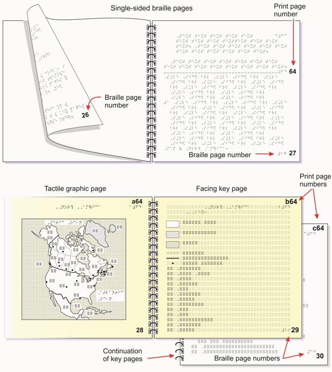
5.12.1 Double-sided (Interpoint) Braille:
Page numbers should be assigned to every braille page. Some of the pages may need to be left blank to accommodate graphics and/or keys. It is not expected that the page number be applied (brailled) to the back of the vacuum form, microcapsule, or graphic pages.
An interpoint braille volume with a single tactile graphic page inserted:
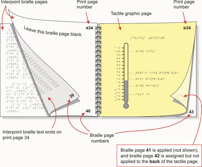
An interpoint braille volume with a tactile graphic and a facing key page inserted:
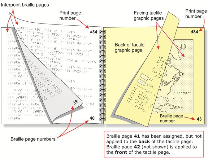
5.12.2 If a tactile graphic contains only one page for a key, the key would be placed on a left-hand (facing) page, and the graphic would be placed on the following right-hand page. (See Circulatory System, page 3-25.)
5.12.3 If one part of a tactile graphic requires more than one page for a key, the graphic would be placed on the left-hand page and the key on the following right-hand pages. All of the graphic and key pages for one print graphic would then follow this format. All the key pages would appear on right-hand page(s), even though there may only be some parts with only one key page. Insert the heading on the graphic. It is not necessary to add the heading on any continued key pages. (See Southwest Asia, page 3-33.)
5.12.4 Single-sided: The keys should be placed on the pages following the graphic. The print and braille page numbers for the key pages will be in ascending order.
A single-sided braille volume with a tactile graphic and two or more key pages inserted:
|
5.13.1 A special symbols page must include a list of braille items that may not be familiar to the reader (e.g., slash, number line braille symbols).
5.13.2 Format of Special Symbols Page
5.13.2.1 The list must be placed on a new braille page with the centered heading SPECIAL SYMBOLS USED IN THIS VOLUME starting on the first line (or on third line if a running head is used). This heading must be followed by a blank line. When a list must be continued on one or more pages, these pages must carry the centered heading SPECIAL SYMBOLS (cont.), starting on the first line (or on the second line if a running head is used). No blank line must be left after this repeated heading unless a category heading immediately follows.
5.13.2.2 When symbols fall into identifiable categories (e.g., number line symbols, typeface indicators, Computer Braille Code symbols, etc.), these should be presented first and followed by the other symbols. The heading for each category must be brailled with initial capitals and placed as a cell-5 heading above the symbols it identifies. When a category list must be continued on one or more pages, repeat the cell-5 heading followed by (cont.) starting on the first line, (or on the second line, if a running head is used.)
5.13.2.3 Each listed symbol must begin in cell 1 and be followed, after one blank cell, by its identification as directed below.
5.13.2.4 All runovers of items in the special symbols list must start in cell 3.
5.13.2.5 Special graphic symbols that are consistently or repeatedly used on diagrams must be listed in the Graphic Symbols page.
5.14.1 Area, line, or point symbols that are consistently or repeatedly used on diagrams should be placed on the Graphic Symbols page following the Special Symbols page. This will reduce the need to redo keys that appear repeatedly throughout the volume.
Example: land and water for a series of maps or supply and demand curves in an economics book.
5.14.2 Alphabetic key symbols such as ISO abbreviations for countries in a geography or history book should also be placed on this page. This will reduce the need to repeat those items in keys. (See Appendix C; Standard Key for Maps, page A-3.)
5.14.3 Format of Graphic Symbols Page
5.14.3.1 A note should be placed on the Transcriber's Notes pages that explains the use of the Graphic Symbols page.
Sample: Graphic symbols that are used throughout this volume are shown on the Graphic Symbols page, braille page p__.
5.14.3.2 The list of graphic symbols must be placed on a new braille page with the centered heading GRAPHIC SYMBOLS USED IN THIS VOLUME in the same manner as the Special Symbols page. (See Unit 9, Tactile Graphics Supplements, page 9-10.)
5.14.3.3 When a list must be continued on one or more pages, these pages must carry the centered heading GRAPHIC SYMBOLS (cont.). No blank line is left after this repeated heading unless a category heading immediately follows.
5.14.4 Assure the following when considering what should or can be included on the Graphic Symbols page:
5.14.4.1 The area, line, point, or alphabetic key symbols appear frequently enough to warrant placement on the Graphic Symbols page. Symbols that occur only in one or two diagrams or that reoccur infrequently should be placed in the key pages preceding the diagram to which they refer.
5.14.4.2 The area, line, point, or alphabetic key symbols are not used for any other feature in that volume. It is recommended that during the planning and formatting, when all the diagrams are examined, the most commonly occurring features be earmarked for inclusion in the Graphic Symbols page.
5.14.4.3 The area, line, or point symbols that are consistently used throughout the transcription are placed on the Graphic Symbols page.
Example: north arrows, measurement lines, directional (flow) arrows, land and water textures.
5.14.4.4 The alphabetic key symbols that are consistently and repeatedly used throughout the transcription are placed on the Graphic Symbols page.
Example: If placed on the Graphic Symbols page, "af" (for Afghanistan in the ISO abbreviations) could not be used for the continent of Africa on any other tactile graphic.
5.14.5 When symbols fall under identifiable categories, the heading for each category must be brailled with initial capitals and placed as a cell-5 heading above the symbols it identifies.
5.14.6 The textures used to represent areas and lines start in cell 1, and the explanation starts in cell 6 with runovers in cell 8. Point symbols are to be centered within the first four cells of the line, and the explanation should begin in cell 6 with runovers in cell 8.
Example of Tactile Design:
Patterns
The Nemeth Braille Code for Mathematics and Science Notation, 1972 Revision should be used when transcribing mathematical material. Scientific material of a technical nature should also be transcribed using this same code. Where it is determined that scientific works are characterized by the use of an occasional mathematical sign or a small number of such signs, the mathematical signs may be treated as indicated in Braille Formats: Principles of Print to Braille Transcription, 1997. Works that are specific to chemistry should be transcribed according to the Braille Code for Chemical Notation 1997.
Information in this document replaces the former Guidelines for Mathematical Diagrams and Report of Tactile Graphics Sub-Committee, Part II: Interim Measures.
Regardless of braille code used, the numeric indicator should be omitted when depicting measuring tools, number lines, and Cartesian graphs. It is not necessary to include a transcriber's note regarding the omission of the numeric indicator. Where confusion may arise as to whether a label is numeric or alphabetic (e.g., a keyed item, the numeric indicator must be used.
The following chart shows information about the inclusion or omission of the numeric indicator (number sign) regardless of whether the text is transcribed in literary or Nemeth (mathematics and science) code.
|
Use Numeric |
Omit Numeric |
Bar Graphs |
✓ |
|
Barometers |
|
✓ |
Cartesian Graphs |
|
✓ |
Clocks |
|
✓ |
Histograms |
✓ |
|
Line Graphs |
✓ |
|
Longitude/Latitude Lines |
✓ |
|
Number Lines |
|
✓ |
Pictographs |
✓ |
|
Pie Charts |
✓ |
|
Protractors |
|
✓ |
Rulers |
|
✓ |
Scatter Plots |
✓ |
|
Spinners |
✓ |
|
Thermometers |
|
✓ |
Time Lines |
✓ |
|
Use the numeric indicator for graphics that are not specified in the chart above. If it is deemed necessary to omit the numeric indicator (for example, due to space constraints), the omission must be explained in a transcriber's note prior to the graphic.
In Nemeth Code, when a single English letter in regular type is used as a label on a tactile graphic, the English letter indicator (letter sign: dots 56) is required if the letter is in lower case, but it is omitted if the letter is capitalized. The English letter indicator must be used with an uncapitalized combination of letters corresponding to a short-form word (e.g., ab, cd), if the short-form combination is preceded and followed by a space.
6.1.1 Analog Clocks. (See Supplement Example 1, Analog Clocks; Supplement Example 2, Twenty-four Hour Analog Clock.)
6.1.1.1 The numeric indicator (number sign) should not be used on analog clocks regardless of whether the text is transcribed in literary or Nemeth (mathematics and science) code.
6.1.1.2 Ordinarily, tactile graphics should be presented in vertical order, one below the other. However, in order to compare several clocks at one time, clocks may be presented in a square formation that shows two clocks side-by-side followed below by two more clocks side-by-side.
6.1.1.3 The circumference of the clock should be tactually distinct from the tick marks used to indicate the hour divisions. Minute divisions should be omitted unless specifically referred to in the surrounding text.
6.1.1.4 The length of the tick marks should be in proportion to the overall size of the clock. Generally, the tick marks for hours should straddle the circumference line and extend no less than 3/16 inch (4.5 millimeters) and no more than 1/4 inch (6 millimeters) on either side of the circumference.
6.1.1.5 The numbers on the clock should be placed outside the clock circle and should be 1/8 inch (3 millimeters) from the tick mark.
6.1.1.6 The hands on the clock should be produced with differing textures and should be of different lengths. The hour hand texture should be dotted or dashed, and the minute hand should be prepared using a smooth texture. A third texture should be used if a second hand is shown. Only the hour hand should have an arrowhead placed at its end.
6.1.1.7 It is not necessary to include tick marks for each minute when only five-minute intervals are required. However, if the reader must discern minutes less than five-minute intervals, the tick marks for every one-minute interval must be shown.
6.1.1.8 When it is necessary to discern minutes, the clock face must be larger to allow sufficient space between the individual minutes, all of which must be included. Tick marks for minutes should extend 1/8 inch (3 millimeters) on either side of the circumference. The tick marks for hours should be tactually more significant than the tick marks for minutes. Numbers indicating individual minutes should not be included.
6.1.1.9 The number placement in the tactile graphic presentation of a 24-hour clock should be similar to the print graphic, even if the numbers are inside the clock circle. (See Supplement Example 2, Twenty-four Hour Analog Clock.)
6.1.2 Digital Clocks (See example of Digital Clock, page 6-5.)
6.1.2.1 The perimeter or outline of a digital clock is shown with the time brailled inside. The perimeter is important because it helps the reader recognize the clock as an object rather than as numbers standing alone to represent time. The time on the clock should be transcribed in the same braille code as surrounding text.
6.1.2.2 The perimeter of the clock should be represented by a series of unspaced braille symbols for grades 4 and up.
Example of Tactile Design:
Digital Clock
A spinner is divided into portions and used to determine the probability of an outcome or moves on a game board. It must be provided as a tactile graphic. (See Supplement Example 3, Spinner.)
6.2.1 If numbers are shown, they should be preceded by the numeric indicator (number sign) regardless of whether the text is transcribed in literary or Nemeth (mathematics and science) code.
6.2.2 Spinners should be enlarged just enough to easily display the segments.
6.2.3 The outline of the spinner should be tactually distinct from the lines separating the segments.
6.2.4 The spinner or pointer should be shown as a simple arrow (shaft and arrowhead) beginning at the centre and extending outward and should be tactually distinct from the segment lines. Including the arrowhead clearly distinguishes spinners from circle graphs. The tail of the spinner should not be shown because it has no mathematical significance, and it adds unnecessary clutter.
6.2.5 Labels should be placed 1/8 inch (3 millimeters) outside the outline of the spinner, leaving the interior of the spinner unobstructed.
6.2.6 If the reader needs to know the color to complete the task, place the color name as a label outside the segment. If space is an issue, use an alphabetic key for labels rather than an area texture.
Circle graphs or pie charts show numerical relationships by dividing a circle into several sectors. Each piece represents a quantity which is a portion of the whole circle. It must be provided as a tactile graphic rather than as a list. (See Supplement Example 4, Pie Chart; Supplement Example 5, Energy Pie Chart.)
6.3.1 If numbers are shown, they should be preceded by the numeric indicator (number sign) regardless of whether the text is transcribed in literary or Nemeth (mathematics and science) code.
6.3.2 Pie charts should be shown as a tactile graphic rather than presenting the information as a list. They should be enlarged just enough to easily display the divisions of the circle.
6.3.3 The outline of the circle should be tactually distinct from the lines separating the divisions.
6.3.4 It may be difficult to differentiate between division lines that are close together. A few of these lines may be stopped just short of the center to avoid clutter.
6.3.5 The circle graph may be rotated slightly to accommodate labels. Lengthy descriptive labels should be indicated with an alphabetic or numeric key.
6.3.6 Labels should be placed 1/8 inch (3 millimeters) outside the circumference, leaving the interior of the graph unobstructed.
6.3.7 Key. (See Unit 5, Braille Formats for Tactile Graphics: Keys and Legends: Content and Format, 5.7.)
6.3.7.1 If a key is necessary for the different sections, it should be placed before the graph. If possible, place the key and the graph on the same page.
6.3.7.2 The key should be listed in the order the sections appear, in clockwise order, starting at the top (at the 12:00 position).
6.3.8 If the portions of the print circle graph show a descriptive label in addition to shading, it is not necessary to show the shading in braille.
6.3.9 If lead lines are required to connect the label to a segment, a minimum length of 3/4 inch (2 centimeters) and a maximum length of 1-1/2 inches (3.75 centimeters) are preferred. There should not be an arrowhead used at either end, and the lead line should not cross over the outside of the circle. (See Supplement Example 5, Energy Pie Chart.)
6.4.1 When identification of coins and paper currency is being taught, real money should be used instead of producing a tactile graphic of the money. Do not attempt to illustrate the images on the coins in a tactile form. Braille readers identify coins by their size, textured edge, and shape, rather than by the images on the front and back of the coin.
Example of when tactile graphics should not be used:
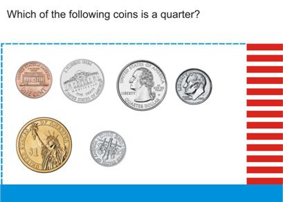
6.4.2 The print information should be transcribed in braille without interpretation. Since additional information may "give away" an answer, do not substitute numbers or symbols for words. (See Describing Money, page 6-11.)
Example: If "quarter" is shown on the coin, do not substitute the amount 25¢.
Example of Tactile Graphic Design:
Describing Money
6.4.3 When a picture of money is shown for the purpose of calculating its value, letters can be used to represent coins. Coinage should be transcribed using the letters "pn" for penny, "nk" for nickel, "dm" for dime, "qr" for quarter, "hl" for half-dollar, "ln" for loonie, and "tn" for toonie. (See Value of Coins, page 6-115.)
If readers become accustomed to a two-cell symbol, it will help them in reading other graphics with key listings. If a single letter counting symbol is used (e.g., p for penny), it may be confused with alphabetic contractions, especially to readers just learning braille contractions.
6.4.4 Numbers can be used to represent bills. Bills can be transcribed using the appropriate dollar sign and number.
Example: $1 for one dollar.
6.5.1 Number Lines (See Number Line, page 6-23; Open- and Solid-Circle Number Line, page 6-17; Supplement Example 6, Number Line.)
A number line is similar to a Cartesian graph except that there is only one dimension. Number lines are used to teach relationships between numbers; therefore, it is essential that the proportional spacing between units be preserved.
6.5.1.1 A numeric indicator is not used before a number if it occurs below the number line, whether the number is whole, fractional, decimal, or negative. A numeric indicator is used before a number above the number line. Follow these guidelines for the numeric indicator (number sign) regardless of whether the text is transcribed in literary or Nemeth (mathematics and science) code.
6.5.1.2 A number line, including markers and labels, is a spatial arrangement and must be preceded and followed by a blank line.
6.5.1.3 Include arrowheads on the number line if shown in print.
6.5.1.4 Every effort should be made to keep number line constructions (braille symbol or spurred line) consistent throughout a transcription. A mixture of braille symbols and spurred lines is permissible when necessary for clear presentation.

6.5.1.5 The number line should always start and end with an arrow or axis line rather than with a coordinate mark.
6.5.1.6 The presence of open (hollow) circles and solid (filled-in) circles is mathematically significant and should not be altered.
If part or all of a number line is bold, indicating that the number line values are included in a solution set, it is assumed that the scale marks (r) are included in the solution set, with the open and filled-in circles at the extremes indicating whether that value is included or not.
Example of Tactile Graphic Design:
Open- and Solid-Circle Number Line
6.5.1.7 If an arc or curved line illustrating a group of numbers is too short to enable the point of the arrowhead to be perpendicular to the number line, it is permissible to use a straight line with squared corners (up, across, down). The arrow would then clearly and accurately point to the intended mark or label on the number line.
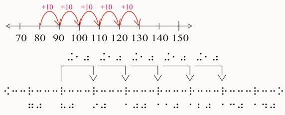
6.5.1.8 Label Placement
6.5.1.9 If there is insufficient space on a line to accommodate the exercise identifier and the entire number line, the number line should be placed on a separate line. A blank line is still required before the spatial number line.
6.5.1.10 Hierarchy for accommodating a long number line without runovers should consider:
6.5.1.11 As a last resort, a horizontal number line may be divided between braille lines. If division is required, the runover should start in cell 3 with a coordinate marker. In the instance of a negative number, the negative will start in cell 3, and the coordinate marker will start in cell 4. The coordinate markers on the runover line do not need to be aligned with the coordinate markers on the line above. A number line should not be divided between pages.
A blank line is required before any components of the runover line. (See Number Line, page 6-23.)
Example of Tactile Graphic Design:
Number Line
6.5.1.12 For kindergarten through grade 3:
(See Supplement Example 6, Number Line.)
6.5.1.13 For grades 4 and up:
(See Open- and Solid-Circle Number Line, page 6-17.)
6.5.2 Line or Dot Plots
Line plots, also called dot plots, are formed by a series of stacked symbols, usually the letter x, above a number line. These plots are used to show the frequency of data values. (See Line Plot, page 6-29.)
6.5.2.1 A line plot may not need to be prepared as a tactile graphic if it is possible to present the number line using the braille symbol representation. (See Unit 6, Mathematical and Scientific Diagrams, 6.5.1.13.)
6.5.2.2 The number line should be transcribed following the guidelines and standards in Unit 6, Mathematical and Scientific Diagrams, 6.5.1.
6.5.2.3 Follow print intention for placement of labels. Whether the name of the data set shown on a line plot is placed above or below the line plot in print, the braille label for the horizontal values must be placed below the values on the number line and should be left justified with the first cell of the first value. Since the label for the line plot is actually the label for the horizontal axis line (rather than a centered heading), this placement will be consistent with the format for the label placement for a Line Graph. (See Unit 6, Mathematical and Scientific Diagrams, 6.6.4.5.)
6.5.2.4 If it is not possible to fit all of the number line scale marks across the page using brailled number line symbols, it may be necessary to produce the number line as a tactile graphic, thus allowing for closer positioning of the scale marks. If the line plot is still not accommodated by using a tactile number line, the number line should be produced using either the brailled number line symbols or a tactile number line and should be bound as facing pages or as a fold-out page. A transcriber's note should be inserted to alert the reader to the change in format.
6.5.2.5 The symbols that are shown in print should be replaced by the full braille cell (dots 123456) and be placed one above the other as shown in the print. The full braille cells should be placed directly above the tick or scale marks. The full braille cell is used rather than the letter "x" because "stacked" x's are difficult to count.
6.5.2.6 A transcriber's note must be added to alert the reader to the change from x's to full cells.
Example of Tactile Graphic Design:
Line Plot
6.5.3 Box-and-Whisker Plots (See horizontal Box-and-whisker Plot, page 6-107; vertical Box-and-Whisker Plot, page 6-111; Supplement Example 7, Box-and-Whisker Plots with Number Line; Supplement Example 8, Box-and-Whisker Plots without Number Line.)
Box-and-whisker plots are a type of diagram or graph used to show the distribution of data.
6.5.3.1 Whenever possible, the plot should be presented horizontally or vertically, as shown in print.
6.5.3.2 The number line of the box-and-whisker plot should be transcribed following the guidelines and standards in Unit 6, Mathematical and Scientific Diagrams, 6.5.1.
6.5.3.3 The number line is the only part of this construction that can be created using braille dot formations. All data above the number line must be presented as a tactile graphic.
6.5.3.4 Keep the plot on one page if possible.
6.5.3.5 The number line and/or grid lines must be retained if shown in print.
6.5.3.6 The plot should be placed above the number line even if it is shown below the number line in print. If two plots appear below a number line in print, they should be moved above the number line on the tactile graphic. The new position of the plots should be a mirror image of the original position of the plots below the number line. (See Box-and-Whisker Plot (horizontal), page 6-107.)
6.5.3.7 All plotted dots should be uniform in size. The plotted dot should be a more significant dot (larger than a braille dot). Note the dot size on the examples.
6.5.3.8 Be consistent in placement of the labels. Labels should not be placed between the number line and the box, if possible.
6.5.3.9 If components of the box-and-whisker plot are identified with numbers, the numeric indicator (number sign) must be transcribed. Align with box plot, point symbol, or lead line.
6.5.3.10 Place labels so they clearly identify the item. In order to accommodate this, the capital sign may be omitted and explained in a transcriber's note. (See Supplement Example 7, Box-and-Whisker Plot (with Number Line).)
6.5.3.11 The bottom of the box should be no more than 1/4 inch (6 millimeters) above the number line.
6.5.3.12 The horizontal plot may be rearranged into a vertical presentation. The number line for vertical plots is brailled on the left of the page beginning in cell 1. (See Box-and-Whisker Plot (vertical), page 6-111.)
6.5.3.13 If there is not enough room to show the complete plot within the width of the 40 cells or by rearranging it into a vertical presentation, break the plot into separate lines. Indent the runover two cells to the right and begin with the next scale mark. If the runover line starts with a plus or minus value, the scale mark would still align with the first digit of its numeric label.
6.5.3.14 If there are two plots that are related and they must be shown one below the other, line up the values between the two plots, if possible.
6.6.1 Graphing Components
6.6.1.1 Grids
6.6.1.2 Lines
6.6.1.3 Labels. If space is needed, some numbers can be omitted from the vertical and horizontal axis lines (e.g., only the even numbers or only the odd numbers are shown). A transcriber's note explaining this modification is not necessary. No labels would be omitted for bars in a bar graph or histogram.
6.6.2 Cartesian Graphs
A Cartesian graph is one that shows numerical relationships by drawing points, lines, curves, or geometric shapes on the Cartesian plane. The Cartesian plane consists of two or more axes joined at a single point called the origin and possibly a grid to help index points on the graph. The axes are labeled with single letter variables, commonly x or y, and the axis lines may divide the graph into quadrants. (See Supplement Example 9, Cartesian Graph; Supplement Example 10, Shaded Cartesian Graph and Supplement Example 11, Transformation.)
6.6.2.1 Numeric indicators (number signs) should not precede the numbers on the x-axis and y-axis lines regardless of whether the text is transcribed in literary or Nemeth (mathematics and science) code.
6.6.2.2 Lines
6.6.2.3 Labels
6.6.3 Transformations
The four basic transformations are: a translation (slide), a reflection (flip), a rotation (turn), and a dilation (shrinking or enlarging). The background grid is usually shown by the use of lines or evenly-spaced dots. (See Supplement Example 11, Transformation.)
6.6.3.1 Numeric indicators (number signs) should not precede the numbers on the axis line regardless of whether the text is transcribed in literary or Nemeth (mathematics and science) code.
6.6.3.2 Grid
6.6.3.3 Lines
6.6.3.4 Labels
6.6.3.5 Plotted Figures
6.6.4 Line Graphs
“A line graph is comprised of a horizontal and vertical axis labeled with a word or word(s) (e.g.,” time” or “distance”) or a combination of a letter and word(s). For example, “time (t)” or “distance (d)” may be used. Line graphs are usually plotted in the upper right quadrant, or quadrant I. (See Supplement Example 12, Line Graph.)
6.6.4.1 If the values are numeric, use the numeric indicator (number sign) regardless of whether the text is transcribed in literary or Nemeth (mathematics and science) code.
6.6.4.2 Grid. When it is necessary to track the values of plotted points, it may be helpful to add grid lines, even if not shown in print. If grid lines are added, tick marks shown in print may be omitted.
6.6.4.3 Key
6.6.4.4 Lines
6.6.4.5 Labels
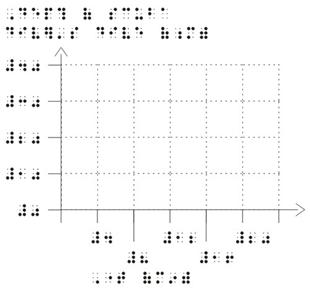
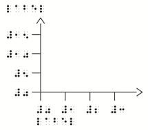
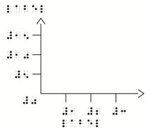
6.6.4.6 Plotted Lines
6.6.5 Scatter Plots
A graph showing a set of points, each based on a pair of data, is called a scatter plot. (See Supplement Example 13, Scatter Plot.)
6.6.5.1 If the values are numeric, use the numeric indicator (number sign) regardless of whether the text is transcribed in literary or Nemeth (mathematics and science) code.
6.6.5.2 It is essential that the exact distribution and number of dots presented in the print be replicated in the tactile version of a scatter plot.
6.6.5.3 Numerical values are usually not shown on the axis lines, but if shown, their placement should be produced as described in Line Graphs. (See Unit 6, Mathematical and Scientific Diagrams, 6.6.4.)
6.6.5.4 Grid. The purpose of scatter plots is to show correlations; therefore, there is usually no need to add grid lines.
6.6.5.5 Lines
6.6.5.6 Labels
6.6.5.7 Plotted Points
6.6.6 Bar Graphs
A bar graph is one that uses the lengths of bars to represent the quantitative relationship between horizontal and vertical values. The values on one of the axes are often numeric with the other values being descriptive. The orientation of the bars may be horizontal or vertical. (See Supplement Example 14, Bar Graph.)
6.6.6.1 The orientation of the graph should always match that of the print unless it is impossible to do so. If the orientation is changed in braille to accommodate the graph, a transcriber's note must be added explaining this change.
Example: "In print, bars are shown vertically. In braille, the bars are shown horizontally."
6.6.6.2 If the values are numeric, use the numeric indicator (number sign) regardless of whether the text is transcribed in literary or Nemeth (mathematics and science) code.
6.6.6.3 Grid. When it is necessary to be able to track the values of the bars, it would be helpful to add grid lines that are perpendicular to the bars, even if not shown in print. If grid lines are added, tick marks shown in print may be omitted.
6.6.6.4 Key
6.6.6.5 Lines
6.6.6.6 Labels
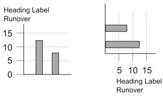
If the bars are depicted horizontally, the labels should be centered with the width of the bar or set of bars and runovers, if necessary, are left justified with the line above.
If the labels are descriptive (i.e., words) the descriptions should be left-aligned, with an appropriate number of guide dots inserted between shorter words and the vertical axis line. Leave one blank cell before inserting a minimum of three unspaced guide dots (dot 5).
EXCEPTION: When producing a bar graph using braille symbols, the runover is indented two cells to the right of the line above, as described in 6.6.6.7 below.
If the labels are numeric, align according to place value.
If the bars are depicted vertically, dots 25 of the value should be aligned with the horizontal grid line or tick mark.
If the bars are depicted vertically, the labels should be centered with the width of the bar or set of bars. If the label does not fit within the width of a bar, place alternate labels on the line below. A lead line is required from an additional row(s) of labels to the bar or set of bars to which it pertains.
If the bars are depicted horizontally, dots 456 of the first cell of the value should be aligned with the vertical grid line or tick mark. It may be necessary to stagger the horizontal values, placing the values one or two lines below the horizontal axis. A lead line from those values not directly under their corresponding grid line or tick mark will be necessary.
6.6.6.7 Bars in a Tactile Graphic
6.6.6.8 Bars Using Braille Symbols
Example: bar graph using braille symbols
6.6.7 Histograms
A histogram is a bar graph that combines data into equal intervals. (See Supplement Example 15, Histogram.)
6.6.7.1 If the values are numeric, use the numeric indicator (number sign) regardless of whether the text is transcribed in literary or Nemeth (mathematics and science) code.
6.6.7.2 The shape of the print graphic display is important and should not be distorted.
6.6.7.3 If the bars are depicted horizontally, align the value at the left edge of the bar since each bar represents a range of values on the horizontal scale.
6.6.7.4 No space must be left between adjacent bars as the data are continuous. It is not necessary to show the variance in color.
6.6.7.5 The tactile rendition of a histogram should be based on the same criteria that apply to bar graphs. (See Unit 6, Mathematical and Scientific Diagrams, 6.6.6.)
6.6.8 Graphing Calculators
6.6.8.1 Calculator keys should not be reproduced as a tactile graphic. Keys that are represented as shapes with interior print signs should be brailled following The Nemeth Braille Code for Mathematics and Science Notation, 1972 Revision: Braille Indicators; Shape Indicators.
6.6.8.2 Graphing calculator screens may show many graphs that should be reproduced.
6.6.8.3 When print shows the graphic displays such as geometric shapes or plotted graphs that are generated by graphic calculators or computer screens, a tactile graphic representation must be provided in braille. When the displayed information on the screen shows only data or tables, no tactile graphic is required.
6.6.8.4 When the screen display uses an “x” to show a plotted point, the tactile graphic should use a solid dot.
6.6.8.5 The x-axis and y-axes should be clearly shown in the tactile graphic, even if obscured in the digital display.
6.6.8.6 On the screen display in print, the labels for the vertical and horizontal axes are placed differently depending on the software used. In the tactile graphic, these labels should always be placed as indicated in Unit 6, Mathematical and Scientific Diagrams, 6.6.
6.6.8.7 When both “Pencil and Paper” and electronic graphs are shown, a border indicating the electronic screen may be placed around the digital display to differentiate between the two types of graphs.
|
Pictographs represent numeric data through use of pictures and/or partial pictures.
6.7.1 If the values are numeric, use the numeric indicator (number sign) regardless of whether the text is transcribed in literary or Nemeth (mathematics and science) code.
6.7.2 The explanation for a pictograph tells the number that each picture represents and is often placed below the graph in print. Move the explanation above the graph. Begin in cell 1 and use the wording shown in print.
6.7.3 The print information should be transcribed in braille without interpretation because additional information may "give away" an answer.
6.7.4 A frame may surround the data in the print graph.
If the tactile graphic is produced as embossed braille, the top line is represented by a top box line (dots 2356), and the bottom line is represented by a bottom box line (dots 1245). (See Average Life Span Pictograph, page 6-55.)
If the pictograph is produced as a tactile graphic, the frame is not included.
6.7.5 The row heading must begin in cell 1 with runovers in cell 3. Determine where the longest row heading ends. Space over one cell width and begin the pictures or symbols for all braille lines in the cell that vertically aligns with this one.
6.7.6 Guide dots may be inserted at the end of a row heading. Leave one blank cell before inserting a minimum of three unspaced guide dot symbols (dot 5).
6.7.7 One blank cell must be left between each picture or symbol.
6.7.8 When representing a partial picture, maintain the orientation and proportion of the picture.
6.7.9 For kindergarten through grade 3, pictographs must be produced as a tactile graphic. (See Unit 11, Graphics for Early Grades; Supplement Example 16, Dinosaur Pictograph.)
6.7.9.1 In braille, when it is not practical to produce the picture used in print, simple geometric shapes should be substituted. Center symbols horizontally with row heading.
6.7.9.2 The symbols should be horizontally centered with the row heading.
6.7.9.3 When print tells the number that each picture represents, it should be provided in braille beginning in cell 1 with runovers in cell 3. Transcriber's note symbols are not required.
If the picture used in print is referred to in surrounding text and there is no explanation provided in print, insert a description enclosed in transcriber's note symbols starting in cell 7 with runovers in cell 5.
6.7.10 For grades 4 and up:
6.7.10.1 Simple pictographs may be embossed in braille rather than shown as a tactile graphic. (See Average Life Span Pictograph, page 6-55.)
6.7.10.2 Embossed braille pictographs can only be used when whole or half units are being represented.
6.7.10.3 When print tells the number that each picture represents, it should be provided in braille beginning in cell 1 with runovers in cell 3. Transcriber's note symbols are not required.
If the picture used in print is referred to in surrounding text and there is no explanation provided in print, insert a description enclosed in transcriber's note symbols starting in cell 7 with runovers in cell 5.
6.7.10.4 Each whole unit should be represented by full braille cells. Each half unit should be represented by dots 123.
6.7.10.5 When partial units are shown, a tactile graphic must be produced. The exception is when 1/2 a unit is shown. If only whole and half units are shown with an explanation given for only the whole units, it is not the responsibility of the transcriber to indicate the value of the half unit. It is the responsibility of the reader to determine the value of half of a whole unit. (See Average Life Span Pictograph, page 6-55.)
Example of Tactile Graphic Design:
Average Life Span Pictograph
6.8.1 Pictures to be counted.
In early elementary grade texts, counting objects are often shown as detailed pictures (e.g., butterflies, flowers, cars).
Ideally, tactile shapes to be counted must be grouped just as they are grouped in print, with 1/4 inch (6 millimeters) between individual shapes and 3/4 inch (2 centimeters) between groups of shapes.
Manipulatives are used for introducing counting concepts.
6.8.1.1 For kindergarten through grade 3:
Example of Tactile Graphic Design:
Counting Symbols
6.8.1.2 For grades 4 and up:
If the surrounding text or questions refer to the actual print object, a note explaining the substitution is required.
6.8.2 Counting Groups of 1s, 10s, 100s (See Blocks of One Hundred, page 6-67; Supplement Example 17, Place Value with Hundreds.)
In early elementary grade texts, numeric place values are often shown as individual items to represent ones or items grouped together to represent tens or hundreds. In print, these place values are shown as pictures of blocks, stacks, bundles, or boxes. Manipulatives are available for introducing this concept.
6.8.2.1 For kindergarten through grade 3:
Sample transcriber’s note: "In braille, the counting blocks for this question are divided over three pages."
Example of Tactile Graphic Design:
Blocks of One Hundred
6.8.2.2 For grades 4 and up:
6.8.3 Decimal and Fractional Representations
In early elementary grade texts, concepts of decimal notation are shown as grids of 100 individual squares or 10 strips of 10, with various amounts of shading. (See Supplement Example 18, Shading of Tenths Strips.)
6.8.3.1 Grids should be shown as a tactile graphic. Grids must be grouped just as they are grouped in print, with 1/4 inch (6 millimeters) between individual grids.
6.8.3.2 Squares should be no smaller than 3/8 inch (1 centimeter) on a side. A single raised dot (larger than a braille dot) can be used to show the shading in a square representing one unit.
6.8.3.3 Strips of 10 should be no smaller than 3/8 inch (1 centimeter) wide. A suitable area texture such as fine dots that are smaller than braille dots can be used to show the shading in strips of 10 or more units. There should be enough blank space around the shading so that the reader can still identify each individual square in the strip of ten.
6.8.3.4 If a sign of operation or comparison is shown (e.g., +, -, or =), these signs should be placed so that the dot 1 or dot 4 is aligned with the top of the grid and on the top row if more than one row of grids is depicted. A minus sign would be lower than the top of the shape, using a full cell as a reference. Where space permits, one blank cell must be left before and after a sign of operation or comparison.
6.8.3.5 A blank line must precede and follow this spatial arrangement.
6.8.3.6 If there is an exercise identifier, the picture objects may start on the same line.
6.8.3.7 For problems involving whole numbers and decimals (e.g., 2.8), it may be necessary to use more than one braille page to depict the tactile graphic. A transcriber's note should be inserted before the start of the tactile graphic, telling the reader how many pages the tactile graphic involves.
Example: "In braille, the counting blocks for this question are divided over three pages."
A thermometer is a piece of equipment that measures temperature. (See Thermometer, page 6-73.)
6.9.1 The numeric indicator (number sign) is not used on values, even values with a minus sign, regardless of whether the text is transcribed in literary or Nemeth (mathematics and science) code.
6.9.2 In print, the degree symbol may be shown with each of the values. In braille, the degree symbol may be shown as a heading instead, above the list of values. Alternatively, the degree symbol may be omitted altogether and a transcriber's note inserted stating that in print the numbers are shown as degrees.
6.9.3 Thermometers usually show the temperature markings too close to be able to make accurate readings tactually. It is permissible to enlarge the thermometer in order to show small increments of measurement. It is not necessary to include the entire span of the thermometer.
6.9.4 If the print shows a frame surrounding the thermometer, it should be omitted in the tactile version.
6.9.5 The thermometer tube should be a minimum of 3/8 inch (1 centimeter) wide.
6.9.6 Place the tick marks on the left, outside of the tube, regardless of print placement. Any other labels should be placed on the right, outside the thermometer.
6.9.7 If print shows the scale increments on both sides of the thermometer tube, simplify by showing tick marks on only one side. If print shows two different temperature scales (Celsius and Fahrenheit), place them on either side of the tube.
6.9.8 When it is required to discern temperatures to the nearest 1 or 2 degrees, place the tick marks no closer than 1/8 inch (3 millimeters) apart. The tick marks representing major increments (10 or 5 degrees) should be longer than those representing smaller increments. Reduce the number of labels to show only the major increments.
6.9.9 There should be 1/8 inch (3 millimeters) between the labeled values and the major tick marks. Dots 25 of the values should be aligned with the tick marks.
6.9.10 Values on the left side of the thermometer should be right aligned. Values on the right side of the thermometer should be left aligned.
Example of Tactile Graphic Design:
Thermometer
Actual braille rulers and protractors with raised marks do not register small values. Rulers can provide an accurate measurement to within 1/4 inch (6 millimeters). Protractors can provide an accurate angle measurement to within 5 degrees.
Numeric indicators (number signs) are not shown with numbers on actual braille rulers or protractors regardless of whether the text is transcribed in literary or Nemeth (mathematics and science) code.
6.10.1 Tactile graphics representing rulers and protractors should not use the numeric indicator.
6.10.2 Be aware that minimal increases in size will occur when a tactile graphic master is either vacuum formed or developed using microcapsule paper.
6.10.3 When accurate measurements are required, the graphic must be of sufficient size and line strength that braille measuring tools (i.e., actual braille ruler or protractor) can be used to accomplish the measuring task. The object to be measured must be longer than 1/4 inch (6 millimeters) or have an angle greater than 5 degrees.
6.10.4 Proportions must be accurately reproduced in the tactile graphic.
6.10.5 When a print graphic uses a measurement line to indicate the length of a line, the measurement line need not be shown if it is possible to label the line with its appropriate units within 1/4 inch (6 millimeters) of the line being measured. (See Example 21, 3-Dimensional Rooftop.)
When it is not possible to place the measurement label within 1/4 inch (6 millimeters), or when the length of a line is broken into partial measurements, the measurement line should be retained in the tactile graphic. If a print measurement line contains perpendicular lines (endpoint lines) showing the extent of the measure as well as arrowheads, the arrowheads should be omitted. The measurement line should be extended to meet the endpoint lines. The total length of the endpoint lines should be no less than 3/8 inch (1 centimeter) and no more than 1/2 inch (1.25 centimeters). When an angle shows a measurement by means of an arc with an arrowhead, the arrowhead should be omitted. The diagram is read more easily if the kind of line used to show measurement is different from the kind of line that is used for the structure (e.g., dashed versus solid).
6.10.6 Objects to be measured using an actual braille ruler (See Supplement Example 19, Measuring.)
6.10.6.1 An object to be measured must not be altered unless it cannot be accurately measured using an actual braille ruler.
6.10.6.2 The object to be measured should be raised sufficiently to allow alignment with an actual braille ruler—at least 1/32 inch (1 millimeter). One inch (2.5 centimeters) should be left on both sides of a line or on all sides of an object to be measured to allow for the placement of an actual braille ruler.
6.10.6.3 When the object to be measured is less than 1/4 inch (6 millimeters) it should be enlarged in whole number increments rather than fractional increments. The whole number increments allow for easier conversion of measurements for the reader. A transcriber's note must explain the exact proportion of change.
Sample transcriber’s note: In braille, the print image has been enlarged to three times the actual size.
6.10.6.4 If raised dots or points are used at the endpoints of lines, these dots or points should be minimal in size so as not to alter the reading of the line measurement.
6.10.7 Angles to be measured using an actual braille protractor
6.10.7.1 The rays of an angle to be measured with a braille protractor must be at least three inches (7.5 centimeters) in length.
6.10.7.2 The rays of an angle to be measured should be raised at least 1/32 inch (1 millimeter) to allow alignment with an actual braille protractor.
6.10.7.3 One inch (2.5 centimeters) should be left on both sides of the angle to be measured to allow for the placement of a braille protractor.
6.10.8 Objects to be measured using a drawing of a braille ruler
When the concept of measurement is first being taught, a diagram of a ruler is often shown below an object to be measured.
6.10.8.1 It is permissible to enlarge the ruler and object proportionately in order to show small increments of measurement—for example 1/32 inch (1 millimeter) or 1/8 inch (3 millimeters). A transcriber's note must explain any enlargement.
6.10.8.2 The tick marks denoting whole standard or metric increments must be longer than those for the fractional increment tick marks.
6.10.8.3 Dots 123 of the first digit of the number should align with the tick mark and be placed 1/8 inch (3 millimeters) from the tick mark.
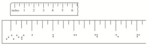
6.10.9 Angles to be measured using a drawing of a braille protractor (See Supplement Example 20a, Protractor; Supplement Example 20b, Angle to be Measured.)
When the concept of measurement is first being taught, a diagram of a protractor is often shown with an angle to be measured.
6.10.9.1 It is permissible to enlarge the diagram of the protractor and angle proportionately in order to show small increments of degrees.
6.10.9.2 The tick marks denoting major degree marks must be longer than those for the minor degree marks. (See Unit 6, Mathematical and Scientific Diagrams, Clocks 6.1.1.4.)
6.10.9.3 The numbers on the protractor should be placed both inside and outside the circle as space allows, with either the beginning or the end of the label 1/8 inch (3 millimeters) to 1/4 inch (6 millimeters) from the tick mark.
The vertical and horizontal aspect of the print graphic should be maintained in the tactile graphic. The tactile graphic needs to be large enough for the reader to interpret the details. Lead lines should be avoided when possible. Labels can be keyed if space is limited.
When a print graphic uses a measurement line to indicate the length of a line, the measurement line need not be shown if it is possible to label the line with its appropriate units within 1/4 inch (6 millimeters) of the line being measured. (See Example 21, 3-Dimensional Rooftop.)
When it is not possible to place the measurement label within 1/4 inch (6 millimeters) or when the length of a line is broken into partial measurements, the measurement line should be retained in the tactile graphic. If a print measurement line contains perpendicular lines (endpoint lines) showing the extent of the measure as well as arrowheads, the arrowheads should be omitted. The measurement line should be extended to meet the endpoint lines. The total length of the endpoint lines should be no less than 3/8 inch (1 centimeter) and no more than 1/2 inch (1.25 centimeters). When an angle shows a measurement by means of an arc with an arrowhead, the arrowhead should be omitted. The diagram is read more easily if the kind of line used to show measurement is different from the kind of line used for the structure (e.g., dashed versus solid).
6.11.1 Simple Geometric Shapes. (Two-dimensional)
6.11.1.1 A distinct line texture should be used to separate a shape from surrounding material.
6.11.1.2 Simple shapes should be shown as solid (filled) objects.
6.11.1.3 If enlarging, the print proportion must be retained.
6.11.1.4 Plotted points on lines or objects need to be distinct from the lines or objects on which they are placed. It is especially important for microcapsule and computer-embossed graphics to use a 1/8 inch (3 millimeters) blank space all around a point to separate it from the surrounding material. The point should not be smaller than 1/8 inch (3 millimeters) in diameter. (See Angles on Survey Map, page 6-81.)
6.11.1.5 Labels should be placed outside the shape if possible and 1/8 inch (3 millimeters) away from the shape or point symbol.
6.11.1.6 Labels that are lengthy may be keyed to conserve space.
6.11.1.7 In print, the degree symbol may be shown with each angle value; in braille, the degree symbol may be omitted altogether and a transcriber's note inserted stating that in print the angles are shown in degrees.
Example of Tactile Graphic Design:
Angles on Survey Map
6.11.2 Complex Geometric Shapes (Three-dimensional)
Tactile three-dimensional drawings are among the most difficult for the reader to interpret. It is permissible to insert a transcriber's note explaining the technique used to present three-dimensional objects such as cubes and cones.
Sample transcriber’s note: "In these three-dimensional diagrams, the 'hidden lines' are shown as broken lines."
6.11.2.1 There must be a tactile distinction between the visible lines and the lines that are "hidden."
6.11.2.2 If enlarging, the print proportion must be retained.
6.11.2.3 Lines that are "hidden" should be easily discriminable, but not as prominent as the visible lines.
6.11.2.4 Solid lines should be used to represent visible lines.
6.11.2.5 Broken lines (dashed or dotted) should be used to represent lines that are "hidden."
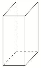
6.11.2.6 Shading should be used sparingly and only if required for the understanding of the concept.
6.11.2.7 Many three-dimensional figures can be simplified to two-dimensional figures. (See Supplement Example 21, 3-Dimensional Rooftop.)
6.11.3 Nets (See Nets, page 6-87.)
A net is a pattern that can be cut out and folded into a three-dimensional figure.
6.11.3.1 If enlarging, the print proportion must be retained.
6.11.3.2 Solid lines should be used to represent the outside edges.
6.11.3.3 Folding lines should be tactually distinct from outside lines. Broken lines (dashed or dotted) should be used to represent lines to be folded.
6.11.3.4 If the print graphic shows tab areas for gluing, they should be areas of texture on the tactile graphic.
6.11.3.5 There are manipulatives available for introducing this concept.
Example of Tactile Graphic Design:
Nets
A Venn diagram is made up of two or more overlapping circles, often used to show relationships between groups of items sharing common properties. Sometimes a rectangle called the Universal set is drawn around the Venn diagram to represent all possible elements. (See Supplement Example 34, Venn Diagram.)
6.12.1 If the values are numeric, use the numeric indicator (number sign) regardless of whether the text is transcribed in literary or Nemeth (mathematics and science) code.
6.12.2 If the rectangle is shown in print, it must be included in the tactile graphic and labeled as in print.
6.12.3 It is helpful to differentiate between each circle by having line textures that are tactually distinct from one another. Each one of the original circles retains its own texture when overlapping occurs.
6.12.4 Labels must be centered within the overlapping circles, as shown in print. If labels do not fit, use an alphabetic key rather than using lead lines or texture symbols.
A tessellation is an arrangement of shapes that forms a repeating pattern. The shapes fit together with no gaps or overlaps. (See Tessellation: Polygons, page 6-91; Supplement Example 22, Tessellation: Lizard.)
There are manipulatives available for introducing this concept.
6.13.1 Complex patterns should be simplified and enlarged. Show only enough to demonstrate how the shapes adjoin and form a repeating pattern.
6.13.2 The shapes should not make a raised edge by overlapping each other, but should align to form one shared edge or one outline.
Example of Tactile Graphic Design:
Tessellation: Polygons
A stem-and-leaf plot is a method of showing data distribution. It is a specialized table that is brailled in Nemeth notation using the rules of stem-and-leaf plots in the BANA Braille Codes Update 2007 for The Nemeth Braille Code for Mathematics and Science Notation, 1972 Revision.
A stem-and-leaf plot should not be produced as a tactile graphic. (See Stem-and-Leaf Plot, page 6-95.)
Example of Tactile Design:
Stem-and-Leaf Plot
An orthographic drawing communicates the shape and size of a three-dimensional object through a series of related two-dimensional views (See Supplement Example 23a, Orthographic View: Mat Plan; Supplement Example 23b, Orthographic View: Layering Method.)
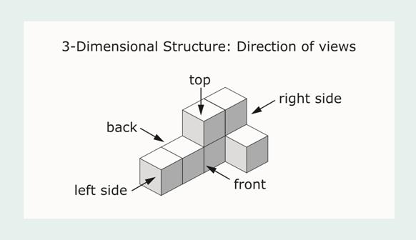
6.15.1 Orthographic drawings are very difficult to interpret by touch. The preferred way for a reader to interpret orthographic drawings is by using manipulatives (stacked or linking blocks).
6.15.2 A three-dimensional cube structure should not be reproduced in tactile graphic form as shown in print.
6.15.3 An orthographic drawing may be shown as a tactile graphic by using either the Mat Plan or the Layering Method. The Mat Plan is not able to show a block missing underneath a suspended block.
6.15.4 Include a note to explain the format used for orthographic views on the Transcriber's Notes page and/or before the first occurrence.
Sample transcriber’s note: "In braille, cubes may be presented from a top view in either column or layer form. When a solid structure is shown in print, only a base layer will be shown, with a number designating the total cubes stacked in each column. When the print structure is shown with one or more cubes missing (below an upper level), each layer will be shown in order from bottom to top. The shaded area represents the position of a cube."
6.15.5 Mat Plan (See Supplement Example 23a, Orthographic View: Mat Plan.)
6.15.5.1 Insert a transcriber's note explaining the Mat Plan format.
Sample transcriber’s note: "cubes stacked in columns"
6.15.5.2 Draw squares showing the base layer of the orthographic drawing. In each square, braille the number of cubes that make up that column.
6.15.5.3 Label the Mat Plan with "front," "back," "left," and "right."
6.15.6 Layering Method (See Supplement Example 23b, Orthographic View: Layering Method.)
6.15.6.1 Insert a transcriber's note stating the number of layers in the cube structure.
Sample transcriber’s note: "cubes in two layers"
6.15.6.2 Draw an area grid of each layer, texturing each square that contains a block.
6.15.6.3 Number each layer (e.g., Layer 1, bottom; Layer 2; Layer 3, top").
6.15.6.4 Label each layer with "front," "back," "left," and "right."
Ancient numeration systems refer to writings in Egyptian, Mayan, Babylonian, Hebrew, Ancient Chinese, etc. Refer to Addendum 1 to The Nemeth Braille Code for Mathematics and Science Notation, 1972 Revision: Ancient Numeration Systems.
Ancient numeration systems would not be produced as a tactile graphic.
The Braille Code for Chemistry Notation, 1997 is based on The Nemeth Braille Code for Mathematics and Science Notation, 1972 Revision. Specific provisions using braille symbols for the construction of chemical notation such as bonds, electron dots, ring structures, and arrows, are outlined in the Braille Code for Chemistry Notation, 1997. When transcribing chemistry, biology, and physics texts, refer to these codes for proper formation of chemical symbols and structures.
If tactile illustrations are necessary, these guidelines and standards must be followed in preparing such tactile graphics.
6.17.1 When it is necessary to show lead lines, directional arrows, horizontal braces { } and/or brackets [ ] extending through bonds, they must be shown in tactile form. The embossed symbols for arrows must not be used.
6.17.1.1 When arrows show direction and/or lead from and to operation arrows, show displacement or substitution reactions, and are in an electron configuration (orbitals), a tactile line with an arrowhead must be used.
6.17.1.2 When arrows represent lead lines, a tactile line without an arrowhead must be used.
6.17.1.3 When a brace is used to join a portion of a molecule to its label, a tactile brace must be used.
6.17.1.4 When a bracket extends through bonds, a tactile bracket must be used.
Example: The bracketed line will be drawn as a textured line.
—from Braille Code for Chemical Notation 1997
6.17.2 Care must be taken to place labels so they do not interfere with the actual structure and yet make it clear which portion of the structure is being labeled. (See Calvin Cycle, page 6-103.)
When labels apply to only some molecules or to a portion of a molecule, align the label with the molecule or the portion being labeled. The label has to be aligned above the labeled molecule with a tactile lead line added for orientation. (See Supplement Example 24, Phase Diagram.)
Example of Tactile Graphic Design:
Calvin Cycle
Example of Tactile Graphic Design:
Box-and-Whisker Plot (Horizontal)
Example of Tactile Graphic Design:
Box-and-Whisker Plot (Vertical)
Example of Tactile Graphic Design:
Value of Coins
Complex diagrams, in these guidelines and standards, refer to tactile graphics that require special treatment before they can be readily understood by the reader. While there are diagrams that are too complex to render in a tactile form, there are others that may be useful only if a simplified tactile version is made, thus giving the reader a sense of what is being shown in print.
How does one decide whether a diagram is too complex to do as a tactile graphic? The tactile graphics designer should consider the thought processes explained in the guidelines and standards in Unit 1, Criteria for Including a Tactile Graphic, 1.8 Decision Tree.
7.1.1 A diagram must be simplified when
7.1.1.1 there are too many specified areas—shaded or colored— to represent tactually. More than five textures make tactile graphic diagrams hard to understand and discourage the reader from exploring the display.
7.1.1.2 there are too many line styles—more than five— that lead to confusion, especially if the reader is required to trace direction.
7.1.1.3 there are too many labels required. While very useful for identifying parts, braille labels can overload the illustration and obscure the shapes and parts of a diagram.
7.1.1.4 there is too much explanation required to be understood. Diagrams should simplify concepts, not complicate them.
7.1.1.5 the print shows three-dimensional information. As with perspective, this concept cannot easily be shown on a tactile graphic without showing more than one view.
7.1.1.6 there is any type of network or array where the information is spread over a large area. This arrangement may make the tactual exploration of the diagram more difficult.
Before creating a complex diagram, the designer should:
7.2.1 Determine the main purpose of the diagram.
If the tactile graphics designer does not fully understand what the diagram is showing, accidental omission of crucial information may result. Necessary modifications and simplification will be hard to implement if the purpose of the original print graphic is not understood.
It is advisable to seek assistance from experts in a particular field if diagrams are too complex to understand.
7.2.2 Determine if the diagram is an essential part of the surrounding text.
If a diagram appears to be too complex to render tactually, it may be better to produce a simplified version rather than omit it completely. The reader will benefit from the spatial layout even if it is simplified. Transcriber's notes should be used in conjunction with, rather than in place of, some complex diagrams. Supplement Example 25a, Gastrointestinal Tract and Supplement Example 25b, Gastrointestinal Tract, show how a simplified tactile graphic with an accompanying transcriber's note can be used to represent a complex diagram.
7.2.3 Determine if the original print illustration serves as a visual decoration or provides substantive information needed to understand or appreciate the text.
Color in a complex diagram may have contextual significance, but it may be unnecessary to produce it tactually. For example, in a light spectrum diagram, the knowledge of the placement of color is significant in understanding the concept being taught. (See Supplement Example 28, Light Spectrum.) The color names are inserted beside the pertinent wavelength rather than provided as a texture.
7.2.4 Determine if the reader is required to retrieve data or make specific observations from the print illustration that would otherwise be revealed when attempting to describe the diagram.
In many situations the reader is asked to extract information from a graphic. For example, the reader may be asked to name the provincial park northwest of Toronto, or to estimate the size of an object based on the given scale. This type of diagram should not be described, but be produced as a tactile graphic.
7.2.5 Determine if the print graphic is required in a testing situation.
Examination material cannot be modified without the consent of the examining body or authority. Any tactile enhancement should not conflict with what is being tested. Examiners often include "distractors" in a test question or graphic. These features cannot be omitted or altered without the consent of the examiner.
Tactile graphics designers may use some of the following techniques or design layouts when considering the best way to present the tactile display:
7.3.1 Simplification (See Unit 3, Planning and Editing, 3.6.)
7.3.2 Elimination (See Unit 3, Planning and Editing, 3.7.)
7.3.3 Consolidation and Distortion (See Unit 3, Planning and Editing, 3.8.)
7.3.4 Separation (See Unit 3, Planning and Editing, 3.9.)
7.3.5 Consider whether to use textures when 2- or 3-cell keys or labels do not fully convey where spatial information is located.
7.3.6 Consider whether full labels are better than 2-cell or 3-cell key abbreviations. Labels reduce the need to move back and forth between keyed symbols and the diagram. Where there may not be enough room for full labels, the use of 2- or 3-cell keys enables the designer to place more identifiers on the diagram. (See Unit 5, Braille Formats for Tactile Graphics, 5.10.2.)
7.3.7 Retain features that could be used as a point of reference even though they may not be labeled in print.
Example for 7.3.7: The Great Lakes on a map of North America or the equator on a world map.
7.3.8 Consider placing lengthy information in the key listing rather than attempting to write transcriber's notes to explain the situation.
Example: Including a capital of a state or province in the key.
7.3.9 Choose alphabetic keys over numeric keys as they give the reader a better sense of what the label represents. Two-cell or three-cell keys usually start with the first letter of the word, which may help the reader identify the keyed information. Numeric keys may be better when they stand for information that is sequential or part of a process.
EXCEPTION: ISO abbreviations are used for countries, provinces, and states. (See Appendix C: Standard Key for Maps.)
7.3.10 When possible, key pages should be placed on facing pages so that the reader can easily decode the tactile information without having to turn pages.
7.3.11 When there are more than five area textures or five line textures or five point symbols, the diagram may have to be separated into sections. (See Unit 3, Planning and Editing, 3.9.)
7.3.12 Some concepts are better understood when separate 3-dimensional models or manipulatives are used in combination with 2-dimensional tactile images.
7.3.13 It is recommended that information presented in the form of graphic organizers such as pie charts, bar graphs, webs, network tree, Venn diagrams, cycle maps, be produced as tactile graphics rather than be converted into lists because the reader is required to compare related parts. If presented as a list, rather than a spatial display, comparison is difficult. (See Calvin Cycle, page 6-103.)
7.3.14 It is important to render the simple illustrations as well as the complex ones because readers will be able to interpret the complex graphic much more efficiently if they are able to explore the simple ones first.
In order to avoid dividing a tactile diagram between two or more pages, it may be necessary to modify the format or placement of the elements of the tactile graphic. Modifications and their order of preference are shown below.
7.4.1 Move some information to previous page.
Example: Caption or transcriber's note.
7.4.2 Delete one or more labels by writing a description in a transcriber's note.
7.4.3 Delete the repeated heading on the diagram page.
7.4.4 Make graphic smaller, if practical.
7.4.5 Delete blank line between "Key:" and the key listing.
7.4.6 Put the key listing into column form.
7.4.7 Reduce the space between the text and the graphic.
7.4.8 Delete running head unless required by production agency.
Biology illustrations tend to be very complex and often 3-dimensional. Learning kits and models for biology are available. A number of techniques may be used to create an understandable graphic. (See Parts of Flower, page 3-9; Supplement Example 26, Cross-section of Skin; Supplement Example 27, Bones; and Supplement Example 25a, Gastrointestinal Tract and Supplement Example 25b, Gastrointestinal Tract.)
The next several pages show examples of a step-by-step process that one might follow to produce a tactile graphic.
Step-by-Step Process
|
Step-by-Step Process
|
(See Southwest Asia, page 3-33; U.S.A., page 3-39; Supplement Example 29, North America; Supplement Example 30, Australia: Average Annual Rainfall.)
7.6.1 Water. Distinguishing land from water makes these areas more recognizable to the reader. If water is shown in print, a subtle background texture may be used, and the texture should be consistent.
7.6.2 Scale. A scale on a map gives an indication of the relationship between the distances on the map and the corresponding actual distances. When measuring distance is required and a braille map is enlarged to allow for ease of measurement, it is essential that the scale be enlarged to the same degree as the map. For example, if a braille map is enlarged to twice its original size, the scale must also be enlarged to the same size. (See U.S.A., page 3-39.)
7.6.2.1 If it is not necessary to measure distance, the scale may be omitted.
7.6.2.2 If there is not enough room for the scale on the map page, the scale may be placed at the end of the key (left-hand page). When tactile graphics have more than one key page (right-hand pages), the scale may be placed before the beginning of the key.
7.6.3 Compass. In print, compass styles and placement vary. The decision whether or not to include the compass in braille depends on the concept being taught.
7.6.3.1 If the print refers to direction within a map or if the compass concept is being taught, the compass must be included on the braille map.
7.6.3.2 The direction of the compass rose arrows should always coincide with the lines of longitude and latitude of the map.
7.6.3.3 If direction is not referred to in the map or surrounding information and the top of the map is assumed to be north, it is not necessary to include the compass rose. Insert a statement, either before the graphic or on the Transcriber's Notes page, explaining this convention.
Sample transcriber’s note for 7.6.3.3: ″Unless otherwise instructed, the top of the page is always considered north.″
7.6.3.4 If the compass rose is included, it needs to be simplified and placed consistently in the top left corner of the page.
7.6.3.5 When labeling compass directions, the letter sign is not required with a single uppercase letter.
7.6.3.6 For kindergarten through grade 3, simplify the compass to show only the four principal directions when teaching map concepts.
7.6.3.7 When the orientation of north has been changed from the top of the page on a print map, a simple north arrow (labeled N) must be kept as a point of reference.
Step-by-Step Process
|
Organizational charts, schematic drawings, and flowcharts are graphic representations of the steps of procedures, hierarchical rank, or interrelationships.
Examples: web (see Supplement Example 31, Story Web), network tree (see Supplement Example 33, Organizational Chart), cycle map (see Supplement Example 32, Persuasion Map).
7.7.1 Organizational Charts
An organizational chart is a diagram of the structure or personnel of an organization in which parts or functions are represented by connecting blocks to show hierarchical rank or interrelationships.
7.7.1.1 Every attempt must be made to place an organizational chart on one tactile page. If this is not possible, a fold-out page, which is preferable, or facing pages can be used. (See Appendix D, Production and Duplication Methods.)
7.7.1.2 The hierarchy or order of placement of boxed information should not be altered on the tactile graphic.
7.7.1.3 An alphabetic or numeric key may be required to fit a complex chart on one page. (See Supplement Example 33, Organizational Chart.)
7.7.1.4 The connecting lines should be a different texture than the lines representing the blocks. No blank space required between connecting lines and boxes or circles.
7.7.1.5 Labels for organizational charts are placed inside the boxes or circles.
7.7.2 Schematic Drawings
A schematic drawing explains how something works; that is, it shows the relation between the parts.
Example: the wiring of an electrical system.
7.7.2.1 Schematic drawings should be prepared as a tactile graphic, simplifying and keying where necessary.
7.7.2.2 Standard symbols for devices are used in print. All symbols for specific devices used on the tactile graphic must be tactually recognizable and remain consistent within a drawing or set of drawings.
7.7.2.3 Lines that cross each other but do not connect must clearly be shown tactually by using different textures. (See Bus Routes, page 7-25.)
7.7.3 Graphic Organizers
7.7.3.1 Graphic Organizers are tools that facilitate the visualization of concepts, relationships, and facts. They aid readers in organizing, interpreting, and understanding their learning. Graphic organizers are used to structure writing projects, to help in problem solving, decision making, studying, planning research, and brainstorming. They may be called mind maps, concept webs, sequence maps, concept maps, time lines, Venn diagrams, reasoning tools (cause and effect), comparison and contrast charts, graphic maps, or story webs. The use of graphic organizers as an instructional tool is found in all subject areas at all grade levels.
7.7.3.2 Although this structure is primarily a visual tool, the braille reader will need a tactile graphic of the image to participate in discussions and complete assignments. Minor modifications can be made to the shape and arrangement, such as changing circles to ovals. Care must be taken to prevent distortion and altered meaning or to change the way the student will use the graphic organizer. Most likely the student will use another method to complete his or her work, but needs a tactile version of the original shape and arrangement of the print graphic to aid in the thought process.
7.7.3.3 No blank space is required between connecting lines and boxes or circles. If arrows are used to connect items, there is 1/8 inch (3 millimeters) between the arrowhead and the box or circle.
7.7.3.4 Labels for graphic organizers are placed inside the boxes or circles.
7.7.4 Flowcharts
By using connecting arrows or lines and different shapes, flowcharts show how steps in a process fit together. An elongated circle may signify the start or end of a process, rectangles may show instructions or actions, and diamonds may show decisions that must be made.
Such diagrams must be transcribed in accordance with Braille Formats: Principles of Print to Braille Transcription, 1997, and/or the Computer Braille Code Supplement, Flowchart Design for Applicable Braille Codes.
7.7.4.1 The author or publisher may make the flowchart horizontal, vertical, or a mixture of both in order to fit it on the print page. The arrangement of the boxes is not significant. Only the direction of flow is important. Therefore, the tactile graphic need not conform exactly to print, but the boxes must appear in the same sequence.
7.7.4.2 A tactile graphic of the print flowchart structure should precede the transcription of the text. If numbers are assigned to the print shapes, they may be used in the key. If numbers are not assigned to the print shapes, the shapes should be labeled with transcriber-assigned alphabetic or numeric key symbols, whichever would make the flow more understandable to the reader.
7.7.4.3 If an author's comments/explanations appear parallel to or adjacent to the flowchart, the tactile graphic must be inserted at the place in the text where this discussion occurs.
7.7.4.4 Any special shapes for which symbols have to be devised should be shown as tactile graphics.
7.7.4.5 For grades 1 through 4:
7.7.4.6 For grades 5 through 8:
7.7.4.7 For flowcharts in material for texts beyond grade 8, follow the guidelines in the Computer Braille Code Supplement, Flowchart Design for Applicable Braille Codes.
Example of Tactile Graphic Design:
Bus Routes
This section provides a brief overview of guidelines for the design of tactile maps that are used in Orientation and Mobility (O&M) training and to assist blind and visually impaired travelers. Some design principles outlined in earlier sections also apply to these maps. A more thorough discussion is available in the following references, which are standard in the field of O&M:
Bentzen, B.L. and Marston, J. (2010). “Making and using orientation aids for orientation and mobility” (Volume 2, Chapter 11 in Weiner, W. R., Welsh, R. L., & Blasch, B.B. Editors. Foundations of Orientation and Mobility (3rd edition). New York: AFB Press.
Edman, P.K. (1992). Tactile Graphics. New York: AFB Press
Fazzi, D. L., Petersmeyer, B. A. (2001). Imagining the Possibilities: Creative Approaches to Orientation and Mobility Instruction for Persons Who Are Visually Impaired. New York: AFB Press.
Producers of tactile maps for orientation and mobility (O&M) purposes should have an understanding of how people who are blind travel and how the use of landmarks and information points are key to establishing and maintaining orientation. Orientation and Mobility maps can either be made for general usage or tailored to an individual’s needs. In all cases, they should be very specific to the environment being mapped.
Maps for O&M must be designed in cooperation with an O&M specialist who works with the end user of a person-specific map or an O&M specialist who knows the area being mapped for general usage. Production of the maps can be completed by someone else, in consultation with the O&M specialist as needed.
The intended purpose of the tactile map will influence what to include on the map. For example, a map used for planning and carrying out a walking route for a specific individual may differ significantly from a tactile map that is meant to give a general overview, orientation, or familiarization to a wide area or region.
For a map designed for an individual user, the skill, developmental, and experiential levels of the map’s end user must be considered carefully when making design and content choices. Too much complexity may mean offering information that is beyond the skill level of the reader, which results in the map serving no useful purpose.
An overview map is designed to provide a broader perspective or understanding of the area depicted in the map. These maps represent a large area or specific community location such as a campus or shopping mall. Such maps may not have specific detail that would allow some readers to plan a walking route, but instead are designed to familiarize and orient the reader with the area encompassed. Maps of complex areas may have to be simplified and large amounts of detail may have to be presented through a series of maps or overlays.
Orientation and mobility route maps are designed to give readers the opportunity to plan actual travel routes. The distinguishing feature of these maps is that they allow the map reader to explore a representation of a particular area and then plan a route before physically entering the area (campus, neighborhood, building, etc.). Maps that include specific landmarks and information points allow travelers to plan routes and navigate along walking paths.
8.5.1 A map that includes large print visual features along with braille labels and tactile symbols may serve the needs of the low vision traveler as well as sighted helpers who may be asked for assistance. Symbols should be easily discernible both tactually and visually from their background.
8.5.2 Texture symbols that are used to represent a type of area need to be easy to distinguish both visually and tactually from the other areal symbols on the map and should be uniform in texture each time they are used to represent that same type of area. The tactual and visual characteristics of the symbols should be easily associated with the items they represent.
8.5.3 Symbols or labels should be placed no closer together than 1/8 inch (3 millimeters). Other factors that facilitate readability are distinguishable variations in texture that represent different types of areas, a variety of heights between point symbols representing different types of objects, contrast between areas, and simplicity.
8.5.4 Important landmarks and information points that may be encountered by a traveler include grass, sidewalks, streets, boulevards, blended curbs, fences, ramps, stairs, driveways, bus stops, train stations, subway stops, entrances, buildings, prominent elevation changes, or other surface texture changes.
According to Bentzen and Marston (2010), all of these items can be represented using a variety of areal, line, and point symbols. However, this range of landmarks and information points is not usually found all on the same map.
A map should be designed in consultation with an O&M specialist in order to include representation of the landmarks and information points that are pertinent to the task of the traveler. Too much information may create a map that is too busy and difficult to read.
8.5.5 It is important to ensure accuracy of the features present in the area, which may have changed since the floor plan or map was drawn or since the area was last visited. Features to be included in an O&M map must be verified.
8.5.6 If the tactile map is to be placed in a permanent location, it should include a tactile and a visual "You are here" identifier. This identifier should be the most prominent symbol on the map. Ideally, this identifier should be universally recognized and uniform where more than one map is being installed in the same location or facility.
8.5.7 A permanently located map should be in alignment with the four cardinal directions relative to the physical space depicted.
8.5.8 A north indicator on a tactile map may be helpful in teaching directional concepts to travelers who are developing their orientation skills. A simple arrow pointing north with the letter “N” at the end of the arrowhead may be helpful, but it is not as useful as a tactually and visually distinguishable “north line” along the north edge of the map. A north line on the north edge of a map assures the user that if he is moving toward the “north edge” he is traveling north. A full compass rose diagram usually is not needed.
8.5.9 A map legend or key should be shown before the map and should clearly display and explain the various textures and tactile symbols included on the map.
8.5.10 Usually braille labels should be positioned horizontally. In some cases, aligning the name of the street parallel to the street with the label written vertically or diagonally may be more advantageous. If this technique is used on a map for a specific end user, be sure to ascertain if the traveler is a left-handed or right-handed braille reader so that the braille can be oriented for easier access. If necessary, a label is allowed to cross over a line. When there is not room for a complete word on the label, use a 2-cell “abbreviation” and show the full word in the key. Streets that project to the end of one of the sides of the map can be labeled near that side in order to permit more detail within the middle or central focus of the map.
8.5.11 In cases where there is no obvious grid system, an X/Y coordinate system can be added to the perimeter of the map to assist the reader in finding locations on a complex map.
8.6.1 Decisions about map size, scale, and final dimensions of a map depend upon many factors including the physical area to be covered, the amount of detail desired, and the purpose of the map.
8.6.2 Well-designed portable maps may be significantly larger than 11 by 17 inches (28 centimeters by 43 centimeters), but should be designed in a collapsible format, (i.e., two or more folding sheets). There should be no tactile or visual borders or separations between the adjoining sheets. In this way, when the map is opened and placed on a table for reading, there is no distraction affecting tactile comprehension.
8.6.3 Portable non-collapsible maps, dimensions from 8-1/2 by 11 inches (21 by 28 centimeters) up to 11 by 17 inches (28 by 43 centimeters), may be used to provide very basic representations of an indoor or outdoor area. If the final dimensions of the map are too small, it may be too difficult to represent enough information for the map to be useful.
In order to facilitate on-site instruction for students, maps should be durable and weatherproof or easily reproduced.
8.6.4 Collapsible maps should be able to fold into dimensions that allow easy storage in a backpack or briefcase.
8.6.5 As much as possible, scale should be consistent with the real environment: object-to-object size and position should be proportional; spatial relationships should be geometrically correct.
Example: Sidewalks are not typically wider than streets nor are they typically positioned lower than streets in the environment.
According to Bentzen and Marston (2010), however, it is not essential for scale to be absolutely consistent in all parts of the map for the map to be useful. Limitations of the haptic system of perception as well as perception with impaired vision make consistency in scale throughout an entire map very difficult. Symbols closer together than 1/8 of an inch (3 millimeters) tend to be perceived as a single symbol. Symbols of the same type, for example filled circles, must vary from one another in size by 25 to 30 percent to be perceived as different in size by most users. Larger differences may be even better. Inconsistencies in scale may be necessary in order to make differences in the sizes of symbols perceptible. For most travelers, the scale of the map is not as important as having the correct sequence of the landmarks and information points.
Braille and large print have fixed dimensions that have been determined to result in best legibility. A feature to be labeled may be too small to contain a legible label and may need to be larger in order to accommodate the label.
Bentzen and Marston (2010) have pointed out that decisions about scale will be influenced most by how the map is to be used. For example, a map intended for planning and traveling a long bus route may be most useful at a relatively small scale, but maps for walking the short distances to and from the bus stops on both ends may be most useful at relatively large scale.
Another important determination of scale is the level of graphic abstraction that is meaningful to the map user. Users who are still learning basic environmental concepts may best understand large scale maps that have rather literal representations of features of the environment. For example, a user who is having difficulty understanding the predictable, useful relationships between streets, curbs, sidewalks and inside shorelines may benefit greatly by having a large-scale map of an intersection including sidewalks, curbs, inside shorelines, streets, and crosswalks. (Bentzen & Marston 2010)
8.6.6 A scale for measuring distances is an advanced feature of a tactile map and requires a considerable amount of design work. Using a scale bar, one can actually measure distance on the map with a braille ruler and determine the approximate distance between landmarks. When using a scale, it should be placed after area, line, and point symbols as part of the key.
8.6.7 Footpaths or sidewalks that can be traveled in an area need to be designed so that they can be comfortably traced with a finger.
8.6.8 Audio maps or e-text descriptions may be a useful addition to complex tactile maps to elaborate on specific areas or components of maps that are difficult to represent due to scale.
8.6.9 Quick orientation and mobility maps made of felt strips that adhere to a felt background or tactile components stuck on a paper or cardboard surface are often used for on-site orientation and mobility teaching and learning situations. Instructional teaching aids, such as Picture Maker: Wheatley Tactile Diagramming Kit, Chang Tactual Diagram Kit, and Intersections: the Cook Tactile Orientation and Mobility Kit are commercially available for teaching mobility concepts.
8.6.10 Symbols for Maps. According to Bentzen and Marston (2010) and Edman (1992), standardized symbols for tactile maps may seem like a good idea for visually impaired people who benefit from consistency, however, it may not be advantageous for some purposes and may be difficult to achieve across different map-making techniques. Symbols may vary depending on the production method used, especially for multi-copy maps, the number of features required, and the experience level of the map user.
Consistency in selection of symbols used for a specific traveler and a specific map is important, however. According to Bentzen and Marston (2010), the symbols used for a particular map should be ones that are not easily confused with each other and that are easily perceived and recognized as representing the information they are intended to show. Symbols that are used together on a map should differ from each other in as many ways as possible to be most discriminable. Edman (1992) contains illustrations of the large number of symbols that were in use on multi-copy tactile maps as of the date of publication.
Where possible, tactile graphics should be placed in context within the braille volume as close as possible to the text to which they refer. (See Unit 5, Braille Formats for Tactile Graphics, 5.1.) There are, however, some instances where separate supplements containing all the tactile graphics are a more viable option.
It is important to note that Tactile Graphics Supplements are not independent volumes, but are used in conjunction with the braille volumes, e-text, or audio recorded version, which provide the contextual meaning and purpose of the diagrams that they contain. Tactile Graphics Supplements are designed to be used in conjunction with and not independent of the text to which they belong. The ability to use supplements is an acquired skill, and some readers may be disadvantaged if the graphics are placed in a supplement.
9.1.1 Tactile graphics may be provided in separate supplements when
9.1.2 Tactile Graphics Supplements are not suitable for
9.2.1 If accompanying a braille transcription, Tactile Graphics Supplement volumes must conform to the same transcription code that is used for the main body of the text, and this code should be stipulated in the Transcriber's Notes page of each Tactile Graphics Supplement.
9.2.2 Tactile Graphics Supplement volumes may be compiled in a variety of media (vacuum form plastic, microcapsule paper, computer embossed braille paper, or any other commercial process). More than one medium may be used in a Tactile Graphics Supplement. For example, the key pages preceding the graphic could be produced on computer-embossed paper while the diagram page could be produced on vacuum form plastic or microcapsule paper.
9.2.3 It is recommended that all the graphics pages in a volume be the same size and orientation.
9.2.4 It is not necessary to use a running head on line one of a Tactile Graphics Supplement, unless required by an agency.
9.2.5 Interpoint braille is not suitable for Tactile Graphics Supplements as most tactile graphics are placed on single-sided pages.
To ensure consistency of presentation, all persons involved in graphics production and braille transcription of the same title should be informed of all format decisions. One method of keeping track of format decisions may be the use of a Tactile Information Sheet as shown in the following completed form.
TACTILE INFORMATION SHEET |
|||||
Title: |
Mars and Beyond. Second Edition | ||||
Author: |
Marjory A. Booth | ||||
Publisher: |
The Rolling Press Inc. | ||||
Copyright: |
Booth Enterprise © 1998 | ISBN: 0-19-3444448-12 | |||
Medium: |
Microcapsule (MC) |
# of Pages inserted |
0 |
# of Supplements |
6 |
_ |
Vacuum form (VC) |
# of Pages inserted |
20 |
# of Supplements |
0 |
Transcriber/Format Leader: |
Stéphane Naidoo | ||||
Graphics Designer/Coordinator: |
Judie Majola | ||||
List Approved Date: |
12/11/07 | ||||
| COMMENTS |
| Transcriber's notes and keys are written on photocopies of all diagrams |
| Circled items on the marked-up photocopies must be included in the braille text |
| The print page # has been used to identify diagrams that have no figure numbers |
| Diagrams, drawings, or photos not listed have to be described |
| Answers (at the back of book) have been placed immediately after the related questions |
| Supp # |
Print Page Range |
Brl Page Estimate |
Actual Brl Pages | Supp # |
Print Page Range |
Brl Page Estimate |
Actual Brl Pages |
|---|---|---|---|---|---|---|---|
| 1 | 1-45 | 38 | 6 | 245-286 | 52 | ||
| 2 | 46-80 | 65 | |||||
| 3 | 81-124 | 48 | |||||
| 4 | 125-200 | 52 | |||||
| 5 | 201-244 | 30 |
| Print Page # |
Fig. # | Diagram Description | Medium | # pages |
|---|---|---|---|---|
| Chapter 1 | ||||
| 12 | 5 | The blue ship | MC | 2 |
| 22 | 7 | The Lunar Rover | VC | 2 |
| 25 | 9 | Moonscape | MC | 2 |
| 26 | 12 | Constellations | MC | 6 |
| Leo | MC | 2 | ||
| 28 | Space Shuttle | VC | 1 | |
| 29 | 25 | The wing | MC | 3 |
| Chapter 2 | ||||
| 30 | 26 | The Red Planet | MC | 3 |
| 31 | 27 | Mars rover Spirit | VC | 2 |
| 32 | 28 | Mars rover Opportunity | VC | 2 |
| 33 | 29 | Rock Gallery | MC | 5 |
| 30a | Mars –- Pathfinder scene | MC | 2 | |
| 30b | Mars – Pathfinder scene | MC | 1 | |
| 30c | Mars –- Pathfinder scene | MC | 2 | |
| 30d | Mars –- Pathfinder scene | MC | 1 | |
| 34 | "The Face on Mars" | MC | 2 | |
| 35 | "Happy Face" – Vertical View | MC | 1 | |
| 38 | 40 | MARSIS | MC | 2 |
| 40 | Graph – PFS Weekly Results | MC | 2 | |
| 44 | Graph – Air temperatures vs. altitude | MC | 2 | |
| 45 | 40 | Micro-probe | VC | 2 |
SOURCE: CNIB Library for the Blind, Braille Publishing 1998-2009
9.4.1 Appropriate transcriber's notes should be written and all key symbols should be chosen after the tactile graphics list has been completed.
9.4.2 All persons involved in graphic production and braille transcription should be provided the transcriber's notes and keys that were chosen for the sections they are to produce.
9.5.1 Attribution, reference, and source information should not be included with the tactile graphic, but should be placed after the figure number or diagram heading in the braille volume, e-text, or audio book.
9.5.2 If a chart or block of general informational text is placed within a diagram box (see map on the following page) and does not refer to a specific point or area (i.e., it does not need to be keyed or shown as an area, line, or point feature and explained in the key), the information or chart should be omitted from the diagram and placed in the braille volume, e-text, or audio book.
Example for 9.5.2: diagram with surrounding information that should be placed within the main body of the text.
Gage Physical Geography 7
Graham Draper, Lew French & Andrea Craig
Gage Educational Publishing Co. © 2000
The surrounding text in the above example— Fact File, quotation, and accreditations—will be placed in the main body of text. The figure caption will be placed in the Tactile Graphics Supplement.
9.6.1 Most tactile graphics require additional explanations in transcriber's notes to alert the reader as to how the graphic is presented. Such notes should be placed in the Tactile Graphics Supplement and not in the braille volume, e-text, or audio book.
9.6.2 The transcriber's or producer's note, the image description, and the text from the original material should not be repetitive or verbose, yet must provide sufficient information for the tactile to be understood on its own. (See Unit 5, Braille Formats for Tactile Graphics, 5.6.)
9.6.3 A tactile graphic is referenced by the words "See Tactile Graphics Supplement #" within a transcriber's note in the braille volume or a producer's note in the e-text or audio version. The reference should follow immediately after the heading or figure number of the tactile graphic. (See Unit 9, Tactile Graphics Supplements, 9.2.)
Sample of a producer's note included in an audio book: "This recording references a series of Tactile Graphics Supplements that are available on request. Not all diagrams are reproduced as a tactile graphic. If a tactile graphic is available, the Tactile Graphics Supplement number is referenced at the start of the diagram description."
Preliminary pages for a Tactile Graphics Supplement could include a Title page, a Special Symbols page if required, a Graphic Symbols page if required, a Transcriber's Notes page, and a Contents page.
9.7.1 Title Page
9.7.1.1 Each Tactile Graphics Supplement should have a title page consistent with the braille, e-text or audio versions.
9.7.1.2 The Tactile Graphics Supplement number must appear on the Title page with the total number of Tactile Graphics Supplements.
Example: Tactile Graphics Supplement 2 of 4.
9.7.1.3 The braille page ranges and the Chapter(s)/Unit(s)/Section(s) and the print page range must be shown on the Tactile Graphics Supplement Title page.
Example for 9.7.1.3:
Tactile Graphics Supplement 3 of 5
Chapters 7 and 8
Braille pages p1-p5 and 1-61
To accompany Print pages 410-537
9.7.2 Special Symbols Page
When unusual braille symbols are encountered in a Tactile Graphics Supplement, they must be listed on a Special Symbols page following the Title page. (See Unit 5, Braille Formats for Tactile Graphics, 5.13.)
9.7.2.1 Format for Special Symbols List
The Special Symbols list must be placed on a new braille page with the centered heading ”SPECIAL SYMBOLS USED IN THIS SUPPLEMENT” starting the first line. When a list must be continued on another page or pages, these pages must carry the centered heading “SPECIAL SYMBOLS (cont.)” starting on the first line. No blank line is left after this repeated heading unless a category heading immediately follows. (See Unit 5, Braille Formats for Tactile Graphics, 5.13.)
It is recommended that an up-to-date list of special symbols be kept so that it will be easy to determine which symbols are used in the graphics and which are not. This is especially important when diagrams that were originally designed for inclusion into the braille volume have been grouped to form a Tactile Graphics Supplement.
9.7.3 Graphic Symbols Page
Area, line or, point symbols that are consistently or repeatedly used on diagrams in a Tactile Graphics Supplement should be placed on the Graphic Symbols page. Alphabetic key symbols, such as ISO abbreviations, should also be placed on this page. This will reduce the need to repeat those items in keys. (See Unit 5, Braille Formats for Tactile Graphics, 5.14.)
Example: land and water texture symbols for a series of maps.
During the planning and formatting stages, it is essential to develop and maintain an up-to-date record of the symbols in the Graphic Symbols page so that consistency of symbol usage can be assured.
9.7.3.1 When considering what should or can be included on the Graphic Symbols page(s), make sure that:
9.7.3.2 Standard tactile symbols should be placed on the Graphic Symbols page.
Examples: north arrows, measurement lines, directional (flow) arrows, land and water textures.
9.7.3.3 When symbols fall under identifiable categories, the heading for each category must be brailled with initial capitals and placed as a cell-5 heading above the symbols it identifies.
9.7.3.4 The textures used to represent areas and lines start in cell 1; the explanations start in cell 6 with runovers in cell 8. Point symbols are centered within the first four cells of the line, and the explanation should begin in cell 6 with runovers in cell 8.
9.7.4 Transcriber's Notes Page
9.7.4.1 The format for the Transcriber's Notes page should be consistent with the rules in Braille Formats: Principles of Print to Braille Transcription, 1997.
9.7.4.2 The Transcriber's Notes page should include items such as:
Sample transcriber’s note: "All print perspective diagrams and three-dimensional images have been converted to top and/or side views. Each view has been identified above the diagram."
Sample transcriber’s note: "This material is brailled according to the rules of The Nemeth Braille Code for Mathematics and Science Notation, 1972 Revision and Braille Formats: Principles of Print to Braille Transcription, Update 2007.”
Sample transcriber’s note: "Some of the print diagrams are turned 90 degrees in this supplement."
Sample transcriber’s note: "The numeric indicator is omitted from the values shown on the vertical and horizontal axes on some of the graphs."
Sample transcriber’s note: "Common graphic symbols used in this material are shown and explained on the Graphic Symbols Page."
9.7.5 Table of Contents
Only the Units, Sections, Chapters, or Figure Numbers that are covered in the Tactile Graphics Supplement need to be listed on the Table of Contents page for a Tactile Graphics Supplement.
9.8.1 Print Page Numbers
9.8.1.1 The print page number should be written in the last cells of line 1 in the top right hand corner on all tactile graphic pages, with at least three blank cells between the title and page number. Print page numbers would not appear on preliminary pages such as title, special symbols, graphics symbols, or transcriber's notes pages.
9.8.1.2 Lettered continuation pages should be used when an illustration uses more than one page in the Tactile Graphics Supplement.
9.8.1.3 When diagrams are prepared for both hard-copy braille volumes and e-text, they may not appear on the same print (lettered continuation) page. In this instance, it is advisable to omit the print and braille page numbers from the master as they can be added to the copies as required.
9.8.2 Braille Page Numbers
9.8.2.1 Braille page numbers should be written in the last cells of line 25 of the graphic page, with no fewer than three blank cells left between the last line of text and the braille page number.
9.8.2.2 Braille page numbers for each supplementary volume begin with braille page 1, and do not carry over to consecutive volumes. Preliminary pages would start with p#1 and the first page of text and/or tactile graphic begins with braille page #1.
9.8.2.3 In order for the tactile graphic to be used for insertion into a braille volume or into a Tactile Graphics Supplement, it is advisable to omit the braille page number from the master so that it can be added to the copy at the time of insertion into the braille volume. This allows for the reuse of common diagram masters in more than one braille volume.
9.9.1 Sometimes diagrams with no caption, figure number, or title can only be identified by their print page number or by their position on the print page. Logical identifiers such as "Top," "Bottom," "Left," and "Right" may be written above the diagrams to which they refer.
9.9.2 A tactile graphic should be provided with some form of identification, even if the original print does not directly give the image a name. Tactile graphics can be identified by transcriber's notes or a transcriber-assigned title. The "added name" is a useful identification tool that enables the reader to quickly understand what the picture is showing. Note: The tests publisher or state/provincial assessment content specialist must approve any changes to standardized tests.
9.9.3 Illustration captions and figure descriptions should accompany the diagrams in the Tactile Graphics Supplement so that the reader can interpret the graphic information without having to refer to the braille volume, e-text, or audio book. The caption and description should also appear in the text.
9.9.4 Transcriber's notes that alert the reader to the way a diagram has been changed (e.g., a diagram that has to be shown as a side view tactually) must be placed before the diagram in the Tactile Graphics Supplement.
Key explanations must be included in the Tactile Graphics Supplement rather than within the braille volume, e-text, or audio book.
9.11.1 Divide volumes of Tactile Graphics Supplements in logical section breaks (i.e., chapter, unit).
9.11.2 The recommended Tactile Graphics Supplement size is 40-60 pages in microcapsule paper, but should not exceed 75 pages.
9.11.3 For vacuum form plastic, Tactile Graphics Supplements should be approximately 30-40 pages for thick vacuum form and 70-80 pages for thin vacuum form per Tactile Graphics Supplement.
9.11.4 For computer-embossed tactile graphics, follow the standard size limitations for braille volumes (90 one-sided braille pages).
9.11.5 Page sizes for tactile graphics should be of uniform size throughout the Tactile Graphics Supplement.
The successful production of a usable tactile graphic is best measured by its tactual clarity when read by touch. To ensure that the purpose and content of the print diagram are conveyed, all tactile graphic masters and copies should be proofread by touch to verify that the intended meaning of the print illustration has been conveyed in tactual form.
10.1.1 To guarantee the accuracy of the transformation from print to tactual image, the tactile graphic should undergo two proofreadings. Proofreading should include not only accuracy of braille, correct spelling, proper use of contractions, and correct braille code format, but should be checked to make sure that all information relative to the purpose of the print diagram is shown. The first proofreading should be done by the creator of the tactile graphic to make certain that all information in the print graphic has been successfully portrayed in the tactile graphic itself and any accompanying keys or transcriber’s notes. The second proofreading should be done by a certified braille proofreader (Library of Congress or CNIB certification).
10.1.2 The person who created the tactile graphic should not be the person who proofreads the diagram by touch.
10.1.3 The second proofreading, performed by a certified proofreader, must include the proofreading of the entire drawing, including labels, transcriber's notes, area, line and point textures, alphabetic and numeric keys, and the tactile graphic. It is essential that this proofreading be done by touch, because textures that look different to the eye may not feel different to the reader.
10.1.4 The proofreader should be knowledgeable with the subject matter to ensure that no erroneous information was added or any information important to the purpose of the graphic was omitted.
10.1.5 If possible, all volumes of one textbook should be proofread by the same proofreader for consistency.
The following is a list of items that should be checked when proofreading a tactile graphic.
10.2.1 The key, transcriber's notes, title, and the tactile graphic should be consistent with the rules of the code in which the text is transcribed and should conform to the guidelines and standards stipulated in this manual.
10.2.2 Any necessary transcriber's notes should be free from errors in spelling, grammar, and wording and must be written at a level appropriate to the reader of the text.
10.2.3 For a series of tactile graphics of the same place or object, check that the alphabetic/numeric key, area, line, and point texture symbols for the item are consistent throughout the transcription.
Example: The same area texture for water is used throughout the volume or "ao" is used as the alphabetic key symbol for Atlantic Ocean throughout the volume.
10.2.4 Make certain that the area, line, and point symbols used in the key match those used on the tactile graphic itself. Textures used in the key should match exactly in pattern, orientation, and spacing to those used on the graphic.
10.2.5 Alphabetic and numeric key symbols used in the key should match exactly with those used on the tactile graphic itself. In general, it is easier to change a discrepancy on a key page than on the tactile graphic page.
Example: If "mr" is used on the key page for Mississippi River, you cannot use "ms" on the tactile graphic.
10.2.6 Alphabetic and numeric keys may be shown in logical or random order depending on the nature of the diagram. (See Unit 5, Braille Formats for Tactile Graphics, 5.7.3.)
10.2.7 All area textures, lines, and point symbols should be discernible by touch and distinct from each other.
10.2.8 The surrounding information (area, line, and point textures or size and height variations) must not interfere with identification of key symbols and labels.
10.2.9 When proofreading a tactile graphic that contains lead lines connecting texture symbols, alphabetic keys or numeric keys to labels, ask:
10.2.10 Determine if transcriber's notes are needed to clarify the elimination of details to the diagram that was made during the editing process.
Examples:
Simplification such as the removal of the three-dimensional aspect of the original print drawing, which is shown as a two-dimensional object in the tactile graphic.
Simplification that involves the elimination of unnecessary clutter (e.g., omissions of rivers, political boundaries, lines of latitude, etc.).
10.2.11 Determine if transcriber's notes are needed to clarify the designer’s decision to deviate from usual practice.
Sample transcriber’s notes:
"The following graphic is divided into two sections. The left section is presented first, followed by the right section."
"Number signs on the horizontal axis are omitted in order to allow space for all of the numbers."
"In the following graphic, the measurement label 'cm' is omitted to allow for all numeric labels."
"The years on the graph are from 1910 to 1990. Only the last two digits of the year are shown."
"In the following diagram, the scale and map are doubled in size."
"The diagram is rotated from a horizontal form in print to a vertical form in braille."
10.2.12 Determine if the tactile graphic has too much clutter. If yes, then discuss with the tactile designer what information might not be essential to the purpose of the diagram, and could therefore be eliminated or separated into more sections.
10.2.13 Assure that objects to be measured using a ruler are raised 1/32 inch (1 millimeter) above the level of the paper, with 1 inch (2.5 centimeters) space above or below, to facilitate the use of a braille ruler.
10.2.14 Assure that angles to be measured with a protractor are large enough to facilitate the use of a braille protractor. The rays must extend outward from the vertex of the angle 3 inches (7.5 centimeters), far enough to allow for the placement of the protractor with the rays extending beyond the protractor edges.
10.2.15 For coordinate grids, assure that the x- and y-axes have a different texture or thickness from that of the grid lines. Assure that the plotted lines or points have a more dominant texture than the background grid lines.
10.2.16 Assure that the dotted or solid lines shown in graphs of inequalities (equations that contain “less than” or “more than”) are dotted and solid in the tactile version because the texture of the line is mathematically significant and should not be changed.
10.2.17 Check alphabetic and numeric labels to make certain that they are aligned with appropriate tick marks. Tick marks should be of appropriate length as specified in Unit 3, Planning and Editing, 3.4.3.4.
10.2.18 Verify that the Special Symbols page and the Transcriber's Notes page include necessary symbols or information that appear in the volume of text. Embossed number line symbols must be included on the Special Symbols page.
10.2.19 The running head and print and braille page numbers should be checked for accuracy.
10.2.20 Check the clarity of all braille and textures at outer edges of the page.
10.2.21 If a text is transcribed for Kindergarten through grade 3 students, assure that tactual symbols are used for pictographs, counting symbols, number lines, etc. as described in Unit 11 of this manual. Because this is a counting task and not a literacy task, braille symbols such as "fl" for flower should not be used; instead, use a raised circle, triangle, or other tactile symbol.
10.2.22 Assure that facing pages are used when a transcriber's note and/or key are on a page separate from the tactile graphic itself or if the tactile graphic is divided into two sections. (See Unit 5, Braille Formats for Tactile Graphics, 5.12.)
10.2.23 Tactile graphics for media such as microcapsule paper may be proofread visually using the computer printouts rather than using tactually raised (developed) paper images, but only if a palette of appropriate area, line, and point symbols has already been tested tactually.
10.2.24 Where there is any doubt about the tactual effectiveness of a computer-generated graphic, the diagram should be proofread by touch.
10.3.1 The first copy made from the tactile graphic master should be proofread by touch to verify that the different textures used on the master are tactually distinct from one another.
10.3.2 Additional copies should be checked for clarity of braille and accuracy of the tactile graphic.
10.3.3 Check the perimeter of the developed copy to make sure the top, bottom, left, and right sides are clearly reproduced.
10.3.4 The quality of material such as microcapsule paper may deteriorate over time. As a quality control measure, it is necessary to spot-check the final raised graphic to determine whether the tactual clarity has been compromised.
10.3.5 Vacuum form copies must be checked to ensure that raised textures on the tactile master have not come unglued or loosened during the copying process.
The term “early grades” refers to kindergarten through grade 3. This unit was written in part based on Promising Practices for Transcribing Early Literacy Textbooks, 2009, a working draft document developed by the BANA Early Literacy Materials Production Committee (ELMP). The complete document can be found at www.aph.org/atic/practices.html.
In textbooks and standardized testing, an increasing numbers of graphics are used to communicate content. Understanding graphics is a vital tool for readers. Presenting strong and clear tactile graphics will support young readers in developing these skills.
11.1.1 Materials for early grades, by nature, are primarily presented in image (picture) form. Since young readers are in the early stages of developing reading vocabulary, new concepts must be presented through images rather than words.
It is important that materials for young readers include tactile graphics. As new curriculum content is introduced and presented, the reader has the opportunity to develop skills to interpret and understand tactile graphics while learning new concepts.
The interpretation and reading of a tactile graphic is a skill that must be taught to a braille reader. Students in kindergarten through grade 3 are developing skills to read tactile graphics and may need assistance in interpreting the information being presented, depending on the complexity of the tactile graphic.
11.1.2 Not all instructional objectives can be achieved as presented to print readers. Many of these activities do not offer meaningful learning experiences to students who read braille. Many of the symbols used in print to represent objects are not readily recognized and interpreted by a braille reader.
Activities that require the reader to perform the tasks below should not be produced as tactile graphics:
11.1.3 Best educational practices include alternate activities that support the student in acquiring the skills of literacy, numeracy, and graphicacy. It is the responsibility of teachers, not the transcriber or graphics designer, to provide alternative activities for the student.
It is important to include graphics in texts for young readers. It is much more interesting to count or group shapes or textures than to have "just braille dots" represent information.
11.2.1 Graphics for young readers should be produced using uncomplicated area textures and clean strong lines. Solid shapes are more easily recognized than are outline shapes.
11.2.2 Simplification. All three-dimensional images should be shown as simple two-dimensional shapes or simple outline graphics. The perception and understanding of three-dimensional imagery is beyond the scope of young readers, and images should never be shown in three-dimensional graphics. (See Counting Symbols, page 6-61.)
Simplify the symbols used as a stimulus for activities. Use basic or simplified shapes to replace:
11.2.3 For readers in kindergarten through grade 3, images should be shown as simple tactile shapes. Do not represent objects using braille dot graphics.
Examples: Do not use full cells to represent bars in a bar graph. Do not use single letters to represent objects that are to be counted or grouped, such as "b" for each butterfly to be counted.
11.2.4 For readers in kindergarten through grade 3, do not use the shape indicator (e.g., edc for circle) to represent objects. Shapes should be shown as tactile graphics.
11.2.5 In materials for readers in grade 4 and above, a tactile graphic is preferred, but braille dot graphics may be used, including full cells and shape indicators.
11.2.6 When the colors of objects are important to the content, simplify the shape of the object and write the color name inside the shape when possible (e.g., a group of yellow cars and green cars could be shown as ovals with the color name written inside).
In materials for readers in kindergarten and grade 1, write the braille word for the color in the shape, if at all possible.
In materials for readers in grades 2 and 3, if space does not permit full spelling of the color name, use a two-cell keyed alphabetic symbol placed inside a simple shape to identify similar items shown in different colors (e.g., a group of yellow cars and green cars could be shown as ovals with the keyed symbols "yl" or "gr" brailled inside. A key must include the alphabetic symbols as well as the explanation of the shape and should precede the graphic).
Note: When an alphabetic key is used, the keyed symbol must contain either a dot 3 or a dot 6 in one of the letters. (See Unit 5, Braille Formats for Tactile Graphics, 5.8.1.2.)
11.2.7 When colored symbols are used in print graphics, select uncomplicated textures in basic shapes to show differences as presented in colors. The color symbol must be keyed (e.g., smooth = red, texture = blue).
11.2.8 When coins are presented in activities that teach concepts of money, label as presented in print. Use numbers (10 cents) or two-cell letter symbols (i.e., "pn" for penny, "nk" for nickel, "dm" for dime, "qr" for quarter, "hl" for half-dollar, "ln" for loonie, and "tn" for toonie), depending on the text around the graphic and the concept being taught. (See Unit 6, Mathematical and Scientific Diagrams, 6.4.)
Do not attempt to reproduce the image that is on a coin. It is unlikely that a reader will be able to discriminate the image on an actual coin or then be able to identify a tactile representation of that image. Best educational practices indicate that real money should be used when teaching coin recognition. (See Value of Coins, page 6-115.)
11.2.9 For specifics on representation of 100s blocks and graphics used in teaching place value, also refer to Unit 6, Mathematical and Scientific Diagrams, 6.8.2, of these guidelines and standards.
11.2.10 Puzzles and other "fun" activities presented as print graphics should be included and presented as tactile graphics. Many young readers enjoy these activities.
Examples: connect the dots, pattern sequences.
11.2.11 A simple key may be needed to explain symbols or textures used in a tactile graphic. The key must precede the graphic, preferably on the same page. A key is a transcriber’s note and must be enclosed in transcriber’s note symbols. Use vocabulary appropriate to the grade level. Use the braille code in which the text is produced for both the key and the graphic.
11.2.12 The use of contracted braille versus uncontracted braille should be determined by the needs and reading level of the reader and should be the same as the braille text in which the tactile graphic appears.
Consider the size of a young reader's hands when altering the size of a graphic.
11.3.1 A clock face with a 2-1/2 inch (6.25 centimeter) diameter will be easier to explore than an 8 inch (20 centimeter) drawing. The young reader will be able to see the whole clock face in one search rather than having to make several wider sweeps to cover the entire drawing.
11.3.2 Tactile graphics should include fully written-out labels whenever possible. The task of understanding a graphic that has self-explanatory labels is less complicated than interpreting a graphic that requires the reader to refer to a separate key to find the meaning of textures or keyed words.
Young readers need strong, clear graphics. Because they are learning to interpret information in a new way. The graphic should be easy to read and should be stronger and higher than braille dots.
11.4.1 Strong lines, clear and uncomplicated textures, and simple point symbols should be used to represent the information in diagrams for young readers.
11.4.2 The design of the graphic for readers in kindergarten through grade 2 should include no more than three different line types, three different area textures, and three different point symbols. Graphics for grade 3 should have no more than five of each kind of symbol.
11.4.3 Do not assume that a reader will recognize the symbolic meaning of a drawing of an object from an outline shape. A solid (filled) raised shape, such as one produced using collage, provides a clearer tactile presentation than a spur wheel (tooled) outline drawing.
11.5.1 Print pages titled "Teacher Reference Materials" should be inserted in each volume and should include all of the notes provided to the student in braille. Any symbols used on tactile graphics pages should be added to Teacher Reference Materials.
11.5.2 A print copy of the Title, Special Symbols, and Transcriber's Notes pages should be included with each volume in a section titled Teacher Reference Materials. The Transcriber's Notes page of this section will be a print copy of the braille Transcriber's Notes page.
In addition, all of the transcriber's notes found in that volume should be included, with the print page number on which a transcriber's note appears, followed by the actual transcriber's note.
11.5.3 Transcriber's notes may be used for textbooks for readers in kindergarten and grade 1. A print version MUST be provided in the Teacher Reference Materials.
The production of tactile graphics for standardized tests follows the same guidelines and standards provided in other sections of this manual. There are some considerations that need to be addressed with the test publisher.
12.1.1 Federal, State, and Provincial Mandates for Testing
Federal and regional laws require that standardized tests be administered to all students at specific grade levels and for specific subjects. Students who are braille readers must have access to the materials in formats that allow them to participate fully in testing activities. Braille production agencies or independent transcribers who are producing tests must check with the state or provincial department of education or the school district for which the tests are being produced to determine if there are specific production standards for that state or province. Working with the test publisher will be required to determine if or when changes can be made to the print copy of the test to present a more appropriate braille version.
12.1.2 References
A section on production of tests is included in Braille Formats: Principles of Print to Braille Transcription, 1997, and should be reviewed carefully before beginning the transcription of the tests. The American Printing House for the Blind has published guidelines for test production—Test Access: Making Tests Accessible for Students with Visual Impairments: A Guide for Test Publishers, Test Developers, and State Assessment Personnel. BANA maintains relevant information on its website and should be referenced at www.brailleauthority.org. All of these resources should be reviewed before beginning transcription of testing materials.
12.1.3 Consistency of Production
Whether the test being produced is a standardized test or a test contained in classroom materials, the production must be consistent with established formats and production methods. The reader must have tests in familiar and consistent formats, presentations and production methods, if possible. For example, in a test, a reader should not encounter tactile graphics on microcapsule paper if he or she is accustomed to reading tactile graphics on vacuum-form plastic paper.
12.1.4 Transcriber Certification
The transcriber who produces the standardized test and/or the tactile graphics must be certified in literary and/or Nemeth braille code by the Library of Congress or by CNIB, in the appropriate code in which the test is being transcribed.
12.2.1 Publisher Approval
When graphics are edited, the test publisher or state/provincial assessment content specialist must approve changes. Production of standardized tests requires written copyright permission from the test publisher. Verifying the intent of the test item is important before editing a graphic.
If a graphic cannot be produced or described, the publisher needs to be contacted to determine how to proceed.
12.2.2 Simplification
12.2.2.1 Eliminate unnecessary information in the graphic, such as artistic features, without removing distractors that have been intentionally included and without providing an unfair advantage to the reader by suggesting the answer in the elimination of items.
12.2.2.2 Separate complex diagrams into several simpler graphics when the content is appropriate. Include a transcriber's note to inform the reader of this arrangement.
12.2.2.3 Omit pictures that do not include information vital to the test items. If information in a picture is needed by the reader and can be presented in a picture description (transcriber's note), the description needs to be written and approved by the publisher or by the assessment content specialist.
12.2.3 Re-sizing the Graphic
12.2.3.1 Graphics Requiring Measurement
When the reader is required to perform measurements, the graphic must be large enough and of sufficient line strength that braille measuring tools (i.e., braille ruler, braille protractor) can be used to accomplish the task. (See Unit 6, Mathematical and Scientific Diagrams, 6.10.6-6.10.7.)
Diagrams including measurement and scale in which the reader is asked to measure or compare measured areas must be produced at exactly the same size as shown in print. This requirement applies to both the diagram in the stem of a question as well as the diagrams in answer choices. (See U.S.A., page 3-39.)
Proportions must be accurately reproduced in the tactile graphic. (See Supplement Example 19, Measuring.)
12.2.3.2 Adding Labels
Carefully edit a graphic before adding labels or key information that is not included in the print. If adding a label does not give the reader an advantage or suggest the answer, enlarge the graphic to a size that will provide room for labels. Labels can only be added if approved by the publisher or the assessment content specialist.
12.3.1 Placement of Graphic
If the entire item will fit on one page, the braille order of presentation should follow print.
If the entire item will not fit on one page, the question and answer choices should be together on one page and the graphic on a separate page, regardless of whether the test is being brailled single-sided or double-sided.
12.3.2 Placement of braille labels on tests should be consistent with placement of braille labels on any other graphic. (See Unit 5, Braille Formats for Tactile Graphic, 5.10.)
12.3.3 The key should be placed before the graphic, either at the top of the page with the graphic or on the facing page. For tactile graphics with multi-key pages, see Unit 5, Braille Formats for Tactile Graphics, 5.12.3.
12.3.4 Editing may require that other information, such as a compass rose or scale (when use of the scale is required for the test item) be moved to the top of the page. The direction of the compass rose arrows should always coincide with the lines of longitude and latitude of the map.
12.3.5 Special Symbols and Transcriber's Notes pages should be included in both print and braille.
12.4.1 The graphic must be proofread by a certified proofreader who is knowledgeable in the subject area and the applicable braille code.
12.4.2 A braille proofreader must proofread all tactile graphics before mass production of the braille test to ensure readability and accuracy.
12.4.3 All standardized tests, including graphics, should be completely proofread twice.
12.4.4 All copies of the tactile graphic should be checked for tactile development and quality of braille dots.
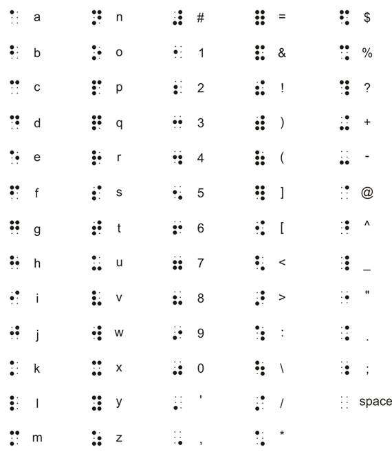
The fonts identified by number are used in the braille examples below.
* True Type font format, 24-point used for all

(Image may not appear as actual 24-point recommended size.)
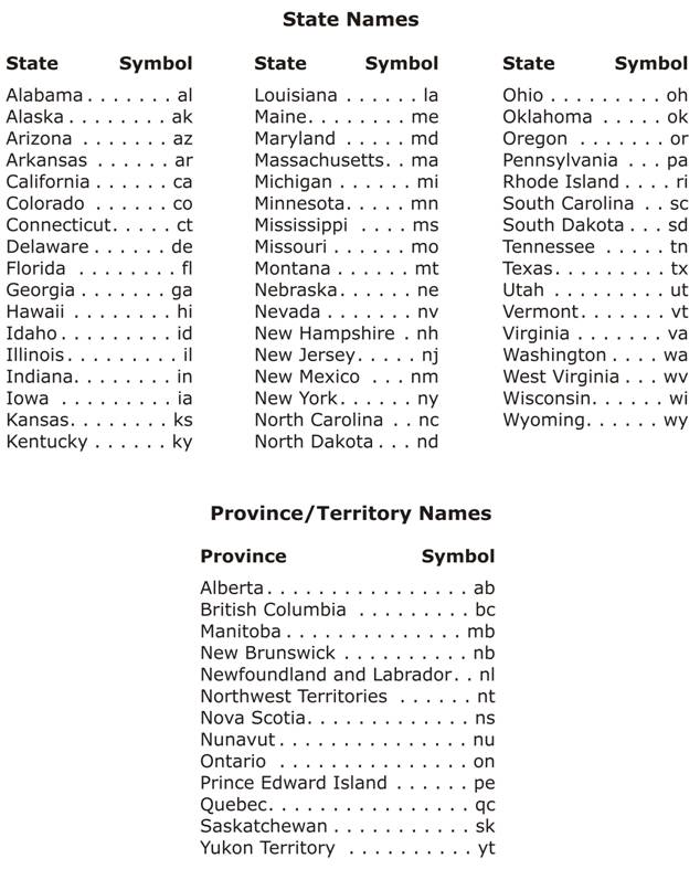
* based on International Organization for Standardization abbreviations
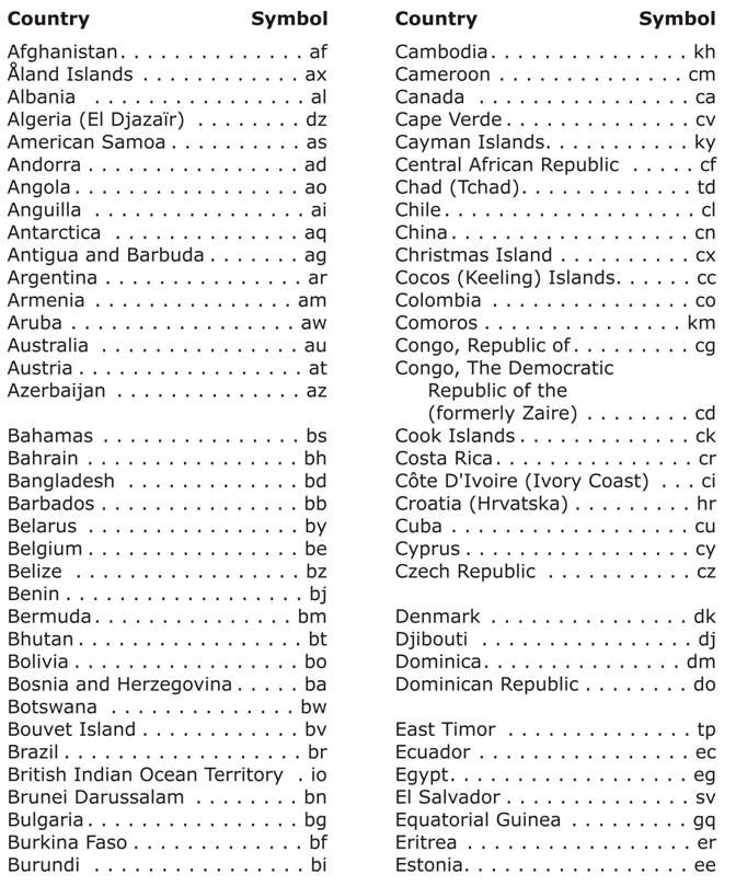
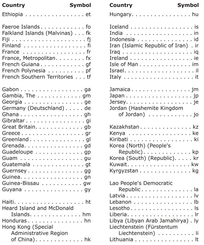
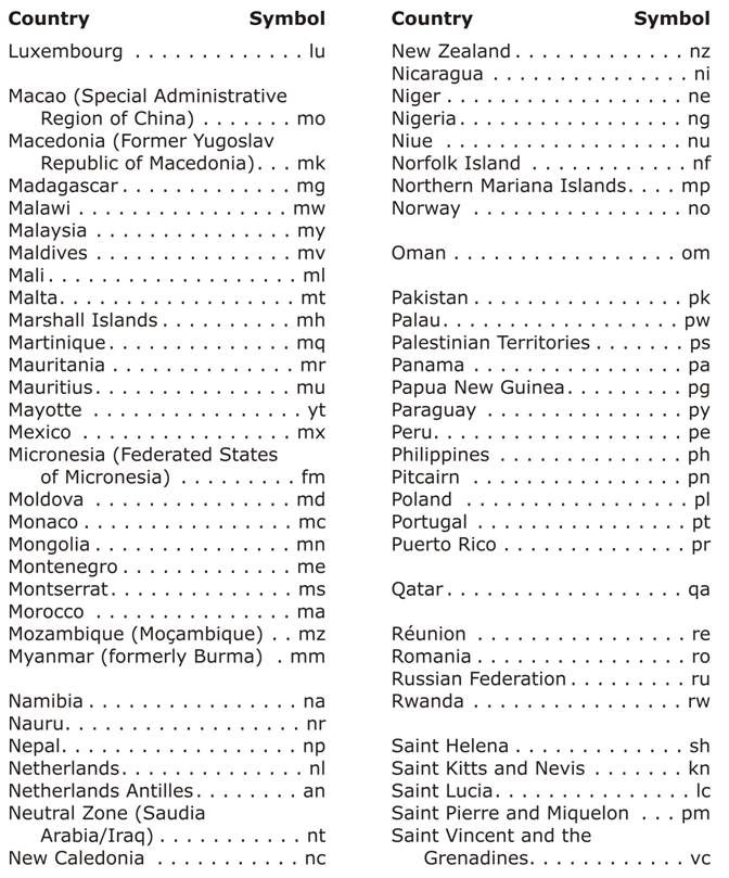
Tactile graphic production is learned "hands-on" and may be very challenging to a beginning tactile producer. Training, experience, and feedback will improve the skills required to produce a clear, understandable tactile graphic.
Various production methods, from simple to complex, may be used to produce a tactile graphic. The method used depends on the tools and production equipment available.
A tactile graphic master can be a combination of different production methods such as tooling and collage or embellishments added to an embossed braille page. Graphics software can be used to create a drawing to assist in pre-planning the size and placement of items on the base layer of a hard copy master.
The terms "production method" and "production medium" are used loosely or interchangeably. There are various media—embossed braille, microcapsule, or vacuum form—in which tactile graphics are created. Different production methods—computer generated, hand-made, or a combination of both—may be used to produce a tactile master from which multiple copies may be made. The production method used to produce a tactile graphic depends on the medium chosen. For example: Vacuum form graphics may be created using production methods such as diagramming foil, collage in cardboard, polymer clay sculpture or even embossed braille; Microcapsule graphics may be created using production methods such as computer software or hand-drawn diagrams. This appendix outlines the main production methods and media used by individual tactile graphics producers and major production centers.
This section refers to tactile graphics that are produced by using an embosser to create the components (areas, lines and points) of the tactile.
D.1.1 Embossed Braille Image
When producing embossed braille graphics with a braille embosser, an image is generated using software for both braille and graphics which are then printed on a graphics embosser. The electronic file can be saved for further editing or duplication. (See Supplement Example 31, Story Web.)
The production and duplication equipment required are: a computer, braille translation software, graphics software, specific braille fonts, braille paper, and a graphics embosser.
Embossed braille graphics are developed with computer software and can be either drawn from scratch or imported from other sources. The computer image will likely require simplification before embossing. After the image has been manipulated and braille labels and/or text are added, it is sent to the embosser for the hard copy to be printed.
Images can be imported into some braille translation software and embossed as part of a regular braille document.
Though embossed braille graphics can be produced very quickly, they often lack some of the characteristics of tactual readability. There is little variation in height, point symbols are difficult to discern, and the number of textures that can be produced are limited. The implementation of good design techniques for the graphic is imperative when producing embossed braille graphics.
When embossed graphics lack definition, their tactual quality can be enhanced by adding embellishments such as collage to the page to provide the height and variance in texture that will make the tactile graphic more readable.
Most standard braille embossers have graphics mode capability. With variations in resolution, the braille dots can be embossed closer together than when embossing braille text. Some embossers permit a change in height of the dot as well. As hardware continues to become more sophisticated, more software programs are being developed to produce better tactile graphics.
Other embossers are capable of printing whatever appears on a computer screen.
The Tiger® family of embossers was the first line of embossers designed specifically for graphics. The Tiger® braille printers use proprietary software (Tiger Software Suite) and specific braille fonts (Braille 29) for their embosser output. Standard braille embossers such as those made by Enabling Technologies and Index Braille also have graphics modes. The software used to produce graphics can be obtained from open market drawing software such as CorelDraw®, Adobe® Illustrator® and Microsoft ®Office®, or from specific tactile graphics software such as Tactile View®, Picture Braille®, TGD Pro®, and Quick Tac®.
Microcapsule graphics are tactile graphics that are produced on special paper also known as Minolta, Micropearl, Zy-Tex, Swell paper, Flexi-paper, Puff paper, or Stereocopy paper.
An image may be computer-generated using braille and graphics software. It is then transferred to microcapsule paper using a photocopier or printer, and then the tactile graphic is developed by a heating device known as a “fuser” or “enhancer.”
NOTE: The ink or printer toner applied to the microcapsule paper must be a black carbon-based ink otherwise the image will not rise. It is important to test your ink before making multiple copies.
Production and duplication equipment required: computer, braille translation software, graphics software specific braille fonts, photocopier or printer, microcapsule paper, and a fuser.
The following list provides some important considerations for creating tactile graphics on microcapsule paper:
The standard TrueType braille font is not suitable for microcapsule paper because when the tactile graphic is developed, the braille dots become too large and difficult to read. Swell Braille, a font developed specifically for use with microcapsule paper, is posted as a free download on the Duxbury Systems Inc. web site at www.duxburysystems.com.
After the Swell Braille font is loaded under the fonts menu of a computer, American Standard Code for Information Interchange (ASCII) keystrokes can be used to input simple labels. (See Appendix A, Braille-to-ASCII Conversion.)
Additional space between lines is required so that braille lines are not too close to each other. Line spacing and paragraph spacing should be increased within the graphics software program. These changes make the braille output closer to the standard braille specifications. (See Appendix B, Sample Braille Fonts.)
Example: When using CorelDRAW® and the font specified above, an increase to 111% for both line spacing and paragraph spacing will result in a microcapsule page that is similar to the spacing on an embossed braille page.
Whether the image is computer-designed or hand-drawn, the ink on the microcapsule paper must be carbon-based in order for the image to rise.
When hand drawn, always use tools such as charcoal pencils, Chinagraph pencils (black only), black gel pens, and some felt-tip markers.
Heat and speed dials on the image enhancer control the amount of expansion of the raised areas. The larger the number (time in seconds) used, the longer it takes the paper to go through the machine; therefore, the greater the expansion. Expansion can also be affected by the voltage supply and room temperature.
Passing a sheet of plain bond paper through the fuser before developing the first diagram allows the fuser to "warm up" to a stable setting. If unsure of the setting, start at a lower setting, increasing if necessary.
Insert the microcapsule paper, with its expansion surface up, into the feed tray. The expansion is completed when the paper comes out the other side.
When creating graphics to be vacuum formed, a hard copy master is created using production methods such as tooling, collage, foil, or sculpture. The heating component and vacuum pump of the vacuum-form machine mold a plastic sheet (Brailon® thermoform sheet) to the shape of a hard copy master. This process forms a plastic duplicate copy while retaining the master for future use. (See Supplement Example 29, North America.)
Research indicates that vacuum-form graphics generally provide a higher level of readability than other techniques.
The following list provides some important considerations for creating vacuum-formed tactile graphics:
Example: rubber-based glue, many plastics such as braille label, graphing tape, glass beads, foam, and food items such as pasta or rice.
D.3.1 Tooling on Paper
Tools can be used to create different area, line, and point textures to form a "picture." Common household tools such as tracing wheels or special tool kits such as the APH Tactile Graphics Kit can be purchased to create a tactile graphics master. (See Supplement Example 9, Cartesian Graph.)
It is important to note that the imprint from the tooling is executed on the reverse side of the braille paper. This means that the tooling must follow the lines of a reversed (mirror) image when transferring a print picture to the braille paper.
Tooling, collage, and embossed braille may be combined to form a tactile graphic master.
Production and duplication equipment required: braille paper, household tools and/or tooling kit, rubber mat, plastic sheets, vacuum-form machine.
Below is a brief outline of some of the procedures for creating a tactile graphic with the tooling method:
D.3.2 Tooling on Foil
Various tools can be used to create different area textures, line styles, and point symbols on diagramming foil. Common household tools, such as tracing wheels, or special tool kits, such as the APH Tactile Graphics Kit, can be purchased to create tactile graphics masters. (See Supplement Example 30, Australia: Average Annual Rainfall.)
When transferring a print picture to a sheet of foil, the drawing must be reversed or created in a mirror image.
Tooling on the foil and collage production methods may be combined to form a tactile graphic master.
Production and duplication equipment required: braille paper, diagramming foil, household tools and/or tooling kit, rubber mat, plastic sheets, vacuum-form machine.
The following list provides some important considerations for creating tactile graphics on foil:
Using mats of different thicknesses will provide a variety of depth and definition for each graphic tool used. For example, using a braille stylus with a thick, firm mat will provide one type of line while using the same tool with a thin soft mat will give you a completely different textured line.
- A wide variety of textures can be produced on foil. Placing the foil on different textured objects and pressing or rubbing the foil into the object will result in a raised pattern (e.g., textured Plexiglas, screens, texture plates found in tactile graphics kits).
- A mat should always be used when applying texture to areas, when drawing lines on a foil diagram, or puncturing air holes. A mat should not be used when burnishing.
- Basic steps for making foil graphics are in the following order:
- Enlarge the figure to an appropriate size to fit the braille page. Reverse the image.
- Lay out or mark the placement of the braille text surrounding the graphic. (Note: the braille is not applied yet.)
- Trace the enlarged and reversed image on the back of the foil making sure that the location of the surrounding braille text or headings are not altered.
- Apply the braille to the graphic using a slate and stylus (e.g., braille labels, heading, abbreviations of states, names of rivers, keyed or numbered labels).
- Use various tools to create area, line, and point symbols. Example: tracing wheel, leather stamp, stylus, pencil, pen, etc.
- Burnish from the front of the diagram on a smooth hard surface to smooth out, heighten, and define lines and symbols.
- Create air holes by puncturing the foil. Small air holes should be made using a very sharp, needle-like instrument and a mat. Air holes should be punctured from the front side with the graphic on a flat surface. The needle or pin should be inserted at a 45-degree angle and should be placed on both sides of lines, at each braille cell, and only next to the raised portions of the graphic. Air holes should not be randomly placed on the smooth areas surrounding the graphic. If air holes are placed in any other area of the page, they will show up as a raised bump on the vacuum-form copy. If the diagram is larger or contains many curves, it may be necessary to place additional air holes along the lines.
- Make a vacuum-form copy of the graphic and determine if more air holes are needed. If the graphic seems fuzzy, more burnishing may be needed to make the lines stand up higher or more air holes may be needed along the diagram or labels to allow for appropriate suction.
- Produce all the key symbols at the same time that the actual textures on the diagram are created. This ensures that the same height, direction, and density are duplicated in both the key and the diagram.
- When foil is raised higher than 1/16 inch (1.5 millimeters) and wider than 1/8 inch (3 millimeters), it needs to be supported (backed) using cardboard or polymer clay.
- Wrapping foil over a cardboard shape rather than gluing preserves all the raised parts of the diagram and provides an additional layer that is useful for the separation of different elements of an image.
Example: land from water on a map.
- Foil will become fatigued if "over-worked" and is very susceptible to overheating when used to make large numbers of copies. If the master is damaged, it is very hard to repair and is sometimes ruined. A good vacuum- form copy should be kept with the master for verification purposes.
- The best foil for this technique is a heavy-duty diagramming foil, available in rolls or sheets.
- Diagramming foil is often used to produce part of a graphic that is attached to a paper master. Due to storage and reproduction issues, a full 11-1/2 by 11 inch (29 by 28 centimeters) sheet of foil is not recommended for a graphic. Sections of foil can readily be used on collage or clay-sculptured diagrams. When foil drawings are applied to paper masters, great care should be taken in gluing them on to braille paper. Do not glue on the entire surface of the foil. This will cause warping of the foil on the paper. Glue should be applied only to one or two adjacent corners of the foil so there will be room for air to circulate under the foil. This method will allow for expansion and air circulation during the vacuum-form process
The type of thermoform plastic to be used to make the copies must be considered when raising the features of a tactile graphic. For example, when using Braillon; Features that are too high (1/4 inch or 6 millimeters) or raised areas that span more than 3 inches (7.5 centimeters) may collapse when being read tactually.
D.3.3 Collage
When using the collage method, textured materials are glued onto a paper foundation (base layer) to form a "picture." Common household items (i.e., drywall tape, corrugated paper, crochet cotton, string, punched-out dots) can be used to create a tactile graphic master. (See Supplement Example 6, Number Line.)
If the original tactile work is used by the student, care must be taken to choose textures that are not harsh to the touch (e.g., as coarse sandpaper and glitter).
Collage may be combined with tooling and embossed braille to form a tactile graphic master.
Production and duplication equipment required: braille paper, household items, plastic sheets, vacuum-form machine.
The following list provides some important steps that are taken when producing a tactile diagram in collage.
D.3.4 Base Layer
This is the layer (usually braille paper) on which the various materials that form the tactile graphic are adhered. Other layers of information may be added to the base layer.
- Photocopy or trace the design onto the front of the base layer already containing braille page numbers and running head (if used). Several copies of the design can be made and used for additional layers.
- If parts of the diagram are to be spurred, a mirror image must be drawn onto the back of a layer. A mirror image is created by using carbon paper or by placing the page against a light source such as a light box and tracing by hand the necessary information to the back of the paper.
- Place the paper, face down, onto a rubber or neoprene mat. Vinyl placemats may be used in place of neoprene mats. Working from the back of the layer, use a tool such as a spur wheel to make an imprint on the front. Textured areas can be created using pinpricks or diagonal spur lines.
- Using a braillewriter or slate and stylus, braille applicable labels or keyed items directly onto the front of the base layer. Direct brailling on the master is preferable since gluing labels adds another layer.
- Within textured areas, leave a blank space around each label.
- Add other textured areas, lines, and points, as required
D.3.4.1 Additional Layer(s)
Layers added to the base layer can define specific areas such as a land mass in contrast to a water texture. Machines are available to apply an adhesive backing to materials used for the additional layers (e.g., Xyron machine). Outlines and textures of areas can be built up through a variety of methods and materials using the methods previously described.
- Using a stick of glue (not liquid or gel), adhere as many layers together as required to provide the best "edge." Stick glue tends to be smoother when it dries. If special care is not taken when applying liquid or gel glue, they tend to leave bumps or marks on the graphic. Do not glue entire surface because this can cause warping. Apply glue only at spots along the outer edge.
- Work from the front, being careful not to flatten the braille, and cut along the outline through all thicknesses at once. Use a cutting knife for smaller areas such as lakes.
- Add string or other textured areas as required.
- Glue cut-out area(s) in the correct location on top of layer(s) such as the water texture.
There are limitations to the height and width of a tactile graphic image shaped in thermoform plastic. For example, when using Braillon, any feature that is raised more than 1/4 inch (6 millimeters) or areas that span more than 3 inches (7.5 centimeters) across the page, will collapse when being read tactually.
D.3.5 Graphs
- Prepare graphs by using computer software to create the grid and graph information and then print out directly onto the base layer. Carbon paper or a light source can also be used to trace the grid and graph information onto the base layer for hand tooling the grid.
- Using a braillewriter or slate and stylus, braille the page numbers, headings, applicable labels or keys, and base layer items directly onto the front of the base layer.
- After using a pencil to indicate the required blank space around labels, place the base layer face down onto a rubber or neoprene mat. Using a ruler with a metal edge as a guide, create the grid with a fine spur wheel, taking care to exclude the blank space. Use a heavier spur wheel to mark the x-axis and y-axis.
- For a bar graph, add the bars by gluing on an additional layer of pre-measured strips of heavier material (e.g., Bristol board, sandpaper, corrugated cardboard).
- For a line graph, place a bead of white glue along the plotted line and add string or crochet cotton on top. Dots for plotted points may be made from heavy paper using a hole punch (different sizes available).
D.3.5.1 Fold-out Page (See Prince Andrew High School Floor Plan, page 3-29.)
When a tactile graphic is too large to fit on a standard 11 by 11-1/2 inch (28 by 29 centimeter) braille page or when it is not conducive to split the tactile into a multiple-page presentation, a foldable flap may be added to increase the width of the page. The tactile graphic is designed to fit over the width of the extended pages and to be read with the foldable section opened.
A standard 11 by 17 inch (28 by 43 centimeter) tactile page can be split into two sections that are 11-1/2 inches (29 centimeters) and 5-1/2 inches (14 centimeters) wide, and then taped back together, with the 5-1/2 inch (14 centimeter) section folded in. This would allow the fold-out page with the flap closed to be bound in a book of 11 by 11-1/2 inch (28 by 29 centimeter) pages. When used as a portable diagram, this smaller folded page can be more manageable to carry.
Packing tape attached to the back of the pages works well to join the two sections together. A small gap of 1/32 inch (1 millimeter) between the two is enough to permit the page to fold over smoothly. The two sections should be in alignment when taped; lines and areas should continue from one page to the next without disruption. When designing the tactile graphic, place braille at least 1/8 inch (3 millimeters) from the fold to avoid cutting through any labels or keys.
This method would also work with two 11 by 11-1/2 inch (28 by 29 centimeter) pages with a larger section folded in.
D.3.6 Sculpture
Sculptured tactile graphics masters are created by molding and baking modeling clay into the required shape. The baked clay object is attached to a paper foundation (base layer) to create a tactile graphic master. (See Supplement Example 27, Bones.)
Production and duplication equipment required: braille paper, polymer clays, clay softening agent, silicone sealant, oven, plastic sheets, vacuum-form machine
The following items outline some of the main considerations that go into the production of clay sculptured tactile graphics masters:
D.3.7 Other Simple Techniques
For use in the classroom, tactile graphics may be produced quickly using simple techniques. Some methods can be used by a person who is visually impaired to practice handwriting or to draw a picture.
Cataloging of tactile graphic masters is recommended. This should be done for both of hard copy masters and the electronic files. The master may be used as a basis for other diagrams. The files can be cataloged by subject and cross-referenced with book titles.
D.4.1 Digital Files
An organized system of naming, storing and, retrieving a large number of files is necessary. Tactile files sorted into folders that relate to chapters or braille volumes and named to indicate their contents facilitates the printing and binding of tactile pages even when reprinted years after initial production or when shared with another organization. Another way to organize tactile files is to make one multipage file for each chapter or volume, containing all the tactile diagrams needed for that chapter or volume. It is recommended to limit the pages of a file to about twenty since larger files take longer to print.
As a precaution in case of damage or loss of original files, it is common to produce a second backup copy and store it at a separate site from the original files.
D.4.2 Thumbnail Images
A thumbnail image is a small graphical representation of a larger graphic. These images allow the contents of a file to be seen as a small graphic without having to open and close the file itself. Thumbnails of an entire folder may be viewed over a single page spread, making it easy to find the exact tactile graphic in a folder with many files.
The latest computer operating systems have thumbnail viewing as part of their interface for viewing most file types. These displays are often referred to as icons.
Another advantage of thumbnails is that large collections of files can be viewed as groups of thumbnails making it easier to search for an individual file when the file name or location is not known.
The contents of multiple files can be visually compared to each other when searching for particular graphic content.
More advanced programs known as image viewers or thumbnail viewers allow you to preview, as well as search, sort, zoom and import your tactile graphics files.
D.4.2.1 Thumbnail Catalog Collections
Most graphics design software programs allow users to tag the file with “keywords” before saving so that it is easy to find in the future.
Tactile graphics containing information that appears frequently in textbooks or that could be requested occasionally by teachers may be copied into a separate collection for general use. They may be used as base drawings for customization at a later date, reducing the production time required to produce new drawings that have similar content.
In a large collection, it is easier to find an individual diagram if it has a descriptive name, and diagrams have been sorted onto folders organized by subject or category.
Example: a large map collection could be subdivided with a section for historical maps, further subdivided into a North American history section. Biology could be subdivided into human biology, and then into a circulatory or respiratory category.
Some graphics files may be stored in more than one folder. Example: A file called “Greenhouse effect” could be filed in an ecology folder or in a climatology folder or in a geology folder. Choosing the keyword “greenhouse” makes it possible to use a search engine to find a file with the appropriate content.
Thumbnail catalog collections of diagrams can be printed with multiple thumbnails on a page and bound as a printed catalog. This is a useful tool for quickly locating diagrams with a particular content. To keep a page of thumbnails as a digital file, save it as a .pdf file.
Printed or digital pages of thumbnails produced for individual completed textbooks can be useful because different textbooks sometimes use the same diagrams. A diagram produced for one level of a series may be reused in the next level of the series. New editions of books can keep diagrams from the older edition.
D.4.3 Storage of the Hard Copy Master
To best preserve the integrity of the tactile graphic master, the environment for storage should be climate controlled, avoiding excessive heat and humidity.
Tactile graphic masters that will be vacuum formed should be stored loosely in a horizontal position to avoid damage to the raised textures.
To avoid loss of glued-on textures on the master diagram, it is advisable to store the tactile graphic with a vacuum-form copy over it.
A print copy of the text from which the tactile graphic was produced should be kept with the tactile graphic master. This will ensure successful reproduction of the tactile graphic in case of texture alterations during storage.
Production method |
Advantages |
| Embossed braille image |
|
| Microcapsule image |
|
| Tooling |
|
| Collage |
|
| Sculpture |
|
| Other Simple Techniques |
|
The textures are grouped by tactile similarity and only one texture from that group should be used in any given tactile graphic.
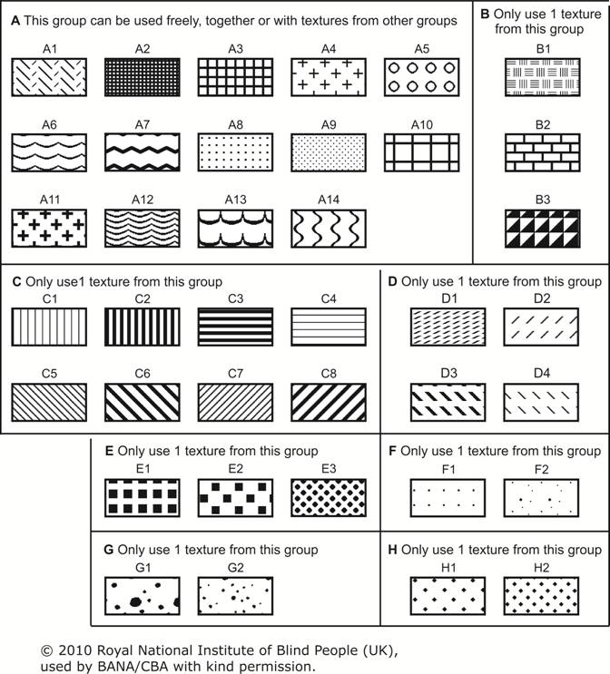
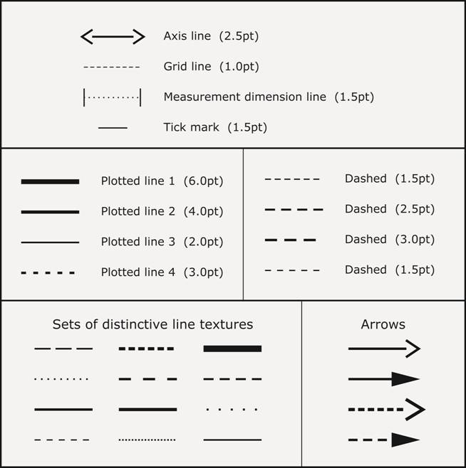
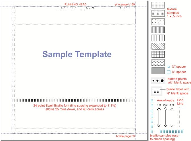
Can be ordered from:
American Thermoform Corporation
Aroga
CNIB (manual braillewriter)
Enabling Technologies
Entering Your Ear Systems (E.Y.E.S.)
Frontier Computing
Perkins School for the Blind (manual braillewriter)
ViewPlus Technologies, Inc.
BANA Braille Codes Update, 2007
Braille Formats: Principles of Print to Braille Transcription, 1997
Braille Code for Chemical Notation, 1997
Computer Braille Code: 2000 Revision
English Braille, American Edition, 1994; Revised 2002
Nemeth Braille Code for Mathematics and Science Notation, 1972 Revision
Addendum 1 to the Nemeth Braille Code for Mathematics and Science Notation, 1972
Revision: Ancient Numeration Systems
Source: American Printing House for the Blind
1. Braille2000
Source: Computer Application Specialties Company
2. Duxbury and MegaDots
Sources:
American Thermoform Corporation
Aroga
Duxbury Systems, Inc.
Enabling Technologies
Frontier Computing
Kit contains stencils, embossing tools, and other items needed to create tactile graphics by dry pressure embossing. Use with American Printing House for the Blind's Mini-Lite Box or natural light. Guidebook is included.
Source: American Printing House for the Blind
Available in a variety of sizes
Sources:
American Printing House for the Blind
CNIB
Neoprene rubber pads, available from Howe Press of Perkins School for the Blind and American Printing House for the Blind, allow a spur wheel to make its pattern and protect the desk surface while a tactile graphic is being created. Soft vinyl or rubber place mats can be used, but may need to be replaced more often.
Double-sided tooling pad (Pheasantland Industries)
Imitation leather available from craft stores
Self-healing cutting mats (Olfa), available from fabric, craft, or stationery supply stores
Sources:
American Thermoform Corporation
Aroga
Enabling Technologies
JP Trading, Inc.
Repro-Tronics, Inc.
Available in a variety of sizes
Sources:
American Thermoform Corporation
Enabling Technologies
Entering Your Ear Systems (E.Y.E.S.)
JP Trading, Inc.
Repro-Tronics, Inc.
Flex tape (may be called graphic tape), available in drafting and art supply stores, comes in various widths. Makes lines quickly and easily and can be removed from a page for a short time after it is initially placed there. After a week or two it will not come off. You need to use two or more layers to make the lines readable.
Puff embroidery*, available in craft stores, will make outlines within which a child can work, color, etc.
Wikki Stix*, available from Exceptional Teaching Aids in California or from teachers' stores, look like waxy pipe cleaners and will stick to paper, but can be removed and reused. Can be used to underline, make shapes, and permit children to connect matching items.
Glue sticks* used with a hot glue gun, available at most department stores.
Compass with attached tracing wheel, available from Howe Press of Perkins School for the Blind, can be used to draw an embossed circle up to 5-1/2 inches (14 centimeters) in diameter.
Spur wheels, available from Howe Press of Perkins School for the Blind, American Printing House for the Blind, Dick Blick Art Materials, or from leather craft shops in a variety of sizes and forms.
Tracing wheels, available at fabric shops.
* Not suitable for duplication using vacuum form
Available at most art & craft and hardware stores
1. Clays:
Fimo®
Super Sculpey®
Sculpey III®
Premo Sculpey®
2. Epoxy putty (Two-part mixture):
Milliput®
Kneadadite®
Magic Sculp®
Apoxie® Sculpt
3. Adhesives:
Silicone Sealant – for mounting to base page
Translucent Liquid Sculpey® – repair and design work
Liquid Fimo® – repair and design work
4. Tools:
Sculpture sticks – for shaping and patterning
Tweezers – for handling finer details
Burnisher – for shaping and patterning
Oven – for curing
Emery board – for smoothing down bumps
Amaco Pasta Machine® – for conditioning clay
Hands and fingers
5. Clay reinforcement:
Wire paperclips
20 to 16 gauge (0.8 to 1.3 millimeters diameter) wire
Aluminum WireForm™ rods
WireForm™ woven mesh – also for texturing
Wire mosquito netting
FibaTape® drywall tape
1. Tactile Graphics Kit
Contains tools, including spur wheels, and step-by-step instructions for the creation of maps, graphs, diagrams, and charts on heavy-gauge aluminum foil or paper. Includes Tactile Graphics Guidebook manual. Items can be purchased separately.
Source: American Printing House for the Blind
2. Tactile Graphics Starter Kit
Intended for those who need to create a limited number of tactile graphics and have little or no practical experience. For making a large number of graphics, see the APH Tactile Graphics Kit. Guidebook is included.
Source: American Printing House for the Blind
Adobe Illustrator® - Source: Adobe Systems Inc.
CorelDRAW® - Source: Corel Corporation
Tiger® Software – Source: ViewPlus Technologies
Disposable wiping cloths and drywall tape (excellent for representing water), string, crochet cotton of different thicknesses, rickrack, plastic screen*, corrugated light bulb protector, upholstery fabric, sandpaper, wallpaper, commercial textured paper, Velcro backing, foam sheets*, felt, Bristol board, poster board.
Dots made with Bristol board, poster board, or sandpaper. To make dots, use different sizes of hole punches, available from stationery stores.
Punch-outs or cut-outs made with different textures such as Bristol board, poster board, sandpaper, wallpaper, etc. These may be preferable to macaroni, buttons, snaps, and sequins, which do not stick well on the page.
* Not suitable for duplication using vacuum form
ST Thumbnails Explorer, a shareware application, available from www.softfields.com, is a fast thumbnail viewer and manager that works with many types of files.
IrfanView is also a fast thumbnail viewer and manager that works with many types of files. It is available as freeware from www.irfanview.com.
Brailon® available in a variety of sizes
Sources:
American Thermoform Corporation
CNIB
Calendered Vinyl (heavy thermoform) can be ordered in .010 gauge Source: Have Our Plastics Inc.
Clear Plastic Sheets (PVC) can be ordered in .0075 matte
Source: Klöckner Pentaplast of Canada, Inc.
Source: American Thermoform Corporation
An interactive tactile board used to construct diagrams and maps
Source: American Printing House for the Blind
Supplemental drawings depicting basic geometric concepts
Source: American Printing House for the Blind
Used in the construction of geometric and other mathematical figures necessary for the study of mathematics, algebra, geometry, trigonometry and calculus
Source: American Printing House for the Blind
Mathematics training device designed for use by students who are blind or have low vision. Teaches a number of basic math and social studies concepts.
Source: American Printing House for the Blind
Introduces street intersections to blind and low vision students
Source: Inegra Products
Consists of cubes that can be joined in any direction to create geometric and abstract forms and to explore spatial relationships.
Source: Didax, Inc.
An interactive tactile board used to create tactile diagrams for numerous educational purposes
Source: American Printing House for the Blind
Manipulative materials that help teach 3-dimensional geometry
Source: Geometro
Consists of Mat Plans and Velcro® cubes to construct stacked cube arrangements of 3-dimensional models. Assists in the understanding of different views, and volume and surface areas.
Source: American Printing House for the Blind
Designs and markets technologies and software
345 Park Avenue; San Jose, California 95110-2704; USA
1-800-833-6687, (408) 536-6000; www.adobe.com
Enables blind or visually impaired people to achieve quality and access
11 Penn Plaza, Suite 300; New York, New York 10001; USA
1-800-232-5463, (212) 502-7600; www.afb.org
Promotes independence of blind and visually impaired persons by providing special materials, products, and services needed for education and life
1839 Frankfort Avenue; PO Box 6085; Louisville, Kentucky 40206-0085; USA
1-800-223-1839, (502) 895-2405; www.aph.org
Reseller of materials for braille and tactile graphics production
1758 Brackett Street; La Verne, California 91750; USA
1-800-331-3676, (909) 593-6711; www.americanthermoform.com
#150 5055 Joyce Street; Vancouver, British Columbia V5R 6B2; Canada
1-800-561-6222, (604) 431-7997; www.aroga.com
Primary source of support, information and most importantly, hope, for all Canadians affected by vision loss
1929 Bayview Avenue; Toronto, Ontario M4G 3E8; Canada
1-800-563-2642; www.cnib.ca
Designs and markets braille translation software
PO Box 22219; Lincoln, Nebraska 68542-2219; USA
(402) 423-4782; www.c-a-s.com
Software house specializing in graphics applications
1600 Carling Avenue; Ottawa, Ontario K1Z 8R7; Canada
(613) 728-8200; www.corel.com
Markets art supplies
PO Box 1267; Galesburg, Illinois 61402-1267; USA
1-800-723-2787; (309) 343-6181; www.dickblick.com
395 Main Street; Rowley, Massachusetts 01969; USA
1-800-458-0024; www.didax.com
Designs and markets braille translation software
270 Littleton Road, Unit 6; Westford, Massachusetts 01886-3523; USA
1-978-692-3000; www.duxburysystems.com
Designs, manufactures, and supports braille embossers
16101 NE Braille Place; Jensen Beach, Florida 34957; USA
1-800-777-3687; www.brailler.com
Markets equipment for persons with visual impairments
302-960 Portage Avenue; Winnipeg, Manitoba R3G 0R4; Canada
1-800-722-6825; (204) 775-1789
Provides educational solutions for those with special needs
5673 W. Las Positas Blvd., Suite 207; Pleasanton, California 94588; USA
1-800-549-6999; www.exceptionalteaching.com
Designs and markets equipment for persons with visual impairments
2221 Yonge Street, Suite 406; Toronto, Ontario M4S 2B4; Canada
1-888-480-6690, (416) 489-6690; www.frontiercomputing.on.ca
Provides manipulative materials and programs to teach 3-D geometry
166 Springfield Blvd.; Ancaster, Ontario L9K 1H8; Canada
(905) 304-7112; www.geometro.net
Manufactures and distributes plastic products and equipment
4-6990 Creditview Road; Mississauga, Ontario L5N 8R9; Canada
1-800-263-5995 (Canada); 1-800-567-1775 (USA); (905) 821-7550; www.hop.ca
Designs and markets manual braille embossers
175 North Beacon Street; Watertown, Massachusetts 02472; USA
(617) 924-7308; www.perkins.org
Designs and markets tactile graphic maps
PO Box 75762; St. Paul, Minnesota 55175-0762; USA
(612) 220-6657; www.intouchgraphics.com
Makes and sells interactive kits for blind and low vision students
10728-18 Street, Dawson Creek, British Columbia V1G 4E2; Canada
(250) 782-3380
Markets professional microcapsule developing machines for Matsumoto Kosan Corporation, Japan
400 Forbes Blvd., Unit 3; So. San Francisco, California 94080-2026; USA
(650) 871-3940
Manufactures a broad range of innovative, high-quality products
419 King Street; Oshawa Executive Centre, Suite 604; Oshawa, Ontario L1T 2K5; Canada
(905) 433-4232; www.kpfilms.com
Provides continuing education to those who prepare braille, and to provide braille materials to persons who are visually impaired
95 Allens Creek Road; Bldg. 1, Suite 202; Rochester, New York 14618, United States
(585) 427-8260, email National Braille Association; www.nationalbraille.org
Provides double-sided tooling pads
1600 North Drive; PO Box 5911; Sioux Falls, South Dakota 57117-5911; USA
(605) 367-5082; email Pat Gacke
Designs and manufactures tactile graphics equipment
75 Carver Avenue; Westwood, New Jersey 07675; USA
1-800-948-8453, (201) 722-1880; www.repro-tronics.com
Designs and manufactures a range of access technologies including the Tiger Advantage Embosser
1853 SW Airport Avenue; Corvallis, Oregon 97333; USA
(541) 754-4002; www.viewplus.com
Designs and markets Olfa cutting tools and mats
5500 N. Pearl Street, Suite 400; Rosemont, Illinois 60018; USA
1-800-962-6532; www.olfa.com
2-cell alphabetic key. Represents a word or words and contains 2 single letters, 2 one-cell contractions, or a combination of a single letter and a one-cell contraction.
2-dimensional view. Appearing to have height and width, but not depth.
3-cell symbols. Represents a word or words and contains 3 single letters, 3 one-cell contractions, a combination of a single letter and one-cell contractions, or a number sign and a two-digit number.
3-dimensional view. Appearing to have depth or thickness, in addition to height and width.
alphabetic key. Two- or three-lettered symbols transcribed in alphabetical order according to the first letter of the symbol rather than by the first letter of the explanation, or transcribed in order of appearance.
agency. An organization that produces braille and/or tactile material for the blind or visually impaired.
analog clock. A clock composed of hand(s) and numbers.
APH. American Printing House for the Blind.
area texture. Any tactual pattern that represents a particular area. The scale of the graphic determines whether an object is considered an area texture or a point symbol.
areal. Of or relating to or involving an area.
armature. A structure used as a support for polymer clay when creating sculptured tactile masters.
ASCII (American Standard Code for Information Interchange). A numeric code for standard keyboard characters, typically built into computer operating systems that allows for text output at a basic level.
atmospheric perspective. The effect of creating a sense of depth shown through haziness or changes in color, imitating the way distant objects appear less distinct and more bluish.
axis. One of the reference lines of a coordinate system. On most graphs, axis lines (axes) are perpendicular to each other.
BANA. Braille Authority of North America.
bar graph. A bar graph is one which uses the lengths of bars to represent the quantitative relationship between horizontal and vertical values.
base layer. A platform such as braille paper to which materials such as string, textures and additional layers are added.
blank space. The white or empty space that is placed around components of the graphic to make it more readable.
bond paper. Smooth white sheets of paper, with a weight greater than 50 grams per square meter, used writing, printing, and photocopying.
bottom box line. A line of braille symbols (dots 1245) used to indicate the ending to a section in a print text.
box-and-whisker plot. Box-and-whisker plots are diagrams or graphs used to show the distribution of data.
braces. Curly bracket grouping symbols { }.
brackets. Square bracket grouping symbols [ ].
braille ASCII. A one-to-one direct substitution that maps the 64 keyboard strokes (including the spacebar) to braille dot configurations. It is built into many refreshable braille displays and braille embossers.
braille code. The characters of a writing system mapped to the six, or in some cases eight, raised dots of the braille cell. Different braille codes are used to map character sets of different languages and notations for music, mathematics, science, chemistry, and computer.
braille embosser. A hardware device connected to a machine (computer, braille notetaker) which manipulates data. The braille embosser reproduces a braille hard copy of a text document and/or a tactile graphic.
braille label. The braille identifier for an area, line, or point feature on a tactile graphic.
braille transcriber. A person who transcribes (manually presses keys to produce braille) or translates (uses a program to produce braille) print text into braille. Professional transcribers obtain certification through the Library of Congress or CNIB.
braillewriter. A machine similar to a typewriter, used for printing braille. Also called a brailler.
Brailon®. See vacuum-form plastic.
brf. An electronic braille ready file in ASCII that can be opened and embossed with various braille software programs.
Bristol board. A heavyweight paper, with a thickness of .006 inches (0.15 millimeters) or higher, that can have a smooth or vellum (prepared mammal skin) finish.
burnish. To rub and smooth out.
capsule paper. See microcapsule paper.
caption. A descriptive title and/or text that provides context for an illustration.
Cartesian graph. A Cartesian graph has lines, curves, or geometric shapes, drawn on a Cartesian plane, that show numeric relationships.
Cartesian plane. A plane, with a rectangular coordinate system, that associates each point in the plane with a pair of numbers.
cataloging. Registering an item into a collection using a standard format.
CBA. Canadian Braille Authority.
cell-5 heading. One of several heading formats used in braille to represent certain print titles, usually minor.
centered heading. One of several heading formats used in braille to represent certain print titles, usually major.
circle graph. A circle graph is a circle divided into pie-shaped pieces which reflect certain values.
clip art. Ready-made illustrations that may be inserted into a document. These illustrations may be found on the Internet, in books, or as part of a software package.
clutter. Term used to indicate excessive or unnecessary information that decreases the reader's ability to quickly interpret a tactile graphic.
CNIB. Canadian National Institute for the Blind.
collage. A manual method for producing tactile graphics by which various textures (e.g., sandpaper) are glued onto a base layer. Also called cut-and-paste.
consolidation. The process of combining several smaller features (e.g., islands) as one feature.
comparison chart. See graphic organizer.
comparison sign. A sign that shows the relationship between mathematical material. (e.g., equals sign).
compass rose. A design, usually a circle, graduated to degrees or quarters and printed on a map to show cardinal directions.
computer-generated graphic. Any graphic that is designed using computer graphics software. The graphic is then embossed or developed.
concept map. See graphic organizer.
concept web. See graphic organizer.
contracted braille. Braille, consisting of letters, numbers, punctuation marks, composition signs and 189 contractions and short-form words. (Formerly referred to as Grade 2 braille.)
contrast chart. See graphic organizer.
coordinate. A set of identifiers used in specifying the location of a point on a grid, map, line, or area.
coordinate marker. A line or lines specifying the location of a point on a plane.
counting symbol. The various pictures or symbols that are to be counted or grouped by a reader, often found in early elementary mathematics material.
cross section. A section of an object created by cutting it perpendicular to the plane of the object.
customized diagram. A tactile graphic that has been designed and produced for a specific use or person and not intended for making multiple copies. i.e., in a classroom setting
density. The extent to which the items on a diagram are close together or thick (compact).
diagram. See graphic.
diagramming foil. A heavy gauge aluminum foil available in rolls or in sheets, used to produce tactile graphics by raising or texturing the surface.
digital clock. A clock in which the time is shown electronically in the form of numbers.
dimensional drawing. A shape that shows length and width (2-dimensional) or length, width and depth (3-dimensional).
discriminability. The ability to distinguishable differences.
distinctive marker. The hollow or solid dot that represents an included or excluded value on a number line.
distractor. Information included in a test item that is not needed by the reader to answer the question, but is intended to distract the reader from the correct answer.
dot plot. See line plot.
drawing. See graphic.
electronic diagram. See schematic drawing.
embosser. See braille embosser.
e-text. (from "electronic text") Refers to text presented in digital format based on standardized format rules for various uses. i.e., computer screen reading programs.
facing pages. Pages that are bound facing each other so that related information can be read without turning a page.
figure number. The reference number given to the original print graphic.
flowchart. A graphic representation of the steps of procedures.
foil. See diagramming foil.
folding line. A line indicated on net diagrams that shows when a tab is to be folded into the shape being formed.
fold-out diagram. A folded insert or section whose full size exceeds that of the regular page.
font. Any digital typeface that can normally be changed to a variety of sizes.
format. The layout or arrangement of braille text, including keys and graphics, and/or graphic elements.
frame. A rectangular or other geometric border surrounding a print image.
fuser. A machine that produces a two-dimensional graphic by raising the image areas copied onto microcapsule paper.
graph. A series of lines, bars or points that represent a successive change in value.
graphic. Information presented by a sketch, design, drawing, illustration, map, plan, graph, and other formats.
graphic map. See graphic organizer.
graphic organizer. Pictoral or graphical chart, figure or map that illustrates concepts, ideas and/or relationships.
graphic symbol. Any area, line or point that is raised from a base layer to be read by touch.
graphic symbols page. A preliminary page of a braille volume or tactile graphics supplement that lists the texture symbols commonly used in diagrams within the volume or supplement.
graphicacy. The ability to understand, interpret and make use of graphical information.
grid. A network of evenly-spaced vertical and/or horizontal lines.
haptic. Refers to the sense of touch.
heading. See title.
hidden lines. A line, usually dashed, that is used to represent any line of an object that is ordinarily hidden from view.
hierarchy. A hierarchy is an arrangement of items in which the items are classified according to importance.
histogram. A histogram shows frequency data and is similar to a bar graph.
horizontal grid line. A set of background lines that extend from left to right across a plane or graph.
information point. Two or more features of a travel environment that by themselves do not convey specific information about one’s location in space, but when juxtaposed, permit travelers to locate themselves relative to their surroundings. For example, the fire hydrant next to the newspaper box specifies a particular location on a block that has several fire hydrants and newspaper boxes, but none others next to each other.
illustration. See graphic.
import. Bring in digital information (e.g., clip art, braille or print text) to an electronic file.
interpoint braille. Braille that is embossed on both sides of the same braille page.
ISO. International Organization for Standardization, responsible for setting international quality standards.
key. The systematic listing of all symbols and their explanations for a particular graphic.
key page. The page preceding the graphic in which the keyed symbols and other information are listed.
key symbol. Textured samples, letters, or numbers that are assigned by the transcriber/tactile producer to represent an area, line, or point.
label. Identifier for an area, line, or point.
label line. See lead line.
landmark. 1. An environmental feature that is detectable to visually impaired travelers, that is always present, and that is not likely to be missed as one travels a route. Once a landmark is located, the traveler is certain of a specific location in a given neighborhood. An example of a landmark may be the only brick sidewalk in a particular shopping area. 2. A prominent feature of the landscape, such as an island or large body of water, serving to identify a particular locality and used as a point of reference by readers of tactile graphics.
landscape. Horizontal orientation of a page, such that the shortest side runs from top to bottom (as opposed to portrait).
layer. A layer or several layers of material or textures can make up a tactile graphic.
layering method. A system of showing cube structures.
lead line. A fine line that connects a braille label or key symbol to the object or feature it identifies.
legend. A print listing of symbols and their explanations that is to be included in the tactile key listing. See key.
letter symbol. Two or three braille cells consisting of letters and/or contractions that are assigned by the transcriber/tactile producer to represent a longer print label.
light spectrum. The section of the electromagnetic radiation spectrum that is visible to the human eye. It is also known as the optical spectrum of light and consists of the colors red, orange, yellow, green, blue, indigo and violet.
line 25 identifier. Transcription of the figure number on line 25 of each page where a figure is shown. A line 25 identifier is not required when producing tactile graphics.
line graph. A graph comprised of one or more lines imposed on a plane with vertical and horizontal values.
line plot. A plot formed by a series of stacked symbols (usually x's) above a number line, used to show the frequency of data values.
line style. A line style that is assigned to represent a specific linear feature.
linear. Having the form and feel of a line.
linear perspective. Actual or suggested lines converging to give the illusion of depth and distance.
loonie. Common name for the Canadian one-dollar coin.
manipulatives. Teaching aids, such as models, used in place of, or in conjunction with, tactile graphics to convey conceptual information.
master. An original tactile or electronic graphic from which duplicate copies can be made.
mat plan. A system of showing cube structures.
measurement tools. Tools that are used to measure quantity or magnitude (e.g., rulers, protractors, thermometers).
medium. The method or material in which a tactile graphic is produced.
microcapsule paper. A special type of paper with microcapsules of alcohol embedded in it. Any black area on the paper swells up when processed. Also known as Minolta, Micropearl, Zy-Tex, swell paper, Flexi-paper or stereocopy paper.
micropearl paper. See microcapsule paper.
mind map. See graphic organizer.
Minolta paper. See microcapsule paper.
mobility map. A map that gives readers opportunity to plan a travel route and includes specific landmarks to navigate.
multiple key pages. When it is not possible to get all the information in a key on one braille page, it is acceptable to have several key pages. These multiple key pages should be prepared and reproduced as subsequent pages to the graphic.
Nemeth Braille Code. The braille code used to transcribe mathematics and science notation.
net. In geometry, refers to an arrangement of edge-joined polygons in a plane that can be folded to become the faces of a polyhedron.
number line. A straight line on which every point corresponds to a real number.
numeric key. Two or three braille cells consisting of the numeric indicator and a digit that are assigned to represent a longer print label.
O&M. Orientation and Mobility.
operation sign. The four operation signs of arithmetic are addition, subtraction, multiplication, and division.
organizational chart. See graphic organizer.
orientation map. An overview map that represents an area or location to familiarize or orient the reader.
orthographic drawing. An orthographic drawing shows six different views of an object: top, bottom, front, back, left side, and right side.
overview diagram. A simple version of a graphic that is to be presented in greater detail, usually in sections or layers.
pictograph. A representation of numeric data through use of pictures and/or partial pictures.
pie chart (pie graph). See circle graph.
planning sheet. A method for developing the design of the tactile graphic and assigning a texture or symbol to each feature in an organized manner.
plastic sheet. A plastic sheet is used with a vacuum-form machine for duplicating copies from original tactile masters.
point of reference. A particular characteristic or symbol that can serve as an identifier for a certain locality.
point symbol. A dot, circle, square, rectangle or other small symbolic item assigned to represent the specific location of an object or feature.
polymer clay. A type of PVC plastic that remains soft until cured, and is used by tactile graphics designers to create masters for vacuum-form plastic copies.
portrait. Vertical orientation of a page, such that the shortest side runs from left to right (as opposed to landscape).
preliminary page. Page(s) that precede the actual text of the braille volume or tactile graphics supplement (e.g., Title page, Special Symbols page, Transcriber's Notes page, Graphic Symbols page and Table of Contents).
producer's note. Any wording not shown in the print text that is inserted in the e-text by the producer.
proofreader. A person, certified by the Library of Congress or CNIB, who reads braille by touch or sight.
protractor. A circular or semicircular tool used for measuring angles. The units of measurement utilized are usually degrees.
reasoning tools. See graphic organizer.
running head. A page header or text that appears at the top of every page on braille line 1—usually the title of the book.
scale. The ratio between the area and/or dimensions and those of the actual object or area which it represents.
scale mark. See tick mark.
scan. To use a scanner to copy print images into digital images.
scatter plot. A graph containing a collection of points which shows the relationship and distribution of two different sets of data.
schematic drawing. A schematic diagram represents the elements of a system using abstract graphic symbols to show details of how a system works.
sector. A part of a circle bounded by any two radii and the arc included between them.
sequence map. See graphic organizer.
sign of comparison. See comparison sign.
sign of operation. See operation sign.
SimBraille. A simulated braille font that uses solid black circles to represent raised (embossed) braille dots. Other dot positions are indicated by tiny ‘shadow’ or ‘placement’ dots.
simplification. Elimination of lines, details, decorations, etc., that are not relevant.
single-sided braille. Braille that is embossed only on one side of a braille page.
slate and stylus. Tools for writing braille dots on a page by hand. A slate holds the paper in place and brings consistency to the position and depth of dots. The tip of the stylus, an awl-shaped utensil, is pressed down through the rectangular openings in the slate to emboss the braille dots on the back of the page. Braille is written from right to left on a slate and stylus.
spatial information. The relationship between objects, or parts of objects to the whole.
special symbols page. A preliminary page, prepared by the transcriber (for a braille volume) or a tactile graphics designer (for a tactile graphics supplement), that lists uncommon (special) symbols used by the transcriber or tactile graphics designer for that volume or supplement.
spinner. A circle divided into portions and used to determine the probability of an event, or the moves on a game board.
spur wheel. A hand tool that has a metal wheel with teeth which can be used to make a raised textured line.
standardized test. A test designed in such a way that the questions, conditions for administering, scoring procedures, and interpretations are consistent.
standards. Rules or principles that are expected to be followed to ensure consistency in the presentation of tactile graphic material. See guidelines.
stem-and-leaf plot. A specialized table showing the distribution of data.
stereocopier. See fuser.
stereocopy paper. See microcapsule paper.
story web. See graphic organizer.
stylus. A pointed tool for writing, drawing, or engraving. See slate and stylus.
supplement. A collection of tactile graphics, bound separately, to be used in conjunction with associated material.
Swell Braille. A braille font with slightly smaller dots suitable for use with microcapsule paper, where the dots swell when developed by a fuser.
swell paper. See microcapsule paper.
symbol. Something that stands for or represents another thing.
table of contents (TOC). A preliminary page of a braille volume or tactile graphics supplement that contains a list of the contents.
tactile graphic. Raised version of a print graphic that is adapted for the sense of touch.
tactile graphics designer. A person who creates and prepares tactile diagrams according to specific guidelines and standards.
tactual. That which can be perceived by touch.
template. A document or file having preset formats and elements. The template can be used as a starting point so that the formats or elements do not have to be recreated each time it is needed.
tessellation. An arrangement of shapes that form a repeating pattern. The shapes fit together with no gaps or overlaps.
texture symbol. A raised pattern that is assigned to represent an object or feature.
thermal form. See vacuum form.
thermoform machine. See vacuum-form machine.
thermoform sheet. See vacuum-form paper.
thumbnail. A thumbnail is a small picture of a file that is generally of good enough quality to determine the graphic content of the file. In the case of tactile graphics, braille appears too tiny to read onscreen, but readable, if necessary, when printed.
tick mark. A short line used to indicate specific values along a scale (e.g., graph, clock, thermometer). Major tick marks are the labeled values; minor tick marks are those that appear between the major tick marks.
time line. See graphic organizer.
title. A line of text that serves to indicate what the passage following is about.
tooling. Shaping, forming, or finishing with a tool; impressing designs with special tools.
toonie. Common name for the Canadian two-dollar coin.
top box line. A line of braille symbols (dots 2356) used to indicate the start to a section in a print text.
transcriber. See braille transcriber.
transcriber's note. Any wording not shown in the print text that is inserted in the braille edition by the transcriber. A key is part of a transcriber's note.
transcriber's notes page. A preliminary page, prepared by the transcriber (for a braille volume) or a tactile graphics specialist (for a tactile graphics supplement), that explains the special braille format or usage that appears throughout a volume or throughout an entire transcription.
transformation. The operation of changing the orientation of a figure through translation (slide), reflection (flip), rotation (turn), and/or dilation (shrinking or enlarging), usually found in mathematical textbooks.
TrueType. A font standard that has .ttf as the file extension.
uncontracted braille. Braille in which every word is spelled out letter for letter. (Formerly known as Grade 1 Braille.)
vacuum-formed. The process of using a machine that produces heat and vacuum pressure to create a plastic copy of a tactile master, commonly referred to as a "thermoform machine".
Vacuum-form plastic. See plastic sheet.
Venn diagram. A diagram made up of two or more overlapping circles, used to show relationships between groups of items sharing common properties.
vertical grid line. One line of a set of background lines that extend from top to bottom on a plane or graph.
Wikki Stix. Wax-coated yarn strands, easily bent for making letters and other shapes that adhere to smooth surfaces and can be re-used.
Xyron machine. A machine that applies adhesive to a wide variety of flat items that can be fed through the rollers. This enables textures material to become self-adhesive and can be applied to tactile graphic masters.
Zy-Tex paper. See microcapsule paper.